| THE AWARD |
| CATEGORIES |
| REGISTRATION |
| SUBMIT YOUR WORK |
| ENTRY INSTRUCTIONS |
| TERMS & CONDITIONS |
| PUBLICATIONS |
| DATES & FEES |
| METHODOLOGY |
| CONTACT |
| WINNERS |
| PRESS ROOM |
| GET INVOLVED |
| DESIGN PRIZE |
| DESIGN STORE |
| THE AWARD | JURY | CATEGORIES | REGISTRATION | PRESS | WINNERS | PUBLICATIONS | ENTRY INSTRUCTIONS |
Echinoctius Series of Exclusive Wines by Valerii Sumilov |
Home > Winners > Design #29964 >Interview |
 |
|
FS: What is the main principle, idea and inspiration behind your design?
VS: The main concept behind this design is the product itself, it's unique character and the idea at its core. The unity of day and night, light and dark - this was the main source of inspiration for this design.
FS: What has been your main focus in designing this work? Especially what did you want to achieve?
VS: My main goal was reflecting the concept of Equinox (Echinoctius) through the design by making the wine label an extension of the product's main idea. I wanted to reflect the contrast and unity of two opposites in an organic, balanced fashion.
FS: What are your future plans for this award winning design?
VS: I wish for this design and product to gain the recognition they truly deserve.
FS: How long did it take you to design this particular concept?
VS: The project was initiated in February 2013 and sent to the printing house in April 2013. The project’s presentation was held as a special event dedicated to the ECHINOCTIUS wine.
FS: Why did you design this particular concept? Was this design commissioned or did you decide to pursuit an inspiration?
VS: First of all I was inspired by the very product - the wine of the highest quality. It's unique. Its running batch is only 2270 bottles. It represents a high level of mastery as shown by its magnificent author, Constantin Stratan. I've been working with him for a long time and have previously acted as a design partner for his unique wines. One of the examples of this collaboration is already known to the world design community in the form of the 5 elemente project - platinum winner of the A'Packaging Design Award 2013. And thanks to the previous success, I had complete freedom in terms of design concepts for Constantin's new product.
FS: Is your design being produced or used by another company, or do you plan to sell or lease the production rights or do you intent to produce your work yourself?
VS: The design is reserved exclusively for the Equinox winemaking company.
FS: What made you design this particular type of work?
VS: I've been working with Constantin Stratan for several years now and there wasn't a second thought when he offered to do a new design for him.
FS: Where there any other designs and/or designers that helped the influence the design of your work?
VS: This is the result of my own work.
FS: Who is the target customer for his design?
VS: This design is aimed towards the target audience of exclusive wines made by Equinox. It is comprised of wine connoisseurs who wish to enjoy an exquisite and exclusive wine regardless of the price tag.
FS: What sets this design apart from other similar or resembling concepts?
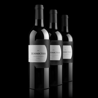
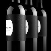
VS: This project is unique in many ways. The design had to reflect the unique character of the product in question - exclusive author wine. Besides, there was a requirement to communicate the deep meaning in the product's name - superlative, solstice, contrast between night and day, black and white, open and obscure. The label's form is original and represents a contrast between day and night, wrapping the bottle around its entire circumference, forming an enclosed system of interaction, where one comes out of the other.
FS: How did you come up with the name for this design? What does it mean?
VS: Echinoctius is the trademark developed by the Equinox winemaking company. The main concept behind this trademark is the contrast and unity of day and night, light and dark, two different wine varieties combined in a single exquisite product.
FS: Which design tools did you use when you were working on this project?
VS: Standard graphic applications.
FS: What is the most unique aspect of your design?
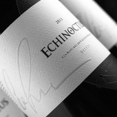
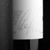
VS: There are several unique aspects to this particular work. First of all, there's a pronounced interaction of two different parts of the label - black and white - that represents the unity of day and night. The way this interaction is arranged through the design depicts the smooth transition between the two extremes. Then there's also the intricate tactile varnish pattern on the dark side of the label, which adds a pronounced texture and a unique look to it. And the fact that this label is circular and goes round the whole bottle isn't something you see every day on the product shelf.
FS: Who did you collaborate with for this design? Did you work with people with technical / specialized skills?
VS: The design was developed in-house by the agency's specialists.
FS: What is the role of technology in this particular design?
VS: The production of this label involved the application of the most advanced printing techniques. The choice of paper was set to high quality art paper by FASSON MAILLE BLANC of the FASSON RICH collection. As for additional printing techniques I would like to note the application of tactile (volume) varnish not only in the vine’s name but in the author’s signature as well, which ensures the quality of the product.
FS: Is your design influenced by data or analytical research in any way? What kind of research did you conduct for making this design?
VS: This is a unique label for an exclusive wine, which will only be distributed through the HoReCa system. The label's main task is to outline the product from the rest of wines of the same category and make consumer remember it as something original, interesting and unusual. While working on the design, I was thinking about how the consumer sitting in the restaurant will be looking at the label, will take the bottle and be surprised after looking at it at a closer distance.
FS: What are some of the challenges you faced during the design/realization of your concept?
VS: The most difficult thing about the entire project was understanding the bulk of responsibility associated with it. Creating a modest design, reflecting the high quality of the product, keeping the continuity with the previous products from the same winemaker, reflecting the product name's essence and confirming own professional qualification - these were the hardest things about this project.
FS: How did you decide to submit your design to an international design competition?
VS: Upon completing this work I felt that it is worth sharing with the international design community. I'm very proud of it.
FS: What did you learn or how did you improve yourself during the designing of this work?
VS: Having a successful predecessor in the form of 5 Elemente, this work had a high bar to reach. So I had to giive my best in this design to keep it on the same level with the award-winning work I did for the company's previous product. My creativity and ability to develop a truly exquisite design was put to the test, and by completing the project I've felt that I've actually passed it. It was a revealing experience for me personally.
FS: Any other things you would like to cover that have not been covered in these questions?
VS: I'm really delighted to see this design awarded with such a great prize. It's a real honor and it really gives me the confidence I need to work on future more ambitious projects.
FS: Thank you for providing us with this opportunity to interview you.
A' Design Award and Competitions grants rights to press members and bloggers to use parts of this interview. This interview is provided as it is; DesignPRWire and A' Design Award and Competitions cannot be held responsible for the answers given by participating designers.
| SOCIAL |
| + Add to Likes / Favorites | Send to My Email | Comment | View Press-Release | Translations |


