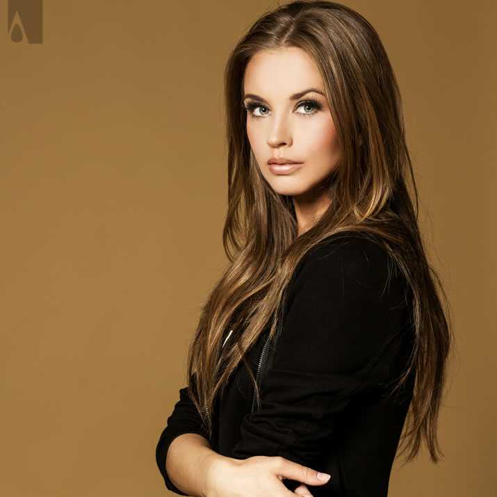
The image above is great. It has good contrast between background and the designer, uses a good lens for capturing light better and there is enough space and head room, the image is a perfect portrait and bust so that the face of the designer is highly visible, and most importantly the subjects are looking towards the camera. Image is sharp, and very professional. This image was taken by a professional photographer, using a professional photo camera and a professional lens, with professional lighting and post touching and editing. The image above is great. It has good contrast between background and the designer, uses a good lens for capturing light better and there is enough space and head room, the image is a perfect portrait and bust so that the face of the designer is highly visible, and most importantly the subjects are looking towards the camera. Image is sharp, and very professional. This image was taken by a professional photographer, using a professional photo camera and a professional lens, with professional lighting and post touching and editing.
 Work with a Professional Photographer. It is worth spending your money.
Your image is important. Work with a Professional Photographer. It is worth spending your money.
Your image is important.
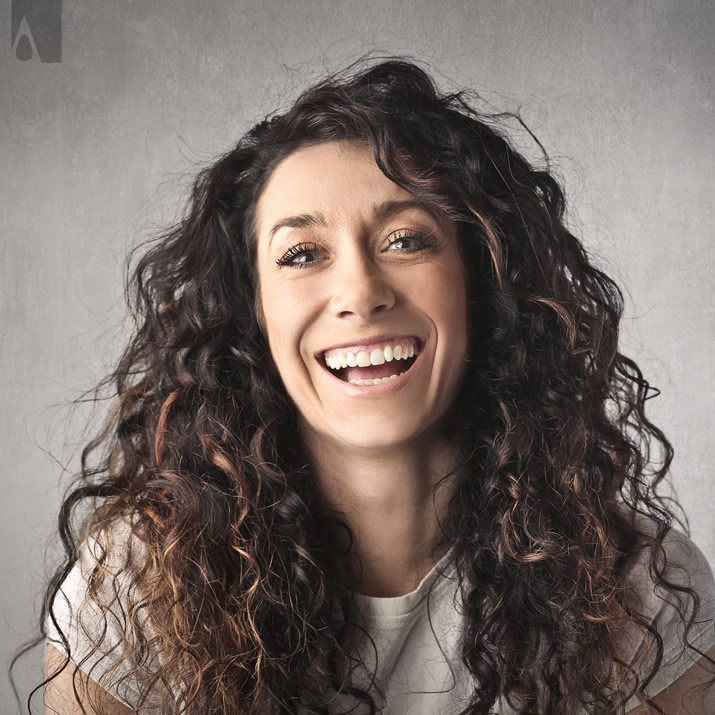
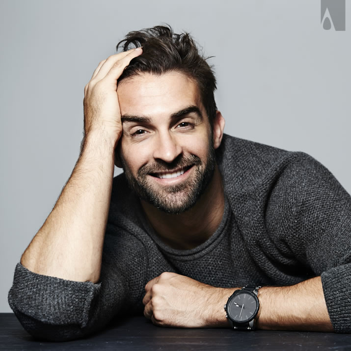
The image above is good. It has good contrast between background and the designer, uses a good lens for capturing light better and there is enough space and head room, the image is a perfect portrait and bust so that the face of the designer is highly visible, and most importantly the subjects are looking towards the camera. Image is sharp, and very professional. This image was taken by a professional photographer, using a professional photo camera and a professional lens, with professional lighting and post touching and editing. This image could have been great, if the model was not smiling too much.
Work with a Professional Photographer. It is worth spending your money.
Your image is important.

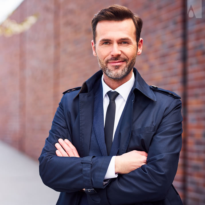
The image above is good. It has good contrast between background and the designer, uses a good lens for capturing light better and there is enough space and head room, the image is a perfect portrait and bust so that the face of the designer is highly visible, and most importantly the subjects are looking towards the camera. Image is sharp, and very professional. This image was taken by a professional photographer, using a professional photo camera and a professional lens, with professional lighting and post touching and editing. This image could have been great, if the model was smiling a bit more, and if white background was used.
Work with a Professional Photographer. It is worth spending your money.
Your image is important.

 The image above is good.. but... The image above is good.. but... It could have been better, if the lighting was better, if you notice one side of the designer is dark, like the dark side of the moon. You will want to make sure that your face is completely visible. Furthermore, for this image, a brighter background would have been better for an increased contrast between the subject and the background.

The image above is good.. but... It could have been better, if there was enough contrast between the background and the designer. Here, the image is great, the bokeh is exceptional, but there is very little contrast between the designer and the background.

The image above is good.. but... It could have been better, studio images with design equipment is always highly attractive, but even so, we should ensure that the face of the designer is clearly seen, here in order to display the mannequin, the photographer had to zoom out, but is mannequin more important than your own face? It is not.

The image above is good.. but... It could have been better, here the issue is that the hair is clipped. There is not enough head room. You will want to have space around the head for a better photo. All other aspects of this image is good; background contrast, bokeh, and face orientation are good but, the hair being cut is not okay.
The image above is good.. but... It could have been better, if the designer put a bit of a smile instead of a smirk, plus the position of the hands give an introvert feeling, the designer is not also centered to the image. Professional photographer would ask you to center, smile and let hands go.

The image above is good.. but... It could have been better, especially if there was head room. There must be some space above the head. Furthermore, the contrast could potentially be higher, but otherwise this is an exceptional photo ruined by leaving the head out of image.
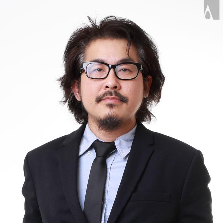
The image above is good.. but... It could have been better, if you work with a professional photographer, they will try to remind you to make sure your hair looks good as well as your clothing. Furthermore, this image is too serious in sense there is no smile, no empathic pull. Your images should be attractive, this is not an image you would send to a date, this is a passport photo.

The image above is good.. but... It could have been better, this image suffers from the hair being cut, not enough head room or space around the head, and perhaps the way the clothing was worn. The background blur, bokeh is exceptional but the image is not okay.

The image above is good.. but... It could have been better, especially if the hairs were not cut out of the scene; there should be space around the head. It is also better not to give the Ruben's pose; try not putting your hands to your face, even though it gives the feeling you are thinking deep.

The image above is good.. but... It could have been better, this image is almost exceptional but the background right portion has a single color element (a wall) that disrupts it. Furthermore, this image should be zoomed in slightly to make it look better. Finally, the hands being hidden does not give a trustworthy image; hands should not be in a crossed section in the image.

The image above is good.. but... It could have been better, if the designers hair was not left out of the scene, furthermore the contrast between foreground and background is low, it is better to have a bit more contrast where possible, otherwise this could have been an excellent image.

The image above is good.. but... It could have been better, here the problem is that the white hair and light color shirt does not create a contrast between the background. It is always better to have some contrast so we could understand where hairs end where wall begins. Crossed out hands is not preffered but in this image it actually looks good.

 The image above is not good.. because... The image above is not good.. because... this is not a portait image, it is half body; we do not need to see the belt first of all, we should cut the image from the top pocket. Furthermore, the background is terrible, better use white instead of wedding photography backgrounds.

The image above is not good.. because... First of all this is not a portrait or bust, should zoom in more to the face, second of all, avoid making victory poses or hand gestures for the profile image, it does not look good. Otherwise, the contrast is actually good here.

The image above is not good.. because... first of all, the hair is cut, that is a no no; there should be some head room, space around the head. Moreover, here, the muscular body features shadow that pretty face; it is better people look your face. This image could have been better if the camera tilted up slightly.
The image above is not good.. because... It is not an actual portrait image, we need to have a portait image, the image could have been better if the camera tilted up slightly and gave more room for the hair and show the upper bust. Techniquewise this is a great image, but it does not work as a profile image.

The image above is not good.. because... It is not a portrait or bust image, the way hands are placed gives the feeling of insincerity, the smile is too much fake, contrast between ambient background and foreground is low, there is a wall element in the background that breaks the composition.

The image above is not good.. because... It is not a personal image, there are many more people in the photograph; this is a group photo. This should follow group photo rules instead. This is a nice shot but not suitable as profile image for sure.

The image above is not good.. because... again, there are many more people in the photograph; this is a group photo not a personal photo, some people's faces were outright cut. This should follow group photo rules instead.
The image above is not good.. because... it is too good. While the hands covering the face is not normally desired, all aspects of this image are actually exceptional, including contrast, post processing, head room, and the facial expression are all really good. This image was taken by a professional photographer, using a professional photo camera and a professional lens, with professional lighting.
Work with a Professional Photographer. It is worth spending your money.
Your image is important.
|