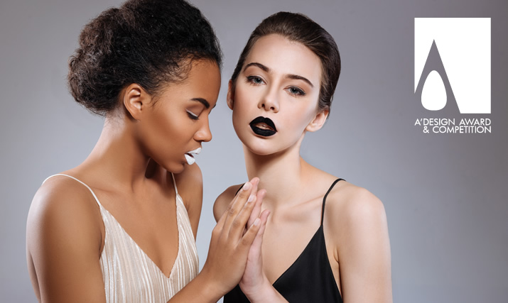
 The image above is great. It has good contrast between background and the subjects, uses a slightly wide angle lens so that there is space between the subjects and the edges - there is enough space, all people are featured as busts or portrait as much as possible instead of showing the whole body so that the face of people are more visible, and most importantly the subjects are looking towards the camera, plus background blur is good, the bokeh is great.. Image is sharp, and very professional. This image was taken by a professional photographer, using a professional photo camera and a professional lens, with professional lighting and post touching and editing. The image above is great. It has good contrast between background and the subjects, uses a slightly wide angle lens so that there is space between the subjects and the edges - there is enough space, all people are featured as busts or portrait as much as possible instead of showing the whole body so that the face of people are more visible, and most importantly the subjects are looking towards the camera, plus background blur is good, the bokeh is great.. Image is sharp, and very professional. This image was taken by a professional photographer, using a professional photo camera and a professional lens, with professional lighting and post touching and editing.
 Work with a Professional Photographer. It is worth spending your money.
Your image is important. Work with a Professional Photographer. It is worth spending your money.
Your image is important.

 The image above is great. It has good contrast between background and the subjects, uses a slightly wide angle lens so that there is space between the subjects and the edges - there is enough space, all people are featured as busts or portrait as much as possible instead of showing the whole body so that the face of people are more visible, and most importantly the subjects are looking towards the camera, plus background blur is good, the bokeh is great.. Image is sharp, and very professional. This image was taken by a professional photographer, using a professional photo camera and a professional lens, with professional lighting and post touching and editing. The image above is great. It has good contrast between background and the subjects, uses a slightly wide angle lens so that there is space between the subjects and the edges - there is enough space, all people are featured as busts or portrait as much as possible instead of showing the whole body so that the face of people are more visible, and most importantly the subjects are looking towards the camera, plus background blur is good, the bokeh is great.. Image is sharp, and very professional. This image was taken by a professional photographer, using a professional photo camera and a professional lens, with professional lighting and post touching and editing.
 Work with a Professional Photographer. It is worth spending your money.
Your image is important. Work with a Professional Photographer. It is worth spending your money.
Your image is important.

 The image above is good.. but. The image above is good.. but. It could have been better, if the background and the people had more contrast; the image looks great at first but later you will notice that it is oversaturated, and there is not enough contrast between people and the background.
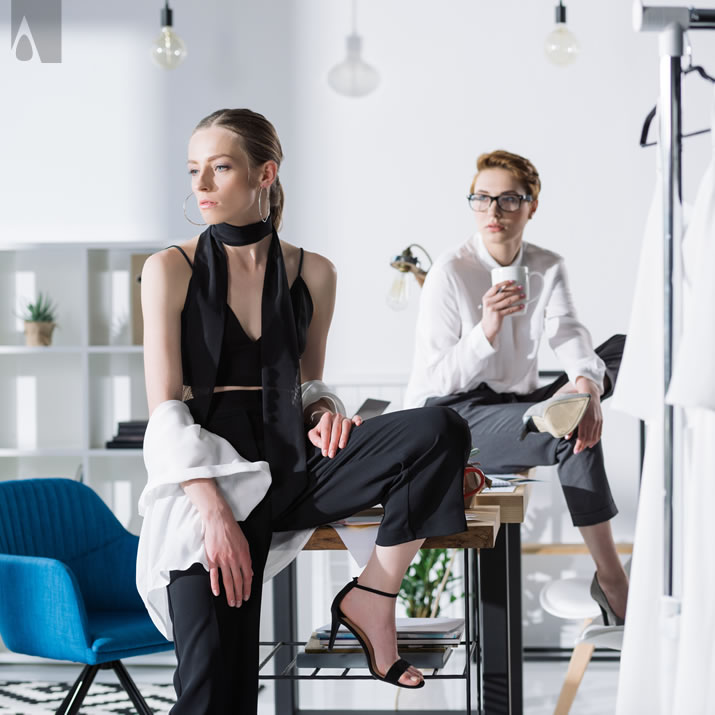
 The image above is good.. but... The image above is good.. but... It could have been better, if the people were looking to the camera, this image is actually very artistic and shows the interior space as well as the style of the designers but it is better to zoom to faces, feature portraits and also models should look to the camera.

 The image above is good.. but... The image above is good.. but... It could have been better, if there were enough space in the right and left, and better to have space in the top, no need to show full body. Large angle lens could be useful in such cases.

 The image above is fun.. but... The image above is fun.. but... It could have been better, selfy images are not really suitable for professional promotion, furthermore, this image is a really good selfy; in most cases people are unable to take such good selfies due to camera resolutions and lighting conditions.
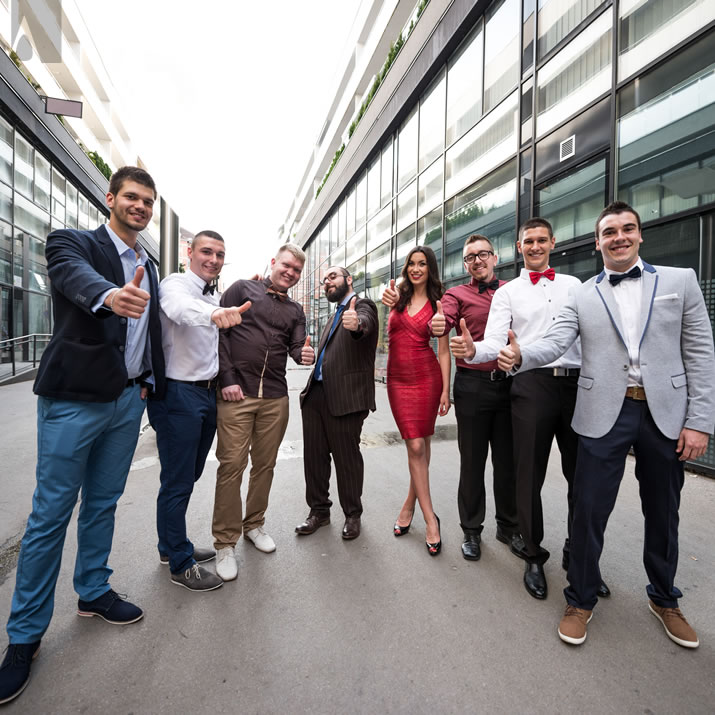
 The image above is good.. but... The image above is good.. but... It could have been better, if you use a wide angle camera, make sure all the subjects are inside the frame. Here, the feets are not fitting. Furthermore, lens distortion correction in photo editing software should also be made.

 The image above is good.. but... The image above is good.. but... It could have been better, if the subjects are seen from front, honestly, this photo is actually quite good but we prefer the front style. Furthermore, all subjects should be within the frame, and not cut.

 The image above is good.. but... The image above is good.. but... It could have been better, here the team members are not all in the photo, the photograph seems unbalanced, furthermore, there is no common dress code, you will want the team to look coherent and in synergy with some stylish or formal clothing.

 The image above is good.. but... The image above is good.. but... It could have been better, some of the team members are lost in the depths of image. It is better to feature the team members in the same line as much as possible unless you want to say Jane and John did little to contribute.
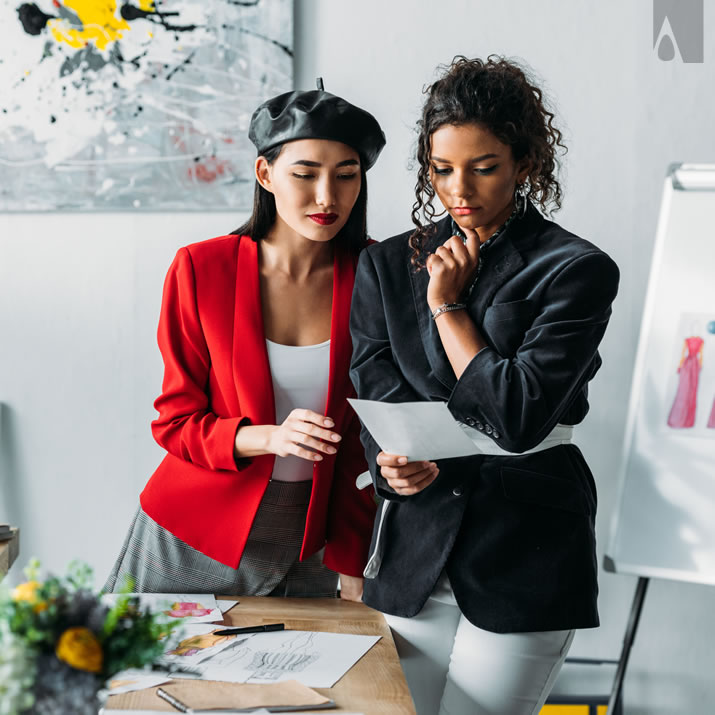
 The image above is good.. but... The image above is good.. but... It could have been better, if you look at the camera, and zoom in slightly. Actually, this image has a special value since it was taken in the ambient of the designers' workshop, so it is actually nice but people should look at camera for our profile images.

 The image above is good.. but... The image above is good.. but... It could have been better, if all the people fit the photo as much as possible withhout being cut, and also people in the background should come forward slightly so that they are not blurred or out of focus.
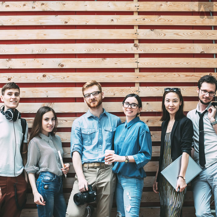
 The image above is good.. but... The image above is good.. but... It could have been better, if the designers were more close to each other and don't pose as three seperate couples. You want to make a group photo not tell your relationship status.

 The image above is good.. but... The image above is good.. but... It could have been better, if the designers were more close to each other and such that no team member would be cut when the image is cropped to square. Furthermore, better to come closer so that camera could also show your face more.

 The image above is not good.. because... The image above is not good.. because... It is a weird selfy with some people left out of frame, some too front, and some team members blurred. It is better to ask someone to take a photo if you are not able to afford a professional photographer.
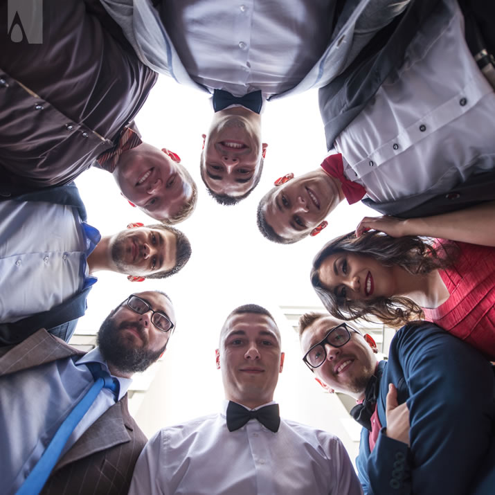
 The image above is not good.. because... The image above is not good.. because... of the perspective; the issue is that a bottom shot is mostly not a suitable material for magazine publication, it is too much fun for the traditional magazines; you want to communicate professionalism first, fun should follow.

 The image above is not good.. because... The image above is not good.. because... It is not an actual group photo if only the team leader is being featured and all team members being blurred. You will want to feature all your team members as much as possible. If they don't want to be in photo, it is okay, no need to have them in a blurred way, better don't have such people in the photo.

 The image above is not good.. because... The image above is not good.. because... It is not a professional photograph; the depth of field was selected wrong and people did not allign correctly; one team member is focused and all others are out of focus, blurred, this is not okay.
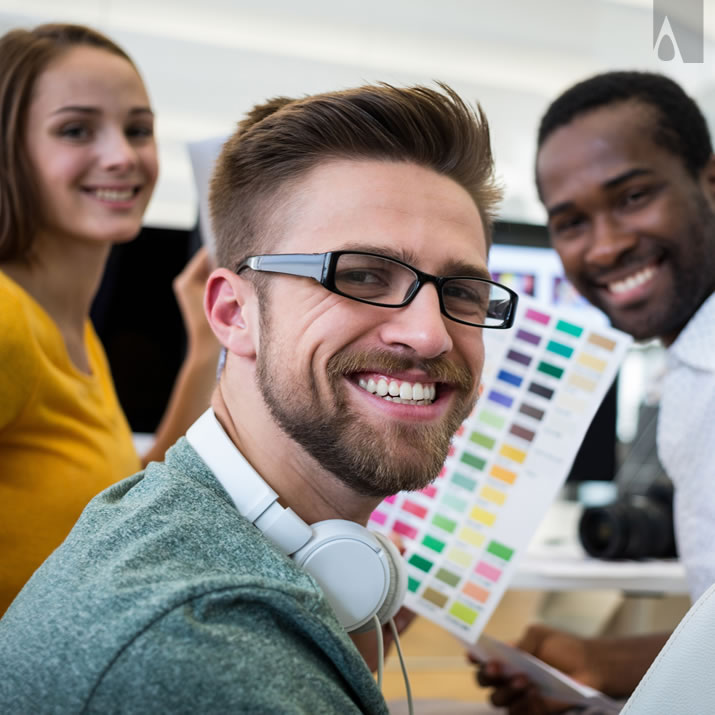
 The image above is not good.. because... The image above is not good.. because... Even though it shows the creative environment, all team members should be in focus, it is not okay to have one prominent team member featured. Better make sure all designers are visible, at the same level.

 The image above is not good.. because... The image above is not good.. because... It could have been better, the issue is that a bottom shot is mostly not a suitable material for magazine publication, it is too much fun for the traditional magazines; you want to communicate professionalism first, fun should follow.

 The image above is great for LARGE GROUPS. Each individual image was taken by a professional photographer, using a professional photo camera and a professional lens, with professional lighting and post touching and editing and put together nicely. Everyone is smiling only, because a professional photographer made them smile, remember this important fact. Even John from accounting is smiling. The image above is great for LARGE GROUPS. Each individual image was taken by a professional photographer, using a professional photo camera and a professional lens, with professional lighting and post touching and editing and put together nicely. Everyone is smiling only, because a professional photographer made them smile, remember this important fact. Even John from accounting is smiling.
 Work with a Professional Photographer. It is worth spending your money.
Your image is important. Work with a Professional Photographer. It is worth spending your money.
Your image is important.
|


![]() The image above is great. It has good contrast between background and the subjects, uses a slightly wide angle lens so that there is space between the subjects and the edges - there is enough space, all people are featured as busts or portrait as much as possible instead of showing the whole body so that the face of people are more visible, and most importantly the subjects are looking towards the camera, plus background blur is good, the bokeh is great.. Image is sharp, and very professional. This image was taken by a professional photographer, using a professional photo camera and a professional lens, with professional lighting and post touching and editing.
The image above is great. It has good contrast between background and the subjects, uses a slightly wide angle lens so that there is space between the subjects and the edges - there is enough space, all people are featured as busts or portrait as much as possible instead of showing the whole body so that the face of people are more visible, and most importantly the subjects are looking towards the camera, plus background blur is good, the bokeh is great.. Image is sharp, and very professional. This image was taken by a professional photographer, using a professional photo camera and a professional lens, with professional lighting and post touching and editing. 


![]() The image above is great for LARGE GROUPS. Each individual image was taken by a professional photographer, using a professional photo camera and a professional lens, with professional lighting and post touching and editing and put together nicely. Everyone is smiling only, because a professional photographer made them smile, remember this important fact. Even John from accounting is smiling.
The image above is great for LARGE GROUPS. Each individual image was taken by a professional photographer, using a professional photo camera and a professional lens, with professional lighting and post touching and editing and put together nicely. Everyone is smiling only, because a professional photographer made them smile, remember this important fact. Even John from accounting is smiling.