DESIGN NAME:
Caring Times in a Distinctive Space
PRIMARY FUNCTION:
Residential Interior Design
INSPIRATION:
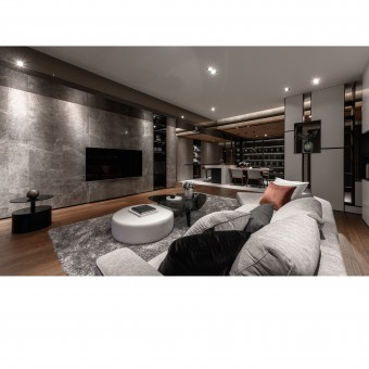
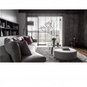
Grayish white serves as a keynote color to connote composure and simplicity. The designer boldly removes inessential walls to retain natural light. By integrating storage into the flow, matching metal wire with specular material and installing elegant lighting, the sense of oppression from the original beams is altogether eliminated. The original layout, in which there was no public space with good natural light and the low beams resulted in a dark and narrow space, is transformed magically.
UNIQUE PROPERTIES / PROJECT DESCRIPTION:
In adherence to an emphasis on environmental protection and good health, "green" building materials that are certified are used, and the entire space is laid out for full accessibility. The use of leather is deliberately minimized. The space is organized based on functions. The arrangement in the open-plan area, the layout of the walls, and the coordination of the colors together make for rich gradations and highlight the distinctiveness of a life in this living space.
OPERATION / FLOW / INTERACTION:
The consistency of the entire place is stretched all the way to the bedrooms with the use of simple lines and combination of grayish white and metallic paint. The low beams are concealed and then transformed into eye-catching vertical surfaces. Some blank is left deliberately in the bedrooms, so that the owner can bond more deeply with their children by looking for some ornaments for the blank. In so doing, the children will enjoy their time at home even more, thus allowing for more intimate interactions and exchanges among the family members.
PROJECT DURATION AND LOCATION:
Taichung, Taiwan
FITS BEST INTO CATEGORY:
Interior Space and Exhibition Design
|
PRODUCTION / REALIZATION TECHNOLOGY:
The certified green building materials are used, and the entire space is laid out for full accessibility. Also, the use of leather is deliberately minimized.
SPECIFICATIONS / TECHNICAL PROPERTIES:
215 square meter
TAGS:
Green interior design, Healthy decoration
RESEARCH ABSTRACT:
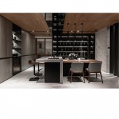
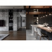
As for functionality, a transparent gliding door in the kitchen can retain maximum natural light while shutting off any airborne grease and fumes. The kitchen island, which has a hardwood table with veins and a marble top, links with the center of the public area and allows for convenience in getting drinking water. With the hardwood overhead and dark specular surfaces all around, a feel both modern and heart-warming is created. Linear light brings about varied expressions of the space and balances with the cold colors, thereby making it possible to enjoy wonderful leisure time together in a laid-back fashion in the dining area.
CHALLENGE:
The complete, massive wall that extends from the entrance to the TV wall in the living room cleverly conceals the audio-visual equipment and its wires, making the living room look neat and vast. The owner thinks outside the box - in different flows, the cabinets can be storage, space dividers, or installation art. They are quietly fused into the space created to meet people’s needs. The hardwood floor, pasted boldly and accurately in perfect alignment, alternates with the lines of the stone material in the bar area and accords with those in the ceiling. Complete with furniture, the sense of space is accentuated, making the place look open and broad, with lots of diversity.
ADDED DATE:
2020-02-19 06:12:57
TEAM MEMBERS (1) :
Chia-Peng Chen
IMAGE CREDITS:
Photo, Andy Chang
|


