Shenwu Jinmao Palac Exemplary Apartment by Joy Chou |
Home > Winners > #99351 |
 |
|
||||
| DESIGN DETAILS | |||||
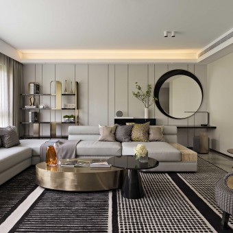
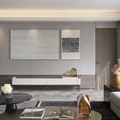
| DESIGN NAME: Shenwu Jinmao Palac PRIMARY FUNCTION: Exemplary Apartment INSPIRATION: Family provides the most primitive and close experience for people, which is the relatively entrusted emotion derived from activities in life; the original practice of inferring things is based on activities and emotions, including the spirit and will activities of human. People should learn to search for beauties from worthless objects. UNIQUE PROPERTIES / PROJECT DESCRIPTION: This work copies the perception for space and life, and nostalgia thorough movement, proportion and vision. These elements form the characteristics of family, providing more profound sensation and memories to people. Such division of perfect proportion creates the design concept gathering aesthetics, art and multiple context in space is the visual result. OPERATION / FLOW / INTERACTION: All new concepts from the design process are explored by the design team and the results from attempts in different possibilities. The design may be simple and neat but is quite intriguing: artistic continuation highlighted in low-profile luxury. A rational order form is revealed from the exceptional style, which all create visual aesthetics full of artistic ideas. PROJECT DURATION AND LOCATION: The model house is located in Jinan, we started the project in May 2019 and finished in December 2019 FITS BEST INTO CATEGORY: Interior Space and Exhibition Design |
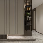
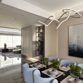
PRODUCTION / REALIZATION TECHNOLOGY: The private space is designed with appeals in furniture, material, fabric, and lighting to customize the unique and exceptional integrity. The design invigorates high-quality life and style of taste to produce tranquility and beauty in the pure rest area. The design team extracts the unique charm and essence of art and culture to plant elegant luxury to all corners of the house, invigorating calm temperament and sensational romance. SPECIFICATIONS / TECHNICAL PROPERTIES: 190sqm TAGS: Modern, Simply, Green, Life, Mansion RESEARCH ABSTRACT: The back wall of the living room is divided and decomposed in proportion of 4:2:3 to break away from the handling approach with traditional lines and dimension. The wall interprets the visual and perceived image after extracting aesthetics upgrade. The public-area façade is divided by material, using the 1:4 division proportion to extend from the living room to the dining room magnifying horizontally and connecting spatial extension. CHALLENGE: The designer regards the space as a carrier filled with memories, using the forwardness in proportion decomposition and extension of spatial linear axis to bring the harmony and resonance with the environment highlighted by the spacious and generous layout. ADDED DATE: 2020-02-18 04:01:48 TEAM MEMBERS (1) : IMAGE CREDITS: Joy Chou, 2019. |
||||
| Visit the following page to learn more: http://www.exclaim.asia/ | |||||
| AWARD DETAILS | |
 |
Shenwu Jinmao Palac Exemplary Apartment by Joy Chou is Winner in Interior Space and Exhibition Design Category, 2019 - 2020.· Read the interview with designer Joy Chou for design Shenwu Jinmao Palac here.· Press Members: Login or Register to request an exclusive interview with Joy Chou. · Click here to register inorder to view the profile and other works by Joy Chou. |
| SOCIAL |
| + Add to Likes / Favorites | Send to My Email | Comment | Testimonials | View Press-Release | Press Kit |
Did you like Joy Chou's Interior Design?
You will most likely enjoy other award winning interior design as well.
Click here to view more Award Winning Interior Design.


