DESIGN NAME:
M-Town Office
PRIMARY FUNCTION:
Interior Design
INSPIRATION:
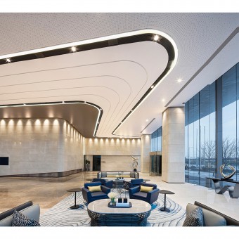
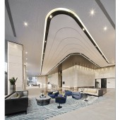
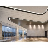
We divide the lobby ceiling into three levels, and, by using the turns of the L-shaped planes, create continuous curves on the ceiling. Like layer-upon-layer of ribbons or winding lines of athletic tracks, they start from one side of the lobby, twist and extend, finally gathering diagonally on another side of the L shapes and forming a winding division resembling a boomerang.
UNIQUE PROPERTIES / PROJECT DESCRIPTION:
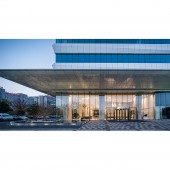
It is a modern high-rise with parallel long windows and streamline shapes that bring about visual effects - an avant-garde, futuristic feel quite unlike those of its neighboring buildings. Such spatial sensation continues in the design of the lobby, making it an extension of the building itself into the public space within, and thereby enhancing the impact the entire building has on the viewer.
OPERATION / FLOW / INTERACTION:
This boomerang not just cleverly connects the dots of silk screen printing on the outer edge and the brown corrugated aluminum sheets on the inner edge, but corresponds with the curvy lines on the floor covering. Thus the contrast of the inner vs. outer and the upper vs. lower is formed, breaking the stillness and seriousness that is common in traditional office buildings. An exceptional vibrancy thus comes into being.
PROJECT DURATION AND LOCATION:
Shanghai, China
FITS BEST INTO CATEGORY:
Interior Space and Exhibition Design
|
PRODUCTION / REALIZATION TECHNOLOGY:
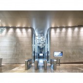
The floor plan is presented in a square. Such facilities as the main elevator halls, restrooms and shaft are at the center of the building. The outer ring of the shallow square is divided into two L shapes, in one of which the lobby is located. In the expansive space that is vaulted, large French windows shape a medium area between the inside and the outside. Using white and beige as the keynote colors, we combine stone materials with stainless steel and aluminum plates, and construct a unique, bright high-tech office setting for business. With the purest colors and materials, the simplicity and consistence of the space are achieved.
SPECIFICATIONS / TECHNICAL PROPERTIES:
15000 square meter
TAGS:
-
RESEARCH ABSTRACT:
-
CHALLENGE:
n keeping with the division design of the ceiling and the floor, for the façade we make use of forms that go diagonally and turn upward. In this way, variety is added to the usually monotonous and dull walls, and the dialogue among the ceiling, the floor and the walls is formed, shaping an architectural lexicon of evenness and continuity. The interior design and the building itself echo each other through the streamline, curvy shapes. What’s more, by means of the enriched and diverse design, the building conveys our understanding of the users. People working in the office building will burst with spiritual vitality and gain access to a pleasant, cheerful working space.
ADDED DATE:
2020-02-17 10:20:10
TEAM MEMBERS (2) :
Patrick Chen and Qiang Tao
IMAGE CREDITS:
Patrick Chen, 2019.
|
