DESIGN NAME:
Command 101 Ideas
PRIMARY FUNCTION:
Corporate Identity
INSPIRATION:
The everyday discussion or talks about using products in the everyday life is the inspiration behind the logo. It gets people excited when they discuss a same topic together. Just like how they like the Command Picture Hanging Strips. It's does not only hold frames, but is practical and creative to hold other things like air-conditioner remote to make them look as though its hanging in mid air. Great for using it as a light passageway in the house at night. There's no limit to creativity!
UNIQUE PROPERTIES / PROJECT DESCRIPTION:
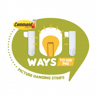
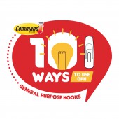
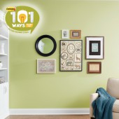
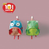
A fun and quirky approach to Command's personality where the ideas of using Command products are highlighted in various ways. In the execution, the idea of a speech bubble, together with 101 ways to use Command products is conceptualised. To design a series of logo, the entire range of products has to be depicted in each logo for example Picture Hanging Strips, General Purpose Hooks, Bathroom Range. To make the entire logo look relevant, the USP like the icon of Strips, Hooks and Caddy is used.
OPERATION / FLOW / INTERACTION:
These logos are used in below the line collaterals like leaflets, brochures, POSM materials. The identity gives the entire event or look a more uniform feel and it speaks volumes about what the entire campaign is about. 101 fun ways to use Command Damage-Free Products. The colour codes are designed in relevance to the product range so it is easy to differentiate in the events.
PROJECT DURATION AND LOCATION:
This project started in April 2018 and finished in Jan 2019.
FITS BEST INTO CATEGORY:
Graphics, Illustration and Visual Communication Design
|
PRODUCTION / REALIZATION TECHNOLOGY:
The actual products has to be incorporated into the identity design to let consumer know what they are buying. Because of the variety of products that Command carries, the entire identity had to be consistent. Thus using illustration that depicts the product was conceptualised and implemented giving the entire look closely related to Command's distinct products.
SPECIFICATIONS / TECHNICAL PROPERTIES:
Each logo must be at least 3cm x 3cm when it is reduced. To meet the different product criteria, the colour code is introduced. Each product range has a different colour coding system. Thus the range is the products follow the colour code for classification purposes.
TAGS:
Logo Design, Brand identity, Graphic Design, Corporate Identity, Advertising
RESEARCH ABSTRACT:
The discussions in everyday life is reflected in the logo. Command did a research about how their consumers view their products and also had some DIY bloggers to do what Command products can help improve their daily life routine. Many creative ways were conceptualised, like using the Command Picture Hanging Strips to stick multi-plugs hidden underneath the table, using the strips to place their security cameras without the need to drill holes or damage the walls. This logo is used in their roadshow campaigns to feature their products in different weeks in different locations.
CHALLENGE:
The challenge was how to implement the fun factor in DIY section, whilst highlighting the products as well as making the series look consistent in the look and feel. The most difficult part was how to implement products into the logo design, yet making it look sleek in design and interactive.
ADDED DATE:
2020-02-17 02:04:38
TEAM MEMBERS (1) :
IMAGE CREDITS:
Photography credits by 3M Command.
|
