DESIGN NAME:
Guizhou Sign Industry Association Office
PRIMARY FUNCTION:
Work Space
INSPIRATION:
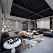
In the Internet era, when capital and technology are reshaping the world, people's needs and behavior patterns are changing, and some traditional functional spaces are being changed. This case selects gray and white two kinds of color to regard as the main tone of the space. In the intersection of condensed and simple elements, under the cleaning of the pure and beautiful humanistic style, explore the most balanced state of human and space, and establish the harmony and warmth of the space.
UNIQUE PROPERTIES / PROJECT DESCRIPTION:
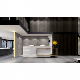
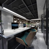
In this case, the designer uses an open and free moving line function partition to make up the sense of space closure, and uses a large area of cement ash to establish the temperament of the space. Through practical insights in appearance as well as through a continuous and slightly changed design idea, it not only expresses the business philosophy, humanistic quality and core value of the enterprise, but also meets the functional requirements hidden in the user.
OPERATION / FLOW / INTERACTION:
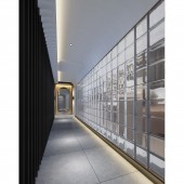
A large area of grille glass is used in the hall on the second floor to deconstruct the order of the space and create a visual effect of the time corridor.
PROJECT DURATION AND LOCATION:
The project started in April 2019 in Guiyang and finished in September 2019 in Guiyang.
FITS BEST INTO CATEGORY:
Interior Space and Exhibition Design
|
PRODUCTION / REALIZATION TECHNOLOGY:
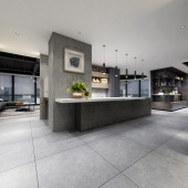
Bare pipelines with industrial wind elements on the ceiling, iron-shaped spherical glass chandeliers with a rich sense of style, arts and books full of humanity on the display walls, injecting aesthetic marks into the mood of the space, reflecting the the professional, elegant, artistic and aesthetic features of the enterprise.
SPECIFICATIONS / TECHNICAL PROPERTIES:
The project covers a total of 368 square meters. The simplicity of the space, the clarity of the structure and the purity of the materials are the aesthetic carriers of the case. Designers use the language of architecture and the way of light and shade, line and surface dialogue to design the space, strengthening the original sense of the space.
TAGS:
Interior, Office, Modern, Simple, Pure, Minimalist, Industrial Style, GSIA
RESEARCH ABSTRACT:
The interior continues the same visual experience as the exterior facade, calm and not lonely. Step by step, the visible part greatly retains the texture and the material itself. There is no superfluous decoration and furnishing here, but only the simple and elegant shape is used to express the dialogue between the design and the space, so as to balance the overall rigid texture and give people a sharp and concise feeling.
CHALLENGE:
The drop-down door integrates the thinking mode of modern architecture, it uses simple square nesting to form a matrix square column with great visual beauty, and then combined with lighting to create a sense of hierarchy, which gives people a progressive subjective experience and expands the depth and imagination of vision.
ADDED DATE:
2020-02-16 04:12:14
TEAM MEMBERS (1) :
Xiongming Li
IMAGE CREDITS:
Image #1: Photographer Chao Liang, Reception Desk, 2019.
Image #2: Photographer Chao Liang, Water Bar, 2019.
Image #3: Photographer Chao Liang, Office, 2019.
Image #4: Photographer Chao Liang, Corridor, 2019.
Image #5: Photographer Chao Liang, Negotiation Area, 2019.
PATENTS/COPYRIGHTS:
Copyrights belong to Xiongming Li, 2019.
|
