Snow Capped Commercial Space by Joy Chou |
Home > Winners > #98435 |
 |
|
||||
| DESIGN DETAILS | |||||
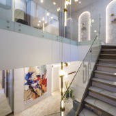
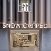
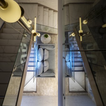
| DESIGN NAME: Snow Capped PRIMARY FUNCTION: Commercial Space INSPIRATION: The building tells its own stories between the past and present periods through the house structure and spatial design; it is not limited to a single style but is to elaborate the highlights of stories, expressing a modern, stylish, and luxurious look in a simple and elegant style. UNIQUE PROPERTIES / PROJECT DESCRIPTION: It is a three-storey and aged building so that the interior design team took around one year to strengthen the building's structure and reconstruct preparatory engineering works, then facelift the external look of this old building. Meanwhile, the team uses the rational style to plan for the exterior and interior design of this project, contrasting the simple and clean contour with the light and shadow to enhance the layers between virtual and solid space decoration. OPERATION / FLOW / INTERACTION: The white shades on the 1st floor extending to the corridor on the 2nd floor continue the warm and comfortable design concept and create a graceful and delicate space style. On the 3rd floor, the original brick wall is preserved and decorated with the white color and green plants; it brings the natural atmosphere for this space and expresses the integration of old and new art textures in a single building as well. PROJECT DURATION AND LOCATION: The project is finished in April 2019 in Taipei FITS BEST INTO CATEGORY: Interior Space and Exhibition Design |
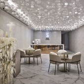
PRODUCTION / REALIZATION TECHNOLOGY: Glass ball and light design enrich the layers on the ceiling and bring a perfect visual effect. Natural stone surface with indirect lighting and the titanium materials are the major designs of the counter space. Perfectly separate rating with the implicit and stylish atmosphere in a proper way, extending the significance of facade at the same time. The entire field is not to show off the superficial taste, but to give the user visual impact and relaxed feeling through materials. SPECIFICATIONS / TECHNICAL PROPERTIES: 435 sqm TAGS: modern, luxury, glass, metal, art RESEARCH ABSTRACT: White is selected to be the main color shade for the Beauty Consultation Area. Glass ball and light design enrich the layers on the ceiling and bring a perfect visual effect. In the concept of design is to lead the trends of fashion continually and head for the wonderful prospect. CHALLENGE: To remove the partitions and reconstruct by using curtains and glass material replace the traditional wall planning for the building to enhance the multiple extensions between fields, making each area available for individual space or multiply-connected space as well. This reconstructed building turns into an original and pure space that reminds people of the importance of returning to the present moment all the time. ADDED DATE: 2020-02-11 03:23:37 TEAM MEMBERS (1) : IMAGE CREDITS: Joy Chou, 2019. |
||||
| Visit the following page to learn more: http://www.exclaim.asia/ | |||||
| AWARD DETAILS | |
 |
Snow Capped Commercial Space by Joy Chou is Winner in Interior Space and Exhibition Design Category, 2019 - 2020.· Read the interview with designer Joy Chou for design Snow Capped here.· Press Members: Login or Register to request an exclusive interview with Joy Chou. · Click here to register inorder to view the profile and other works by Joy Chou. |
| SOCIAL |
| + Add to Likes / Favorites | Send to My Email | Comment | Testimonials | View Press-Release | Press Kit |
Did you like Joy Chou's Interior Design?
You will most likely enjoy other award winning interior design as well.
Click here to view more Award Winning Interior Design.


