Pearl River Howard Plaza Hotel by Cheung Chiu Hung |
Home > Winners > #97842 |
 |
|
||||
| DESIGN DETAILS | |||||
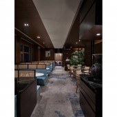
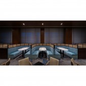
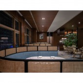
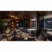
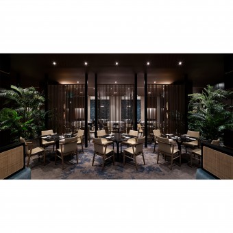
| DESIGN NAME: Pearl River Howard Plaza PRIMARY FUNCTION: Hotel INSPIRATION: Cantonese restaurants, in general, are presented with large round tables with crowded people and busy waiters, however, we have ingeniously applied the borders of space to segment the various spatial areas, and further arranged seats with different styles in the various spatial areas, thereby solving the hotel proprietors needs towards encountered customer groups. UNIQUE PROPERTIES / PROJECT DESCRIPTION: What does a Cantonese style restaurant look like in your heart This design project escapes from the stereotypical and existing spatial ambience of traditional Cantonese cuisines, eliminating the commonly seen presentations of Chinese ancient dimness or excessively extravagant style, as we hope to design a space that is capable of maintaining the aesthetic sentiment of Chinese style with elegance and comfort. OPERATION / FLOW / INTERACTION: Moreover, elements including marbles and wood carving lines are adopted for the space to enhance the spatial layers while increasing the quality. PROJECT DURATION AND LOCATION: The project finished in April 2019, locates in Howard Plaza Hotel, Kaohsiung, Taiwan. FITS BEST INTO CATEGORY: Interior Space and Exhibition Design |
PRODUCTION / REALIZATION TECHNOLOGY: The original space features dim lighting, which is gloomy without vitality, therefore, we have specially designed an entire piece of large glass, allowing natural light to shine upon the circular seats, in the day, copious natural light shines indoor, guiding the green prosperity from outside, at dusk, lights are ingeniously applied to create a romantic ambience, allowing the users to relax the heart and soul while indulging in it. SPECIFICATIONS / TECHNICAL PROPERTIES: The restaurant is 495 square meters. TAGS: Interior, Restaurant, Space, Chinese, Open-style RESEARCH ABSTRACT: The open style booths are presented using wallpapers with Chinese images, embellishing space with aesthetic sentiment, while the carpet is presented via the Chinese ink painting techniques, which resemble exquisite paintings, such that sophistication is replaced by small details, offering the everlasting extraordinary art experience that allows customers to indulge in the space with leisure and comfort. CHALLENGE: What is worth mentioning is that we have designed a tea savoring area, providing teas for customers who only want to drink tea, as thinking ahead for the customers is the sweet thoughtfulness from us. The human oriented core principle is combined with spatial design, so as to rethink the value considerations for quality life, and to restore the close relations or mutual trust between people. ADDED DATE: 2020-02-04 05:50:38 TEAM MEMBERS (2) : Director: Cheung Chiu Hung, Huang Chung Jen and Designer: Lin Liang Ting, Wang Chun Yu IMAGE CREDITS: Cheung Chiu Hung, 2019. |
||||
| Visit the following page to learn more: https://www.fomoart.com/ | |||||
| AWARD DETAILS | |
 |
Pearl River Howard Plaza Hotel by Cheung Chiu Hung is Winner in Interior Space and Exhibition Design Category, 2019 - 2020.· Read the interview with designer Cheung Chiu Hung for design Pearl River Howard Plaza here.· Press Members: Login or Register to request an exclusive interview with Cheung Chiu Hung. · Click here to register inorder to view the profile and other works by Cheung Chiu Hung. |
| SOCIAL |
| + Add to Likes / Favorites | Send to My Email | Comment | Testimonials | View Press-Release | Press Kit |
Did you like Cheung Chiu Hung's Interior Design?
You will most likely enjoy other award winning interior design as well.
Click here to view more Award Winning Interior Design.


