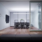
DESIGN NAME: Interesting White
PRIMARY FUNCTION: Office
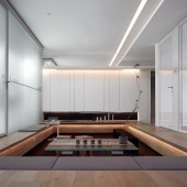
INSPIRATION: When an 80-square-meter office needs to be a product showroom, the designer makes the product a high degree of living and becomes the protagonist of the space, leaving the best landscape to the customers. The designer was inspired by the Japanese garden corridor, and set up a sunken multifunctional reception area to make business communication more like a chat between friends, and you can see the striking slogans on the product to impress customers during the conversation.
UNIQUE PROPERTIES / PROJECT DESCRIPTION: The project is located in an office building in Shenzhen, China with views of the Hong Kong coastline, and is an imported glass partition company. When customers visit, this is also the showroom of their products. Need to use as many products as possible without making the space cumbersome and highlighting the company culture.
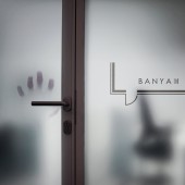
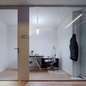
OPERATION / FLOW / INTERACTION: The combination of the light box, the guidance system and the glass partition makes the focus on the product, which weakens the impression that the body space is not large. The sense of space extension created by the mirror also highlights the product in the space. The sunken multifunctional reception area, in addition to receiving guests daily, can also be used as a display area for new product launches, and a good choice for employees to work freely.
PROJECT DURATION AND LOCATION: This project was started in August 2019, and was finished in November 2019 in Shenzhen, China.
FITS BEST INTO CATEGORY: Interior Space and Exhibition Design
|
PRODUCTION / REALIZATION TECHNOLOGY: Wooden floor, Mongolian black, ultra-white glass partition, lacquered board
SPECIFICATIONS / TECHNICAL PROPERTIES: Project scale is 80 square meters
TAGS: Office, showroom, sunken, glass partition, multifunctional
RESEARCH ABSTRACT: In order to impress visitors, the designer artistically turns the product into a living exhibit. It is not the normal appearance, it will stimulate people to think of more possibilities of using the product, so as to achieve the purpose of sales.
CHALLENGE: Using the marketing design method summarized by the company for many years, in the case of small project space, the functional division ratio between the exhibition hall and the office is reasonably allocated. Starting from the company's sales purpose, leaving the best scale and landscape to the reception area and conference room, so that customers visiting can see the best presentation of the product, so as to better sell it.
ADDED DATE: 2020-01-31 07:09:29
TEAM MEMBERS (4) : Kay, Don, Jef and Ling
IMAGE CREDITS: Ling,2020
PATENTS/COPYRIGHTS: Copyrights belong to Kay, 2020
|