DESIGN NAME:
Essence of Humanity
PRIMARY FUNCTION:
Office Space
INSPIRATION:
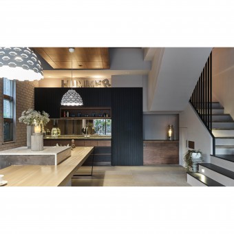
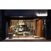
The project was a reformation of an old storefront to a design studio. There was a retro mottled indoor wall that fits perfectly with the concept, hence the team keeps it. After rearranging the circulation and bringing vintage textures and modern furniture; black, gray, and brown were chosen to be the main color tones. The poetry of modern and retro humanities integrates perfectly and, at the same time, presents an one-of-a-kind personal statement.
UNIQUE PROPERTIES / PROJECT DESCRIPTION:
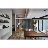
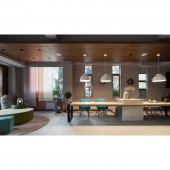
The concept of this project is to create a gallery-like studio with a personality under vintage and retro styles. Therefore, integrating minimalistic, geometric looks with both modern and old tones and textures. Keeping as much room as possible from the original layout, the designers added a display wall for their own works and paired it with a gradient art wall done by a muralist, consisting of various materials to create a tranquil and reserved painting from which warmth of humanity pours out.
OPERATION / FLOW / INTERACTION:
To make the office space livelier, the designer used everywhere-scenery design techniques. Not only the entrance at the foyer is decorated with the exquisite vista of gradient murals, but the gate and the reception are also adorned with various plants. The team removed the original skylight panel and installed steel frames to plan out the terrace roof. With the tiling of dark rectangular shingles and stone, enable to create an exceptional Zen garden and inject bright liveliness by bringing various plants.
PROJECT DURATION AND LOCATION:
Construction began in April 2016, and after three months, it was completed in July 2016.
FITS BEST INTO CATEGORY:
Interior Space and Exhibition Design
|
PRODUCTION / REALIZATION TECHNOLOGY:
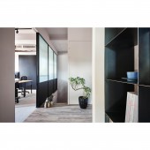
In order to refine the retro artistic essence without losing the originality of an up-and-coming design team, the designers focused on creating key crafts with different materials. Terrazzo-like tile flooring, soft wooden textures, and elevations shaped by clean-cut steel hardware are mixed at the reception area on the first floor. In the office space on the second floor, big plates of black iron were used as doors to cabinets and were paired with chalkboard paint and dark laminate flooring.
SPECIFICATIONS / TECHNICAL PROPERTIES:
The team hoped that the 82 square meters area of the second floor could have a wide feeling and echo the outdoor landscape; therefore, large windows and fluted glass are used. Moreover, the sequencing and overlaying of lines add more to visual layers, such as wood planks on the ceiling right above the meeting table stretching out the axis, wooden molding on elevations in the pantry room, and the stairs give the flow of the space a beautiful depth of field with sharp, turning lines and surfaces.
TAGS:
Office, Retro, Modern, Fusion of old and new, Heterogeneousness
RESEARCH ABSTRACT:
A warm, minimalistic appearance and a simple, open design mean that people will be able to sense the story of a journey to pursue a dream. The consulting area, a bar area, and a pantry room on the first floor were brought forth so that designers and visiting guests could talk about design and imagination in a comfortable environment. Large glass elements are utilized to divide the work area, the meeting area, and the terrace, creating a wonderful working environment for the designers.
CHALLENGE:
Under the consideration of not dismantling the original structure, the designers planned out the appearance of the building with a special minimalistic, geometric design, which proved to be quite the challenge to execute. They hoped to arrange the hollow window frames on the outer walls so that the scenery indoors and outdoors could be connected. With the light coming in from the massive French windows, the whole facade and shape give off an expansive and bright sentiment.
ADDED DATE:
2020-01-16 10:14:30
TEAM MEMBERS (2) :
Tsung Yen Feng and Jou An Chen
IMAGE CREDITS:
Hey!Cheese
|
