Journey of Art Boutique Hotel by Hsin Jien O Yang |
Home > Winners > #96986 |
 |
|
||||
| DESIGN DETAILS | |||||
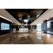
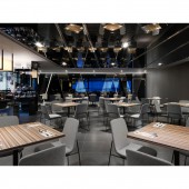
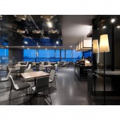
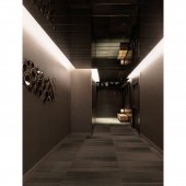
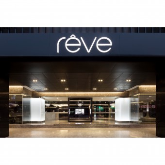
| DESIGN NAME: Journey of Art PRIMARY FUNCTION: Boutique Hotel INSPIRATION: This design project fuses the taste of traveling and architectural design via appealing postures, exquisite spatial content, and low-profile color performances, demonstrating aesthetic sentiment within the design, allowing one to savor the luxury and the extraordinary quality, which is of lasting memories. UNIQUE PROPERTIES / PROJECT DESCRIPTION: This design project is a boutique hotel, that thinks outside the box to lead the local trend, and is segmented from the surrounding environment, allowing this district to be no longer merely a quiet old town. Based on the core values of new vitality and non-exaggerated design principles, it has low-profile luxury with exquisiteness, which creates variations via the approach of seeking differences within similarities in order to combine culture with life. OPERATION / FLOW / INTERACTION: The guest room corridors are decorated based on the theme of cultural art, eliminating the boring and long corridors through the variations of lights, shadows, and artistic paintings. What is worth mentioning is the design for the bathroom in the guest rooms, in order to stress the broader and comfortable spatial experience as compared to hotels in general, we have set up an independent bathtub to create a modern and well-executed sentiment. PROJECT DURATION AND LOCATION: The project started in December 2015, finished in April 2018. Locates in Taichung City, Taiwan. FITS BEST INTO CATEGORY: Interior Space and Exhibition Design |
PRODUCTION / REALIZATION TECHNOLOGY: In the aspect of design, we wish to create a distinctive personality and brand clarity; moreover, to build a spacious, comfortable, fashionable, and succinct space. For this, we have given up on sophisticated materials, and utilized the shining texture of hard materials to connect the entire spatial area, introducing to travelers a distinctive and strong design ambience. SPECIFICATIONS / TECHNICAL PROPERTIES: The property is 4000 square meters. TAGS: Interior Design, Hotel, Luxury, Space, boutique RESEARCH ABSTRACT: - CHALLENGE: The overall spatial layout distribution is clear, where the ground floor is the entrance lobby, with the café on the left and the hotel reception counter on the right. A massive amount of black glass is used for the entrance lobby, allowing the space to extend and appear more spacious via the reflective effects of the glass; since the space has a semi-open style, the reception counter for the café is designed using a marble texture, demonstrating the visual effect of a boutique café; the scene for the hotel reception counter on the right is dazzling, emphasizing the hotel quality while capturing people’s attention. ADDED DATE: 2020-01-16 09:56:29 TEAM MEMBERS (1) : Director: Huang Fang Ting IMAGE CREDITS: Hsin Jien O Yang, 2019. |
||||
| Visit the following page to learn more: http://www.exdiworks.com/?fbclid=IwAR0nI |
|||||
| AWARD DETAILS | |
 |
Journey of Art Boutique Hotel by Hsin Jien O Yang is Winner in Interior Space and Exhibition Design Category, 2019 - 2020.· Read the interview with designer Hsin Jien O Yang for design Journey of Art here.· Press Members: Login or Register to request an exclusive interview with Hsin Jien O Yang. · Click here to register inorder to view the profile and other works by Hsin Jien O Yang. |
| SOCIAL |
| + Add to Likes / Favorites | Send to My Email | Comment | Testimonials | View Press-Release | Press Kit |
Did you like Hsin Jien O Yang's Interior Design?
You will most likely enjoy other award winning interior design as well.
Click here to view more Award Winning Interior Design.


