DESIGN NAME: Simplicity
PRIMARY FUNCTION: Office
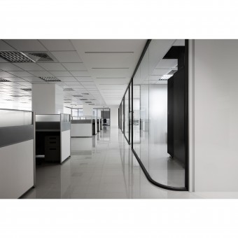
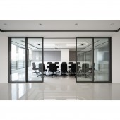
INSPIRATION: Eliminating excessive resplendent decorations and spatial arrangement, adopting a large area of clean white foundation with the combination of glass and iron piece to create the simplified and open visual effects; the element of LED light strips is further added to segment space via the light sources.
UNIQUE PROPERTIES / PROJECT DESCRIPTION: This design project is based on modern style as the fundamental color tone, the main color tone adopted dignified and tranquil grey for the display with the match of pure white color, while extremely modern craftsmanship and techniques are further applied to deconstruct the spatial aesthetic sentiment.
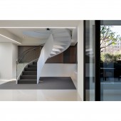
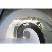
OPERATION / FLOW / INTERACTION: What is worth mentioning is the design of the spiral staircase within the space adopted an arc elegant line to balance the masculinity of the space, where the application of steel panel and arc-shaped glass simplified the volume of the staircase; as for the positioning of the staircase, a location nearby the balcony has been chosen to gently correspond with the landscapes.
PROJECT DURATION AND LOCATION: The project finished in 29th November 2019 in Taichung, Taiwan.
FITS BEST INTO CATEGORY: Interior Space and Exhibition Design
|
PRODUCTION / REALIZATION TECHNOLOGY: Moreover, a spiral staircase is further designed within the space as a connection between the top and the bottom offices, and it is a significant highlight within the domain, acting as an installation art that stands tall here.
SPECIFICATIONS / TECHNICAL PROPERTIES: The property is 410 square meters.
TAGS: Interior Design, Office, Space, Modern style, Clean
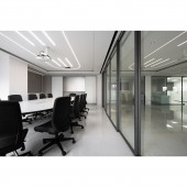
RESEARCH ABSTRACT: With the design of eliminating closed partitions, the open and smooth emotional circulation guides in the sunlight and natural greenness from outdoor, thereby accomplishing the spatial sentiment fused with nature. Moreover, indoor illuminations are collected to allow the light source to undertake the outdoor sunlight, apparently improving the existing gloomy and closed impressions of traditional offices.
CHALLENGE: The entire space allowed the new and the old to form a strong contrast and conflict via iron piece and glass, thereby stimulating extraordinary spatial resplendence; exquisite design ideas are put into the modern style, eliminating sophistication with simplicity to create a bright, spacious and elevated space, while the use of different materials, the sense of transparency under the variation of lights and shadows as well as the virtual spatial volume stack to form the sensual spatial new looks.
ADDED DATE: 2020-01-14 03:51:26
TEAM MEMBERS (1) : Designer: Li Min Chen
IMAGE CREDITS: Li Min Chen, 2019.
|