Yulai Fang Restaurant by Yue Jiang |
Home > Winners > #95749 |
 |
|
||||
| DESIGN DETAILS | |||||
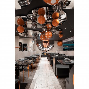
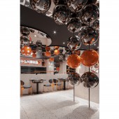
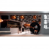
| DESIGN NAME: Yulai Fang PRIMARY FUNCTION: Restaurant INSPIRATION: As the image display of this brand's flagship store, the entrance retains the orange and black color matching of the main vision, bringing fashionable and enthusiastic tone to the whole space. The designer tries his best to create the IP image of "Fish Boyfriend". While enhancing brand recognition and penetration, it provides a totally immersive theme park dining experience, which easily captures the hearts of young female customers. UNIQUE PROPERTIES / PROJECT DESCRIPTION: This 215-square-meter restaurant project is located in a busy shopping mall with many shops. Through the connection and superposition of geometric shapes, designers use interesting thinking to transform it into a combination of facades. The ingenious intervention and application of terrazzo material and mirror stainless steel make a good division of indoor and outdoor space. OPERATION / FLOW / INTERACTION: The long table area and the square table area complement each other, which not only enriches the spatial level, but also meets the needs of different consumer groups. Simple tone collocation and exquisite detail pursuit reflect a delicate lifestyle, a avant-garde aesthetic concept, and a lively space atmosphere. PROJECT DURATION AND LOCATION: The project started in April 2019 in Chongqing and finished in May 2019 in Chongqing. FITS BEST INTO CATEGORY: Interior Space and Exhibition Design |
PRODUCTION / REALIZATION TECHNOLOGY: Entering the store, the bright color layout, as well as the combination of rigid and soft materials, gives people a fresh sensory experience. The integration of curve and straight line enhances the sense of space and creates the visual sense of fashion and simplicity. SPECIFICATIONS / TECHNICAL PROPERTIES: The project covers a total of 215 square meters. The whole space shows its own personality in the blending of fashion and art. TAGS: Interior, Restaurant, Modern, Fish Boyfriend, Bubble Gallery, Fashion, Enthusiastic, Immersive, Young RESEARCH ABSTRACT: With the increasingly strong demand for experiential consumption, people's pursuit of restaurants is no longer limited to simple taste and temptation, but more yearning for the brand culture and the spiritual space constructed by its extension. The semi-open door head design not only satisfies the free circulation of light and view, but also makes the facade of the whole restaurant form a more simple and prominent expression. CHALLENGE: The use of mirror smallpox reduces the sense of depression in the low overhead area, and its reflective effect also presents a colorful, diverse and dramatic visual effect for customers. ADDED DATE: 2019-12-19 10:41:07 TEAM MEMBERS (3) : Yue Jiang, Ting Pan and Yanhong Li IMAGE CREDITS: Image #1: Photographer Yiwen Xu, Dining Area, 2019. Image #2: Photographer Yiwen Xu, Dining Area 2, 2019. Image #3: Photographer Yiwen Xu, Dining Area 3, 2019. Image #4: Photographer Yiwen Xu, Dining Area 4, 2019. Image #5: Photographer Yiwen Xu, Entrance, 2019. PATENTS/COPYRIGHTS: Copyrights belong to Yue Jiang, 2019. |
||||
| Visit the following page to learn more: http://c7.gg/fSzqv | |||||
| AWARD DETAILS | |
 |
Yulai Fang Restaurant by Yue Jiang is Winner in Interior Space and Exhibition Design Category, 2019 - 2020.· Read the interview with designer Yue Jiang for design Yulai Fang here.· Press Members: Login or Register to request an exclusive interview with Yue Jiang. · Click here to register inorder to view the profile and other works by Yue Jiang. |
| SOCIAL |
| + Add to Likes / Favorites | Send to My Email | Comment | Testimonials | View Press-Release | Press Kit |
Did you like Yue Jiang's Interior Design?
You will most likely enjoy other award winning interior design as well.
Click here to view more Award Winning Interior Design.


