Touch the Sky Office by Yong Zhang |
Home > Winners > #94494 |
 |
|
||||
| DESIGN DETAILS | |||||
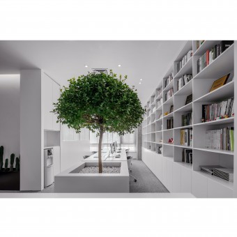
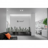
| DESIGN NAME: Touch the Sky PRIMARY FUNCTION: Office INSPIRATION: Touch design ingeniously refines cultural elements and applies them to modern space, showing elegant charm while leaving more room for touch. Green plants light up the living vitality of the office. The clean and free color is the trail of wandering thoughts, extending tentacles in the blank space. UNIQUE PROPERTIES / PROJECT DESCRIPTION: The whole space chooses the most classic white as the main tone, without tedious design and too much decoration, subtracting the depression in the office. Through the combination of natural pure white and quiet black, the brand image is presented concisely, while creating a harmonious sense of transition between left and right space. This extreme reduction makes it easier to focus on the few objects in the room. This environment calms the mind and sharpens your senses. OPERATION / FLOW / INTERACTION: The creativity of design comes from the infinite possibilities of thought. Soft tones give rise to infinite reverie in space, while the antennae of ideas spread and interact with each other in space. All of these give creative ideas a far-reaching enlightenment that can not only express logic and structure, but also reflect the image of "touch". PROJECT DURATION AND LOCATION: The project started in January 2019 in Tianjin and finished in May 2019 in Tianjin. FITS BEST INTO CATEGORY: Interior Space and Exhibition Design |
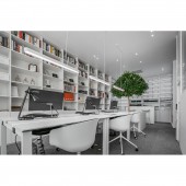
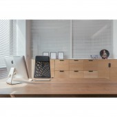
PRODUCTION / REALIZATION TECHNOLOGY: The conference room is designed with glass and shutters. Such a communication area not only maintains the mutual penetration and connection, enhances the tension of the place, but also guarantees the privacy of the whole space. The interior uses the local hanging art of the fitted design, coupled with the deep sensory effect of metal, to create a delicate artistic atmosphere. In addition, multimedia devices enhance the information radiation effect of wall space. SPECIFICATIONS / TECHNICAL PROPERTIES: The project covers a total of 220 square meters. Designers divide the space into different areas, which not only meets the needs of teamwork and focus, but also relaxes the nervous brain. TAGS: Interior, Minimalist, Modern, Simple, Art, Office, Touch Design, Elegant RESEARCH ABSTRACT: The charm of design is often to try to break the boundary and inherent limitation, so as to make the space more possible and interesting, and make people in the space have different experiences. This case transforms office space into art space, and at the same time adds modern humanistic elements to shape the unique temperament of the office. In the view of designers, art should not be a distant luxury, but a daily product, which can be seen everywhere as food for life. CHALLENGE: Free communication is essential to team innovation. In order to maximize the performance of the limited space, designers have opened up a whole area of soft packaging materials. Here, everything unknown and existing common sense memory are transmitted, and the tentacles of creative thinking begin to spread. The small green tree separates the high white two-person table, which provides a more casual and face-to-face office form. ADDED DATE: 2019-11-22 07:27:24 TEAM MEMBERS (2) : Yong Zhang and Xin Ma IMAGE CREDITS: Image #1: Photographer Yuhua Kou, Reception Area, 2019. Image #2: Photographer Yuhua Kou, Open Office, 2019. Image #3: Photographer Yuhua Kou, Conference Room, 2019. Image #4: Photographer Yuhua Kou, Open Office 2, 2019. Image #5: Photographer Yuhua Kou, Independent Office, 2019. PATENTS/COPYRIGHTS: Copyrights belong to Yong Zhang, 2019. |
||||
| Visit the following page to learn more: http://www.tj-touch.com | |||||
| AWARD DETAILS | |
 |
Touch The Sky Office by Yong Zhang is Winner in Interior Space and Exhibition Design Category, 2019 - 2020.· Read the interview with designer Yong Zhang for design Touch the Sky here.· Press Members: Login or Register to request an exclusive interview with Yong Zhang. · Click here to register inorder to view the profile and other works by Yong Zhang. |
| SOCIAL |
| + Add to Likes / Favorites | Send to My Email | Comment | Testimonials | View Press-Release | Press Kit |
Did you like Yong Zhang's Interior Design?
You will most likely enjoy other award winning interior design as well.
Click here to view more Award Winning Interior Design.


