Macy’s Website Redesign by Willy Lai and Dave Torres |
Home > Winners > #94023 |
 |
|
||||
| DESIGN DETAILS | |||||
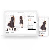
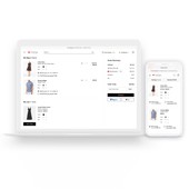
| DESIGN NAME: Macy’s Website PRIMARY FUNCTION: Redesign INSPIRATION: The design of our new website was inspired by premier fashion media and leading consumer technology products, and our goal was to create a clean, simple, and fashion-inspired design that would help differentiate Macys from it's competitors. UNIQUE PROPERTIES / PROJECT DESCRIPTION: In 2019, Macys website was redesigned in direct response to customer feedback, resulting in a clean, simple, and fashion-inspired design that dramatically improved user engagement. OPERATION / FLOW / INTERACTION: Users can access the website via a laptop computer, tablet, or smartphone. The new website design streamlines user purchases through a simpler, cleaner, and fashion-inspired design. PROJECT DURATION AND LOCATION: The project started in October 2018 and finished in October 2019. The team members were based in San Francisco and New York. FITS BEST INTO CATEGORY: Interface, Interaction and User Experience Design |
PRODUCTION / REALIZATION TECHNOLOGY: We utilized modern responsive web technologies. SPECIFICATIONS / TECHNICAL PROPERTIES: We developed resonsive web design across different devices. TAGS: Macys, macys.com, Web, Website, Redesign, UX, user experience, fashion, e-commerce RESEARCH ABSTRACT: Extensive user experience research was performed over the course of the project, including user surveys, user interviews, A/B testing, formal usability lab testing, remote usability testing, and guerrilla-style usability tests conducted at Macys stores. CHALLENGE: The creative challenges for this project included creating a user friendly, fashion-inspired design at scale while supporting a variety of business goals for a large and complex traditional organization. Culture transformation was crucial to realize and operationalize the new design. ADDED DATE: 2019-10-27 23:50:16 TEAM MEMBERS (8) : Willy Lai, Dave Torres, Agata Krol, Ricky J Li, Hafez Janssens, Philis Liu, Elena Rubtsova and Stephanie Houle IMAGE CREDITS: Images courtesy of Macys. |
||||
| Visit the following page to learn more: http://youtu.be/7NPButQYuQU | |||||
| AWARD DETAILS | |
 |
MacY’s Website Redesign by Willy Lai and Dave Torres is Winner in Interface, Interaction and User Experience Design Category, 2019 - 2020.· Read the interview with designer Willy Lai and Dave Torres for design Macy’s Website here.· Press Members: Login or Register to request an exclusive interview with Willy Lai and Dave Torres. · Click here to register inorder to view the profile and other works by Willy Lai and Dave Torres. |
| SOCIAL |
| + Add to Likes / Favorites | Send to My Email | Comment | Testimonials | View Press-Release | Press Kit |
Did you like Willy Lai and Dave Torres' Interface Design?
You will most likely enjoy other award winning interface design as well.
Click here to view more Award Winning Interface Design.


