Cafe Loop Cafe by Jun Murata |
Home > Winners > #93508 |
 |
|
||||
| DESIGN DETAILS | |||||
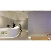
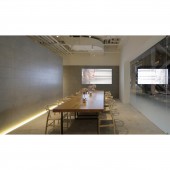
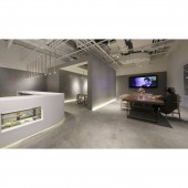
| DESIGN NAME: Cafe Loop PRIMARY FUNCTION: Cafe INSPIRATION: The commercial facility where this cafe is located is designed by Kengo Kuma. He renovated a building that was originally an old shipyard into a commercial facility. It was early last year that I designed a Japanese restaurant in it. The owner's acquaintance visited this restaurant, and he loves it so much. His company is in Japan. He is working in tourism and real estate business in Japan, and was looking for business space to acquire customers in China. After we took some meeting, we decided to design a cafe which could hold the seminar for business information and advertisements. UNIQUE PROPERTIES / PROJECT DESCRIPTION: This place is close to Shanghai's financial district and has been further promoted in recent years. There are many investors and businessmen with high sensitivity. Newly built high-rise condominiums and demand from neighboring residents, this cafe was designed as a hot spot where you can experience Japanese culture and travel. OPERATION / FLOW / INTERACTION: The design started in the fall of 2018. We had already completed a Japanese restaurant in the same building, so we knew the surroundings and the atmosphere of the stores that were being completed one after another. There were many gorgeous stores and many top brands. Most of the stores were just franchised stores. The shipyard was renovated after paying homage to the original architectural history and space and deciding what to leave and what not to leave. I thought about designing a very modest and modest café while examining the historical and what to leave. PROJECT DURATION AND LOCATION: The cafe faces huge void space which has concrete columns that have supported the existing building. The glass of the facade has a gradation effect. The rectangular gallery in the center of the store introduces various services and activities of the owner company. Around the gallery, a cafe area counter screen office is located, and various activities are integrated. Cafes are used as seminars and showrooms as well as for general users. We expect that this space gives healing and rest to various people and it is used for multipurpose use. FITS BEST INTO CATEGORY: Interior Space and Exhibition Design |
PRODUCTION / REALIZATION TECHNOLOGY: The gallery is at the centre of the store with a cafe counter on one side of the art space, and the design is intended to encourage flexibility and movement between the spaces. Wall space is left bare for exhibitions, and the pared back, meditative palette allows the film on screen to become the focal point. SPECIFICATIONS / TECHNICAL PROPERTIES: This space has 9,300m width, 10,200m depth, and 4,200mm height. There are no tiles on the walls, and the area around the ceiling remains white.Suppressing the texture and selecting a modest texture also leads to cost reduction. TAGS: gallery, showroom, simplicity, refurbishment, shipyard, minimalism, monochrome, pallet, shanghai, cafe, RESEARCH ABSTRACT: Because this is a related facility of a company headquartered in Japan, this cafe was required to feel a Zen atmosphere.But don't fake or imitate Japanese-style architecture.For this reason, the usage of colors and materials was determined very carefully. Margins are provided in the plan and cross-sectional plans.The arrangement of tables and chairs is very spacious. CHALLENGE: To put it simply, one theme was not to stand out. How it is used is not a single cafe, it is used as a gallery, business space, and small office in a complex way, and excessive setting created a space where the shipyard's remains and scale could be felt effectively. ADDED DATE: 2019-10-11 02:41:58 TEAM MEMBERS (1) : IMAGE CREDITS: JAM |
||||
| Visit the following page to learn more: http://www.junmurata.com/loop | |||||
| AWARD DETAILS | |
 |
Cafe Loop Cafe by Jun Murata is Winner in Interior Space and Exhibition Design Category, 2019 - 2020.· Read the interview with designer Jun Murata for design Cafe Loop here.· Press Members: Login or Register to request an exclusive interview with Jun Murata. · Click here to register inorder to view the profile and other works by Jun Murata. |
| SOCIAL |
| + Add to Likes / Favorites | Send to My Email | Comment | Testimonials | View Press-Release | Press Kit |
Did you like Jun Murata's Interior Design?
You will most likely enjoy other award winning interior design as well.
Click here to view more Award Winning Interior Design.


