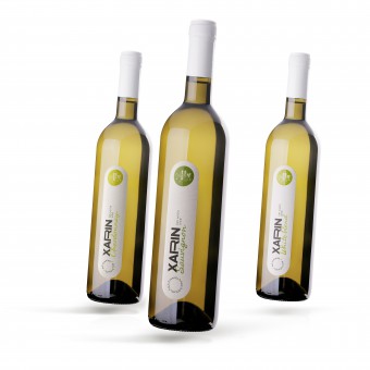
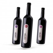
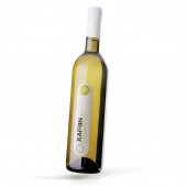
Xarin Series of Labels for the Farm Wines by Albert Fedchenko |
Home > Winners > #92992 |
| CLIENT/STUDIO/BRAND DETAILS | |
 |
NAME: AA Winery PROFILE: АА Winery is a brand created by an agricultural holding in 2017. The peasant farm holding consists of only two persons, this is a key advantage. This winery is not big, for this reason each bottle is warmed by the warmth of people who are truly fond of their work. Kharin Alexander Petrovich and his partner Zvyagintsev Alexander Anatolievich, who is a member of the peasant farm holding, have the work experience in winegrowing and winemaking over 30 years. The winery is oriented toward production of premium line varietal wine. In 2018 Saperavi wine was presented at wine tasting of indigenous grape varieties and won the Silver medal. In 2017 and 2018 Saperavi wine won the Bronze medals at the wine competition of Vinorus trade shows. There are own vineyards of 10 hectares located in Temryuksky district. Variety assortment is Sauvignon, Chardonnay, Cabernet and Saperavi. In 2020, it will be planned to lay out another 12 hectares of technical varieties. The winery is located in sunlit Krymsky district of the Krasnodar Territory, in Varenikovskaya village. It is located very close to the Black Sea. A license for the production, storage and supply with a volume of 5000 decaliters of wine-making products (wines) produced by an agricultural producer was obtained in 2018. In the same year the first season for grape processing and production of dry table wines such as Sauvignon, Chardonnay, Cabernet and Saperavi was held. In 2019, federal brands were obtained, the wine was bottled in glass container and the sale of finished products began. |
| AWARD DETAILS | |
 |
Xarin Series of Labels For The Farm Wines by Albert Fedchenko is Winner in Packaging Design Category, 2019 - 2020.· Read the interview with designer Albert Fedchenko for design Xarin here.· Press Members: Login or Register to request an exclusive interview with Albert Fedchenko. · Click here to register inorder to view the profile and other works by Albert Fedchenko. |
| SOCIAL |
| + Add to Likes / Favorites | Send to My Email | Comment | Testimonials | View Press-Release | Press Kit |
Did you like Albert Fedchenko's Packaging Design?
You will most likely enjoy other award winning packaging design as well.
Click here to view more Award Winning Packaging Design.


