DESIGN NAME:
Combine
PRIMARY FUNCTION:
Office
INSPIRATION:
As the client is an interior and branding designer, during the design project was carried out, the brief was to create an office space allowing free-roaming open space, reminiscing of discussions held at restaurants regarding design experiences.
UNIQUE PROPERTIES / PROJECT DESCRIPTION:
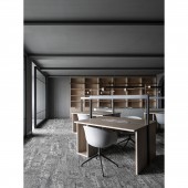
As this project was imbued with serene ambiance with grey color scheme and avantgarde look and feel, the design of an office reflects the working patterns of the working inhabitants who spend more time in this office than at their own homes, therefore, the office design is the design for living and social spaces. The design was of open plan to afford the sense of freedom as well as independent working space, while allowing staffs to switch seats freely.
OPERATION / FLOW / INTERACTION:
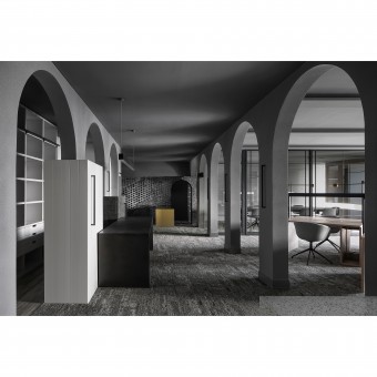
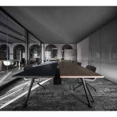
With the withering marks on the brick wall, the arches intersect with one another, as the overall brick wall volume articulates a pulsating movement of rhythm, while the center of the space and its surrounding conference rooms allows the optimal spatial freedom of the open space. As the staffs sit across from one another as if they are sitting in restaurant facing each other, complemented by energy-saving LED lighting fixtures, in creating a serene environment.
PROJECT DURATION AND LOCATION:
The project was completed in April 2019 in Shanghai.
FITS BEST INTO CATEGORY:
Interior Space and Exhibition Design
|
PRODUCTION / REALIZATION TECHNOLOGY:
In limited space, the design team attempted to mix and match different materials so as to cater for consistency and visual comfort among contrast and balance. As carpet was used on the floor for acoustic considerations, complemented by the grey wall, the overall space adopted fire-proof board to demarcate functions and consolidate storage. With ample natural lighting, interior lighting fixtures have also brought out spatial layers to manifest different spatial expressions.
SPECIFICATIONS / TECHNICAL PROPERTIES:
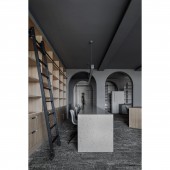
While deploying two continuous arc-shaped arch doors in the space which has given a strong sense of rhythm and layers, while breaking down the pedantic linework of conventional office space, a long table complemented by bottom-up lighting traversing through the interior space much like a library scene.
TAGS:
Open Office Space, Grey Art Paint, Brick Wall, Polish Stone
RESEARCH ABSTRACT:
The layout allocated the supervisor office, meeting room and conference room in zones that need sunlight, as their glass partitions allow the sunlight to inundate the interior. Around the perimeter of the interior, grey arch door, brick wall, steel-plate desks, and storage volumes were placed so as to allow staffs to hold discussion freely in such open office setting, as well as to find a working alcove to focus on work at hand.
CHALLENGE:
As the designer has a pre-conceived idea regarding the positioning of the design industry on the market, i.e. design is a business model utilizing aesthetics and techniques to solve problems while every commissioned project is bestowed with values through design. With limited space, this project was able to consolidate its consistency and visual comfort with different materials so that volumes of weight may be proportionally laid out in suitable function areas to complement reasonable circulation.
ADDED DATE:
2019-09-30 06:20:52
TEAM MEMBERS (2) :
Kai Ning Ling and Kai Ti Hsu
IMAGE CREDITS:
Kai Ti Hsu,Ha Ha Lu(2019)
|
