|
|
|

|
|
| DESIGN DETAILS |
DESIGN NAME:
Darin
PRIMARY FUNCTION:
Korean Health Food Store
INSPIRATION:
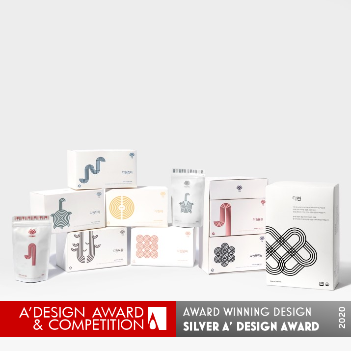
In Oriental medicine, internal healing is considered a fundamental treatment rather than external treatment. And the treatment is the basic principle of smoothing blood circulation. So we used blood circulation, which connects the whole body, as a design motif, and we designed lines as a basic component to express blood circulation.
UNIQUE PROPERTIES / PROJECT DESCRIPTION:
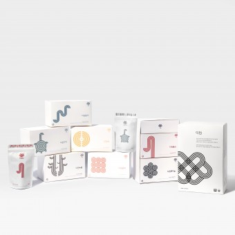
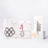
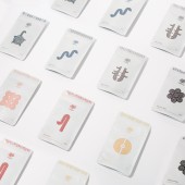
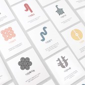
The project is designed to free modern people from reluctance to Korea's traditional health food products in the fatigue society, featuring simple, graphic clarity in delivering packages to the sensibilities of modern people, unlike the undesigned images that have been used by traditional Korean health food shops and called Geongang-won. All designs are made from motifs of blood circulation, visualizing the goal of providing vitality and health to the tired 20s and 30s. In the box, a graphic icon was inserted to show what juice was made of, and at the top of the pack was a pattern derived from the environment in which the material was grown and the properties of the material. In addition, the icons and patterns are made of colors taken from the material and are made up of main colors and sub-colors. Also, we designed a special typeface for the name of the product that will go into the box and pack for Darin's identity
OPERATION / FLOW / INTERACTION:
Darin's package is divided largely with, healthy juice-bearing packs, boxes by material in which the pack is put, and large packaging boxes designed to hold two boxes. The two boxes are packed with two materials that matches well together.
PROJECT DURATION AND LOCATION:
The project started in September 2018 in Korea and finished in November 2018
FITS BEST INTO CATEGORY:
Packaging Design
|
PRODUCTION / REALIZATION TECHNOLOGY:
Darin's juice is made from a total of seven ingredients: onion, black garlic, eel, pear, terrapin, red ginseng and antlers.
SPECIFICATIONS / TECHNICAL PROPERTIES:
The juice pack is 100mmx165mm, the small box is 175mmx105mmx95mm, and the big box is 180mmx275mmx95mm.
TAGS:
package design, korea, graphic design, pattern, healthcare, branding
RESEARCH ABSTRACT:
After a visit and interview to find out how existing health centers operate, we found that the main customers are mostly in their 40s and older, and that most stores use packages of the same design, not different packages from store to store. it. We also surveyed people in their 20s and 30s to find out what they think about ‘Geongang-won’ and what we need to improve, and found that the main reason they refused ‘Geongang-won’ was because of the old-Fashioned design, which made them biased that only people of high age go there. And based on these surveys, we tried to communicate our goals aesthetically and visually to people in their 20s and 30s.
CHALLENGE:
In the process of designing the icons, we have been agonizing over how simple it should be to make the material simpler and more obvious.
ADDED DATE:
2019-09-29 10:25:11
TEAM MEMBERS (2) :
Heesoo Son and Seoyeon Yoon
IMAGE CREDITS:
Heesoo Son and Seoyeon Yoon
PATENTS/COPYRIGHTS:
copyright@2019.Darin.All rights reserved
|
|
| CLIENT/STUDIO/BRAND DETAILS |
 |
NAME:
Darin
PROFILE:
Darin is a Korean traditional health food store, branded with the basic principle of smoothing blood circulation and made to provide 2030 people with energy.
Darin's juice is made from a total of seven ingredients: onion, black garlic, eel, pear, terrapin, red ginseng and antlers.
|
|
|
| COMMENTS |
| Giulia Esposito |
Comment #10427 on December 26, 2022, 9:33 pm |
|
I am absolutely thrilled to have encountered the award-winning design of Darin, a Korean Health Food Store! The packaging design is truly remarkable and stands out amongst its competitors. By combining traditional elements with modern design, the team behind this project has created something truly unique and eye-catching. The intricate details and thoughtful design that went into creating the packaging is evident in its appearance. This is a design that not only looks beautiful, but is also functional and conveys the message of the product in a way that's both creative and effective. It's no surprise that it earned such a prestigious award! Congratulations to Heesoo Son and Seoyeon Yoon for their successful design of Darin's packaging!
|
| Paul Phillips |
Comment #60434 on January 3, 2023, 10:18 pm |
|
I am in awe of the creativity and thoughtfulness behind Heesoo Son and Seoyeon Yoon's award-winning work, "Darin". By introducing simple and graphic clarity to Korea's traditional health food products, they were able to make them more appealing to modern people. The motifs of blood circulation and the use of colors taken from the materials are incredibly clever and further add to the visual appeal of the packaging. The special typeface designed for Darin's identity gives the brand an unmistakable presence and further builds on its unique identity. This is truly an impressive work of art that deserves to be celebrated!
|
| Elena Petrenko |
Comment #64065 on January 3, 2023, 11:57 pm |
|
This clever packaging design creatively combines traditional Korean health food motifs with modern design elements to create an attractive, vibrant package that appeals to people of all ages.
|
| Adam Harris |
Comment #68296 on January 4, 2023, 1:52 am |
|
This is an amazing work! Darin is a stunning example of modern packaging design that has been crafted with so much thought and detail. The use of the motif of blood circulation to represent vitality and health is a clever idea, and the careful choice of colors and patterns derived from the material's environment creates an eye-catching aesthetic. The icons and patterns help to make the material easier to understand, and the special typeface used for the product name gives it a unique identity. This sophisticated design is sure to stand out and it is no wonder that it has won the A' Design Award.
|
| Chloe Turner |
Comment #77842 on January 4, 2023, 6:32 am |
|
It's truly inspiring to see how creative design can be used to represent something as fundamental as blood circulation. Heesoo Son and Seoyeon Yoon have demonstrated a remarkable ability to capture the essence of this concept with their work, "Darin". The packaging design is truly remarkable in its simplicity, yet its impact is powerful. The lines used to create visual movement and the subtle colors used to create the feeling of energy flow, all come together to create a unique and engaging experience. It's no wonder that "Darin" was chosen as the winner of the A' Design Award - it's a remarkable achievement and an example of truly innovative design.
|
| Mark Allen |
Comment #79860 on January 4, 2023, 7:40 am |
|
This award-winning work is an amazing example of the creative power of design. It successfully conveys the goal of providing vitality and health to the tired 20s and 30s through its inspiring visual clarity. The icons and patterns, derived from the material's properties and environment, are beautifully composed with colors taken from the material, resulting in a very modern, vibrant packaging design. By taking a holistic approach to the design process, this work captures the traditional values of Korea's traditional health food products while making it accessible to modern audiences. Congratulations to the designer for this amazing accomplishment!
|
| Elisabeth Clark |
Comment #81232 on January 4, 2023, 8:35 am |
|
As a design enthusiast, I'm absolutely delighted to have seen the work of Heesoo Son and Seoyeon Yoon. Their work, "Darin", is truly a remarkable example of great design. The concept behind it, to free modern people from reluctance to Korea's traditional health food products, is truly inspiring. The way in which it is designed, to appeal to the sensibilities of modern people, with simple and graphic clarity, is remarkable. The way they used motifs of blood circulation to visually represent the goal of providing vitality and health to the tired 20s and 30s is simply brilliant. The icons and patterns used to show which juice is made of, as well as the design of the typeface for the product name for Darin's identity, are truly creative and inspiring. The research conducted to understand the needs of modern people and to improve existing health centers is also commendable. Heesoo Son and Seoyeon Yoon have set a wonderful example for us as to how design can be used to communicate goals and create beautiful and engaging products. Congratulations on winning the A' Design Award!
|
|
|
Did you like Heesoo Son and Seoyeon Yoon's Packaging Design?
You will most likely enjoy other award winning packaging design as well.
Click here to view more Award Winning Packaging Design.
Did you like Darin Korean Health Food Store? Help us create a global awareness for good packaging design worldwide. Show your support for Heesoo Son and Seoyeon Yoon, the creator of great packaging design by gifting them a nomination ticket so that we could promote more of their great packaging design works.
|
|

|
|
|
|
