DESIGN NAME:
Layers Of Colours
PRIMARY FUNCTION:
Residence
INSPIRATION:
As far as the client of this project is concerned, the interior design would be the memory treasure bank for the entire family, as well as the container for dreams, as the client aspired for the serenity of country lifestyle, as well as the unique modern living, between which the design team utilized color as the medium to find the balance through diverse functionality portfolio, spacious circulation to outline the public and private domains that meet the everyday needs.
UNIQUE PROPERTIES / PROJECT DESCRIPTION:
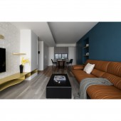
As much as powerful colors can be on the soul, the design team boldly utilized sharp colors and variable form to shape a rich spatial expression, with material detailing to trigger a psychological impulse. The living room floor was interwoven with two types of scratch-resistant timber flooring extended all the way to dining area wall to subtly demarcate interior domains.
OPERATION / FLOW / INTERACTION:
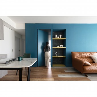
Given the limited floor area, the consideration for visual continuity was considered by the design team by utilizing the design of Hidden Doors to shape a clean-lined domain outlook with the added benefits of spacious interior and a flowing living circulation, which, when applied in the living room wall, the hidden bedroom door did create a visual extension through the circulation guide of cascading materials and colors.
PROJECT DURATION AND LOCATION:
This project was completed in Taichung, Taiwan, in 2019.
FITS BEST INTO CATEGORY:
Interior Space and Exhibition Design
|
PRODUCTION / REALIZATION TECHNOLOGY:
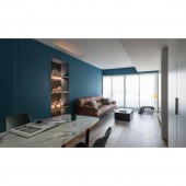
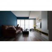
The TV wall adopted white masonry, complemented by bright yellow plates, and served as the display as well as jump platform for the cats, with the opposite sofa backwall provides a start contrasting blue color that shaped an impressive aesthetic ambiance, so as to generate layered visual depth within limited space, with an embedded oil-painting-quality laminate board that became a beautiful view-piece for the entrance.
SPECIFICATIONS / TECHNICAL PROPERTIES:
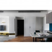
The designer placed two full-height storage cabinet which shaped the transition zone from the entrance to the living room where the vintage white color also evoked the elegance of the interior. While the entrance detailing such as the beautiful arc-angle design decimated the volumetric oppressions, as well as providing ventilation, the dining area brought warmth yet with a touch of personal tonality, as well as functional flexibility where it can be adjusted for the use by 2 or 4 people.
TAGS:
Small Floor Area, Modern Styling, Storage Function, Material Junction, Complementary Color
RESEARCH ABSTRACT:
This project was the space for a young couple and their cats, with the public domain adopting a reserved grey-tone scheme with bold contrasting colors, a harmonious yet dramatic scenarios amongst the real and the virtual. While the entrance detailing decimated the volumetric oppressions, the dining area were treated with a personal warmth and functional flexibility. The master bedroom adopted white-masonry textured cabinets with symmetrical large storage embedded by painted glass and LED strips.
CHALLENGE:
The client wished to partially renovate this 12-year-old used apartment to have large storage space and open view. Given the limited budget and the humble interior footage, the design team was asked to think beyond the pre-conceived singular usage, and to synergize multiple functions so as to create optimal spatial economy. When considering the preserved section, the design team mixed and matched materials and colors to construct a warm and richly layered aesthetics ambiance.
ADDED DATE:
2019-09-28 09:40:12
TEAM MEMBERS (1) :
MING RU LI
IMAGE CREDITS:
Ming Ru Li, 2019.
|


