Owspace Bookstore by Cheng Yu Hsieh |
Home > Winners > #92440 |
 |
|
||||
| DESIGN DETAILS | |||||
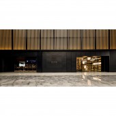
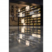
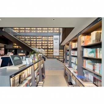
| DESIGN NAME: Owspace PRIMARY FUNCTION: Bookstore INSPIRATION: Owing to the bookstore owners being media people, the design team explored concepts of sanctuary and knowledge ground zero, bringing knowledge from online to offline and the power of knowledge dispersion and discourse. The facade unfolded like an ancient Chinese scroll. Layouts all catered to cultural uses, creating a sanctuary for users to escape the mundane and to remember that "one has worked hard pursuing a vision greater than oneself.” UNIQUE PROPERTIES / PROJECT DESCRIPTION: The space programs of first floor included OWSpace recommendations, OWSpace workshop, dining, and the ten-meter tall book wall the Knowledge Map showing its bookstore culture and brand values. Second floor held the majority of the books with foreign books and periodicals, and a coffee area, stationeries, a select shop, etc. And beside the Best Sellers sat their parody, the Sluggish Sellers. On the third floor were a concert hall, gallery, and family-friendly picture book area. OPERATION / FLOW / INTERACTION: “To give natural lighting to every corner of all three floors” was the priority of the design. The void between the ground floor and the first floor made way for stairs and a ten-meter tall book wall. In addition, the height of the first floor which was 12m high, allowed it to form the second floor and mezzanine floor office space. PROJECT DURATION AND LOCATION: The project started in June 2018 and finished in March 2019, in Hangzhou China. FITS BEST INTO CATEGORY: Interior Space and Exhibition Design |
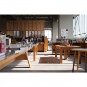
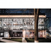
PRODUCTION / REALIZATION TECHNOLOGY: This over 2800 m2 bookstore adopted a warm black color scheme. Black paint on ten meter tall book wall puts people in awe, while leading the traffic flow to the upstairs. The clients originally wanted the ceiling partly black, which would have had a looming presence. After deliberation with the design team, the final design achieved a balanced color scheme. The bookshelves and the desks were all furnished with stained hardwood to refine a reading space worthy of the patrons of letters, upholding the truth intrinsic to words. SPECIFICATIONS / TECHNICAL PROPERTIES: This is a 2800 square meter retail space of three floors with SRC structures. French windows brought the outdoor greenery into the space during the day, while at night the illumination of the indoor formed the appearance of a light box. Arched bookshelves invited lights to every corner of the space. TAGS: Ten-meter High Large Warm Black Book Wall, Illuminated Architecture, Second-hand Bookstands, Multifunctional Space, Greenery, Eco-friendly Design RESEARCH ABSTRACT: The design team created OWSpace which owned by media people, a bookstore of authenticity and substance, a forum of knowledge dispersion and discourse, a good design to launch their flagship store. The facade unfolded like an ancient Chinese scroll. Layouts were all catered to cultural uses. Arched bookshelves and reconfigured path structures made way for natural lighting. French windows ushered outdoor greenery in during the day and indoor illumination of indoor radiating out at night. CHALLENGE: The design team noted that they were like a closing pitcher in this project, since they had to complete design concept, layouts, and 3D drawings in a month. This was the clients' first multifunctional flagship bookstore. The design team hoped a good design will send the business off to a good start. ADDED DATE: 2019-09-27 11:21:30 TEAM MEMBERS (4) : Cheng Yu Hsieh, Hui Ju Chang, Kuan Jui Liao and Ui Ting Lin IMAGE CREDITS: Cheng Yu Hsieh, 2019. PATENTS/COPYRIGHTS: Copyrights belong to C.H.S Design Studio |
||||
| Visit the following page to learn more: http://www.chs-interior.com | |||||
| AWARD DETAILS | |
 |
Owspace Bookstore by Cheng Yu Hsieh is Winner in Interior Space and Exhibition Design Category, 2019 - 2020.· Read the interview with designer Cheng Yu Hsieh for design Owspace here.· Press Members: Login or Register to request an exclusive interview with Cheng Yu Hsieh. · Click here to register inorder to view the profile and other works by Cheng Yu Hsieh. |
| SOCIAL |
| + Add to Likes / Favorites | Send to My Email | Comment | Testimonials | View Press-Release | Press Kit |
Did you like Cheng Yu Hsieh's Interior Design?
You will most likely enjoy other award winning interior design as well.
Click here to view more Award Winning Interior Design.


