Pumpkin House Restaurant by Bryan Chang |
Home > Winners > #92416 |
 |
|
||||
| DESIGN DETAILS | |||||
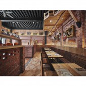
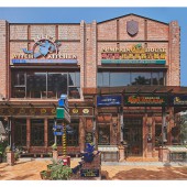
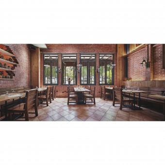
| DESIGN NAME: Pumpkin House PRIMARY FUNCTION: Restaurant INSPIRATION: With the theme of Halloween as the design concept, which match up the series of pumpkin meals of the brand "PUMPKIN HOUSE". Bring out a vivid visual impression through the adjustment of spatial tinge and ambience. We take the advantage of various crafts of making use of red bricks, not only from the combination of red brick itself, but also to the bonding of composite materials, which applied all over the space. UNIQUE PROPERTIES / PROJECT DESCRIPTION: The original two-story light steel structure building is situated in the heart of the city, where is full of homogenous stores around. Therefore, we exploit different manual bricklaying crafts to pile up and modify the exterior walls thence elevate the facade. And in order to distinguished with the adjacent buildings, yet at the same time to reinforcing the structure without destroying the overall proportion. Thereupon, accomplished a well balance in safety measures and visual presentation. OPERATION / FLOW / INTERACTION: Pumpkin House with rich fantastic colors and humanistic temperature. People’s cheering and laughing were heard from time to time from the corners of stacked red bricks. While tasting flavorful meals, the customers would sensate the bizarre surprises of the daily life. PROJECT DURATION AND LOCATION: The project started in December 2013 in Taichung and finished in July 2014. FITS BEST INTO CATEGORY: Interior Space and Exhibition Design |
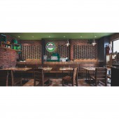
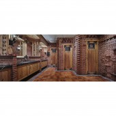
PRODUCTION / REALIZATION TECHNOLOGY: The ceiling retains the original steel texture; merely adopt elegant jazz blue painted timber and red bricks, to form an amusing contrast of hue. The ground is collaged with warmth retro tiles, which go along with the solid wood and stone bricks of the stood side. Take advantage of pinewood to shape the wall surface of the first to the second floor as an attic. Via the lights projection, which extended the vertical visual perception. The private section on the second floor made use of recycled wine bottles as the partition that fabricates a semi-private space, at the same time of environmental performance. SPECIFICATIONS / TECHNICAL PROPERTIES: We used diverse methods to simulate 1:1 scene. For example, at the entrance of the first floor, we exploit bricklaying to construct an opening image, and the warm pinewood creates a staggered effect of interval. Bring about the genial and concise spatial circumstance with natural flavor. TAGS: Halloween, Pumpkin House, Red Brick, Pinewood, Steel Texture, Humanistic RESEARCH ABSTRACT: The seating division on each floor is making use of brick partitions, which exploit varying construction methods. Utilize red bricks and pinewood, which brings the humanistic implication of the space. Whole space is laid out through bright hues, lines and materials. CHALLENGE: The toilet that with the least mention in the spatial planning becomes a major point in this project. The restaurant owner expects us to create a distinct landscape, deliberately set it on the second floor, so that people can explore more interesting elements on their way. In the corridor along the way, we have set up bunch of exhibitions. Exploit red bricks as the base element, inlay the pinewood and wine bottles that bring the surprising visual sensation as well as follow the direction of the flow. ADDED DATE: 2019-09-27 08:05:52 TEAM MEMBERS (1) : Ray Ho IMAGE CREDITS: All copyright belongs to VASTE INTERIORS All image credit belongs to LDK International Co., Ltd. PATENTS/COPYRIGHTS: All copyright belongs to VASTE INTERIORS All image credit belongs to LDK International Co., Ltd. |
||||
| Visit the following page to learn more: http://reurl.cc/EKZxn1 | |||||
| AWARD DETAILS | |
 |
Pumpkin House Restaurant by Bryan Chang is Winner in Interior Space and Exhibition Design Category, 2019 - 2020.· Read the interview with designer Bryan Chang for design Pumpkin House here.· Press Members: Login or Register to request an exclusive interview with Bryan Chang. · Click here to register inorder to view the profile and other works by Bryan Chang. |
| SOCIAL |
| + Add to Likes / Favorites | Send to My Email | Comment | Testimonials | View Press-Release | Press Kit |
Did you like Bryan Chang's Interior Design?
You will most likely enjoy other award winning interior design as well.
Click here to view more Award Winning Interior Design.


