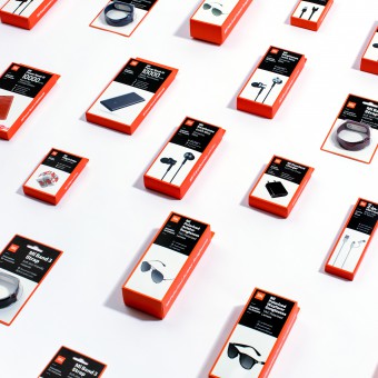
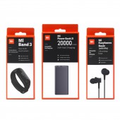
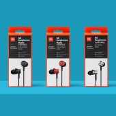
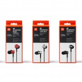
India Packaging Product Packaging by Xiaomi |
Home > Winners > #92159 |
| CLIENT/STUDIO/BRAND DETAILS | |
 |
NAME: Xiaomi PROFILE: Xiaomi Corporation was founded in April 2010 and listed on the Main Board of the Hong Kong Stock Exchange on July 9, 2018 (1810.HK). Xiaomi is an internet company with smartphones and smart hardware connected by an IoT platform at its core. With the vision of being friends with its users and being the “coolest company” in the hearts of its users, Xiaomi is committed to continuous innovation, with an unwavering focus on quality and efficiency. The company relentlessly builds amazing products with honest prices to let everyone in the world enjoy a better life through innovative technology. Xiaomi is currently the world’s fourth-largest smartphone brand, and has established the world’s leading consumer IoT platform, with more than 213 million smart devices (excluding smartphones and laptops) connected to its platform. Currently, Xiaomi products are present in more than 90 countries and regions around the world and have a leading foothold in many of them. In July 2019, the company made the Fortune Global 500 list for the first time, ranking 468th among all, and 7th among internet companies. Xiaomi is the youngest company on the 2019 Fortune Global 500 list. |
| AWARD DETAILS | |
 |
India Packaging Product Packaging by Xiaomi is Winner in Packaging Design Category, 2019 - 2020.· Read the interview with designer Xiaomi for design India Packaging here.· Press Members: Login or Register to request an exclusive interview with Xiaomi. · Click here to register inorder to view the profile and other works by Xiaomi. |
| SOCIAL |
| + Add to Likes / Favorites | Send to My Email | Comment | Testimonials | View Press-Release | Press Kit |
Did you like Xiaomi's Packaging Design?
You will most likely enjoy other award winning packaging design as well.
Click here to view more Award Winning Packaging Design.


