Avenue Green Sheshan Kindergarten by Chloe Liew |
Home > Winners > #92143 |
 |
|
||||
| DESIGN DETAILS | |||||
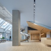
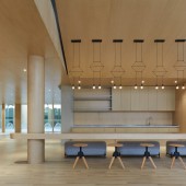
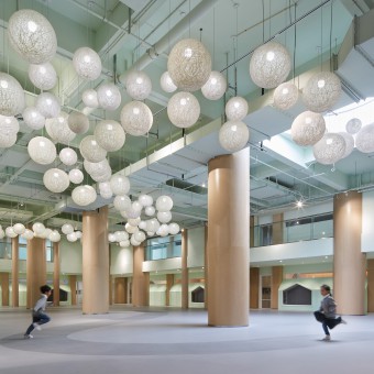
| DESIGN NAME: Avenue Green Sheshan PRIMARY FUNCTION: Kindergarten INSPIRATION: Designer responds to local conditions, envisioning how children and teachers will be using the space. When reach out to the community, we explore on daily interactions between children, teachers as well as parents. The designer intentionally makes the entire space into a huge toy, by placing a surprising curved slide in the center core of the reception waiting area. With this structure, it promotes children's curiosity and unearths their unlimited and self initiated exploration mode. UNIQUE PROPERTIES / PROJECT DESCRIPTION: There are different zones that offer different architectural terrain and structures which can accommodate various modes of activities, in the manner of both dynamic and quiet. The large open, bright and pleasant area is where the children can run freely around the columns, and play hide-and-seek. Meanwhile, the small huts that are incorporated in the large space allow children to enjoy personal and quite ambiance. OPERATION / FLOW / INTERACTION: There is a cafe-liked facility for the purpose of interaction. It is an open area where parents can wait and rest, while children play around a slide. One of the features at this reception area is the backdrop wall with simple color-coat, which is used to project children's works and showcase kindergarten's culture. PROJECT DURATION AND LOCATION: The project was designed in February 2018, and it is completed in April 2019 in Shanghai, China. FITS BEST INTO CATEGORY: Interior Space and Exhibition Design |
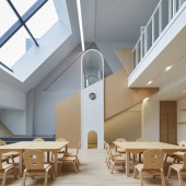
PRODUCTION / REALIZATION TECHNOLOGY: Designer adopts wood and pale colors scheme in the space. This light combination scheme demonstrates and conveys a message of sustainability and environment-friendly concept and at the same time gives a sense of homely warm feeling. The designer intentionally makes the entire space into a huge toy, by placing a surprising curved slide in the center core of the reception waiting area. With this structure, it promotes children's curiosity and unearths their unlimited and self initiated exploration mode. SPECIFICATIONS / TECHNICAL PROPERTIES: Designer also takes children's perception and feeling into consideration while dealing with design details and concept for the kindergarten. As the slanted window structure being part and parcel of the building, the interior is highly geometrical which challenges the children's visual experience, while the rooms are arranged with a narrative-inspired twist. We also utilize the building natural phenomenon of sunlight into the interior space to create a sense of peacefulness and coziness. TAGS: interior design, kindergarten, wood, light color, RESEARCH ABSTRACT: Each element in the space was designed to carry emotional value, providing kids with a different perception of the original "house" concept. We hope to provide a fantastic learning experience that is immersed in our interior architecture, and at the same time to give the children sense of ownership and safety. Kindergarten is always the second home. In this beautiful second home, let the children to chase around and feel the warmth while growing up happily. CHALLENGE: Designer specially created a cool mezzanine level for an interlocking space and circulation, with the intention to turn the building space into a huge spatial toy for children to play in. We bring in the climbing net to the mezzanine area to allow children to climb high and look down from above. It creates fun for exercise and also varied contact spaces for children to move around for exploration. ADDED DATE: 2019-09-24 04:44:09 TEAM MEMBERS (1) : Designer: Chloe Liew IMAGE CREDITS: Chloe Liew, 2019. |
||||
| Visit the following page to learn more: http://1t.click/auE8 | |||||
| AWARD DETAILS | |
 |
Avenue Green Sheshan Kindergarten by Chloe Liew is Winner in Interior Space and Exhibition Design Category, 2019 - 2020.· Read the interview with designer Chloe Liew for design Avenue Green Sheshan here.· Press Members: Login or Register to request an exclusive interview with Chloe Liew. · Click here to register inorder to view the profile and other works by Chloe Liew. |
| SOCIAL |
| + Add to Likes / Favorites | Send to My Email | Comment | Testimonials | View Press-Release | Press Kit |
Did you like Chloe Liew's Interior Design?
You will most likely enjoy other award winning interior design as well.
Click here to view more Award Winning Interior Design.


