DESIGN NAME:
Hygeia Grand
PRIMARY FUNCTION:
Health Management Center
INSPIRATION:
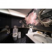
The brand is named HygeiaGrand after the goddess of health, Hygeia, in Greek Myth. How to build an elegant and fashionable space becomes the key point of the design. Through the exquisite grandeur of a luxurious residence, the designer infuses the art atmosphere to make a quality health management center, turning over the stereotype of the health management center and achieve the commercial space atmosphere of exquisite aesthetics.
UNIQUE PROPERTIES / PROJECT DESCRIPTION:
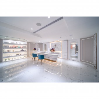
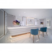
Through the different end views at the corner, the reception area, administrative area, and consulting area are defined. By applying arcs design, the soft and flowing visual focus connects the styles of the ceiling, the counter, and the TV wall and shaping the open and broad feeling of the interior space. The rose gold titanium adds the noble texture to the overall vision. From the metal LOGO on the major visual wall, counter, chair feet, to wall, the luxurious beauty is introduced.
OPERATION / FLOW / INTERACTION:
To solve the problem of the 2.1 meter ceiling, besides maximizing the arc, the design also connects the overall space flow through the arc element, especially from the counter to the waiting area. The application of molding and rose gold materials will achieve the integration and unification of all the elements. Plus, the arrangement of the natural stone on the three walls connect the entrance, the counter, and the artistic end views and string the reception area, administrative area, and consulting area to make the overall flow smoothly without any hindrance.
PROJECT DURATION AND LOCATION:
The project started in July and finished in October 2018 in Taipei.
FITS BEST INTO CATEGORY:
Interior Space and Exhibition Design
|
PRODUCTION / REALIZATION TECHNOLOGY:
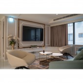
As the height is not large, white is adopted as the basic color of the overall space, and the elements of mirror, marble, titanium, and molding are used to make the noble texture. The application of the arc elements leads to the smooth flow and creates the flowing energy. The large arc at the entrance leads the clients naturally to the counter. After the consulting service, they can wait at the sofa area. The TV wall is an extension of the design element of the counter. The sofa of the arc design is also selected to create a visual focus. The clinic or consulting rooms are in the earth tone. The warm space will make the clients feel more relaxed and safe. Considering cleaning and maintenance, the floor adopts the imported tiles to match the white walls and reduce the gaps and seams. In this way, the space will be visually extended and expanded.
SPECIFICATIONS / TECHNICAL PROPERTIES:
-
TAGS:
Interior, Design, House, Residence, Interior, Design, commercial space,Modern style
RESEARCH ABSTRACT:
White serves as the base of the space. The gloss surface materials embellish and support the noble atmosphere. The arc guides the flow. The TV wall extends the design element of the counter by strengthening and gathering the visual focus. The clinic or consulting rooms are in the earth tone. The warm sight will make the clients more relaxed. Considering cleaning and maintenance, the floor and wall adopt the imported tiles to reduce the gaps and seams to make space visually extended and expanded.
The greatest challenges include how to overcome the 2.1 meter height to make the space broader and arrange the piping including the water supply and drainage function for the business.
CHALLENGE:
The greatest challenges include how to overcome the 2.1 meter space to make the space broader and arrange the piping including the water supply and drainage function for the business.
ADDED DATE:
2019-09-11 08:24:06
TEAM MEMBERS (1) :
IMAGE CREDITS:
Chun Han Lee, 2019.
|
