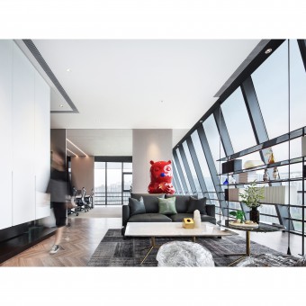
Simple Refined Office by Meng Yue |
Home > Winners > #91205 |
| CLIENT/STUDIO/BRAND DETAILS | |
 |
NAME: Shanghai Yuemeng Design Co., Ltd. PROFILE: Shanghai Yuemeng Design Co., Ltd. has been focusing on serving the real estate industry since its establishment about ten years ago. We have served Vanke, Sunac, Greenland, China Resources, Country Garden, China Overseas Building, Greentown, Poly, Sunshine City and other customers, and won praise from them. Now the company has formed a two-center pattern of research and development in Shanghai and service in Jinan, which can not only better meet Party A's innovation needs, but also ensure the response speed and consistency of the service. Shanghai YueMeng Space Design has three departments, Design department,soft outfit department and hardcover department. There are nearly 100 people in the company. What’s more, Shanghai YueMeng Space Design has a systematic design theoretical framework, and a lot of experience on how to improve the return rate of Party A's marketing investment. we based on the experience management design system, through practical considerations, really help Party A to improve the marketing efficiency and sales performance. |
| AWARD DETAILS | |
 |
Simple Refined Office by Meng Yue is Winner in Interior Space and Exhibition Design Category, 2019 - 2020.· Read the interview with designer Meng Yue for design Simple Refined here.· Press Members: Login or Register to request an exclusive interview with Meng Yue. · Click here to register inorder to view the profile and other works by Meng Yue. |
| SOCIAL |
| + Add to Likes / Favorites | Send to My Email | Comment | Testimonials | View Press-Release | Press Kit |
Did you like Meng Yue's Interior Design?
You will most likely enjoy other award winning interior design as well.
Click here to view more Award Winning Interior Design.


