DESIGN NAME:
Structural Beauty
PRIMARY FUNCTION:
Office
INSPIRATION:
This case is an office space for daily work and customer reception. Its design concept emerges from the interaction between human and the world, explores the ultimate significance of human in the world, and expresses the essence of human with space. The overall atmosphere is as cool, rational and introverted as Yamamoto's clothing design. Minimalist and Wabi-sabi are the theme throughout the space design.
UNIQUE PROPERTIES / PROJECT DESCRIPTION:
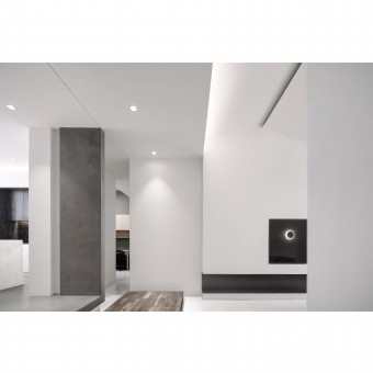
This space contains the designers' understanding of people and space, which emphasizes the influence of space structure itself on people, and pursues the relaxed and natural comfort of people in space in calm and restraint. The simple and smooth lines are like being carefully cut, perfectly releasing the charm and temperament of spatial structure.
OPERATION / FLOW / INTERACTION:
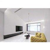
In the functional design, considering the exquisite feeling of every guest who comes to negotiate, the south window of the original house is relatively low, and the top is higher, after design, the top is pulled down and made into a sharp top, pull low effect to reduce the sense of hollowness which lives among them, the design of the pinnacle makes the whole space more smart and warm.
PROJECT DURATION AND LOCATION:
The project started in October 2018 in Shanghai and finished in January 2019 in Shanghai.
FITS BEST INTO CATEGORY:
Interior Space and Exhibition Design
|
PRODUCTION / REALIZATION TECHNOLOGY:
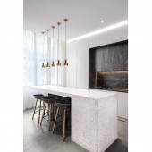
In the collocation of colours, the concise and clear white is added with the calm and firm gray. The contrast between gray and white forms a mild but obvious impact. In the use of materials, it is also very symbolic. Like its minimalist concept, terrazzo, panDOMO, gypsum board, wood, paint, these basic building materials make up almost all of it.
SPECIFICATIONS / TECHNICAL PROPERTIES:
With the elevation of the ground in the north is raised, the views interact more smoothly with the outside world. The addition of the platform makes the whole space visually coherent, which will give people more pleasant experience. The wooden floor is covered with traces of time, which gives the depth of history in this brand new space. The platform is the concrete expression of spatial segmentation.
TAGS:
Interior, Minimalist, Modern, Simple, Art, Office, Wabisabi
RESEARCH ABSTRACT:
The pursuit of social material and information resources is a natural instinct of human beings. Instant information and rich material world bring us a sense of security. With the development of society, people pay more attention to the conformity with their own self-spirit besides their own practicality in exploring the structure of office space.
CHALLENGE:
Walking into the interior of the office is like entering a Wabisabi dream. The designer's skillful mastery of natural light makes the interior space seem full of vitality. The light pouring into the north and south converged in the center of the hall, making the whole space quiet and bright. The atmosphere of the whole hall has changed brightly and darkly, and the demeanor is more vivid.
ADDED DATE:
2019-08-20 11:30:48
TEAM MEMBERS (2) :
Zhongliang Xiang and Yang Chen
IMAGE CREDITS:
Image #1: Photographer Nifengxiao, Corridor, 2019.
Image #2: Photographer Nifengxiao, Reading Area, 2019.
Image #3: Photographer Nifengxiao, Water Bar, 2019.
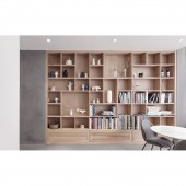
Image #4: Photographer Nifengxiao, Bookshelf, 2019.
Image #5: Photographer Nifengxiao, Audio-visual Area, 2019.
PATENTS/COPYRIGHTS:
Copyrights belong to Zhongliang Xiang, 2019.
|


