DESIGN NAME:
Fengtang Art Education
PRIMARY FUNCTION:
Training Institute
INSPIRATION:
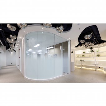
The institute enrolls art candidates aged in sixteen to eighteen, which are transition ages from adolescence to youth, so we have to consider both interesting factors and certain mature factors in our design. We choose black, gray and white as base, main colors of whole space, this matches with hue relationships in pencil sketching. We take Origami as main factor in form designs such as sculptures, artworks, many polygon origami factors have been used into decorations
UNIQUE PROPERTIES / PROJECT DESCRIPTION:
Designing education or training space is different from designing other commercial spaces, such design is not only beautifying spaces, it shall be more focusing on humanism, be able to get teachers and students feel respects and cares via each designed corner, and to inspire their further pursuit, cognition of art.
OPERATION / FLOW / INTERACTION:
"Paper planes" go along from indoor to outdoor, forms a way to guide people movements, also give very good meaning that our student transform from a piece of white paper into an airplane, fly higher and higher. "Paper plane" is also a special childhood memory among parents generation, that makes consumers feel close to the place.
PROJECT DURATION AND LOCATION:
The project started in November 2018 in Qingdao and finished in March 2019 in Qingdao.
FITS BEST INTO CATEGORY:
Interior Space and Exhibition Design
|
PRODUCTION / REALIZATION TECHNOLOGY:
The stairs to third floor, we adapt on-site arc welding to twist firm steel plates into soft, beautiful shapes, meanwhile, to avoid hits or hurts, for safety purpose.
SPECIFICATIONS / TECHNICAL PROPERTIES:
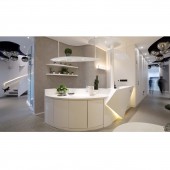
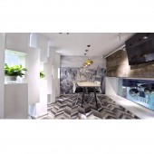
The main structure of the case consists of three floors with a building area of 490 square meters. Visitors may go directly first floor entrance to second floor teaching area. The teaching area on second floor covers open-type spaces such as reading section, resting section, business discussion section, teacher office, drinks bar. The third floor is an extended floor on base of original two floors, we set business discussion section, teacher offices as well.
TAGS:
Interior, Minimalist, Modern, Simple, Art, Interesting, Education Space
RESEARCH ABSTRACT:
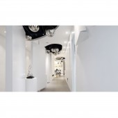
Educational space design is different from other commercial space design, in addition to the beautification of the space, it should reflect the humanistic care for students and teachers, through the space design let them feel the respect and care of the school for them, and can stimulate their further pursuit of art and cognition. In this project, in addition to traditional basic functions of training institute, we offer moreentertainment sections to release students and their parents. Loop corridor concludes all ways to go in whole space, guiding people movements easily.
CHALLENGE:
Tenets of this design firstly is to meet all parents' and students' demands on spaces, to become their favorite places to stay and study, secondly it must comply with marketing requests, help institutes to achieve marketing goals, thirdly, students who study here possibly would go in for design career or other careers related to art in future, we hope to leave a basic aesthetic standard in their hearts.
ADDED DATE:
2019-08-19 07:42:19
TEAM MEMBERS (2) :
Main Designer: Jason Cao and Assistant Designer: Zhilu Li
IMAGE CREDITS:
Image #1: Photographer May, Front Hall, 2019.
Image #2: Photographer May, Water Bar, 2019.
Image #3: Photographer May, Corridor, 2019.
Image #4: Photographer May, Negotiate Area, 2019.
Image #5: Photographer May, Stairs, 2019.
PATENTS/COPYRIGHTS:
Copyrights belong to Jason Cao, 2019.
|


