Beautiful Life Mothball by Pica Packaging Design Lab |
Home > Winners > #89378 |
 |
|
||||
| DESIGN DETAILS | |||||
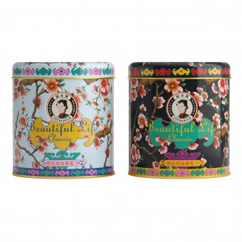
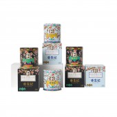
| DESIGN NAME: Beautiful Life PRIMARY FUNCTION: Mothball INSPIRATION: Mothballs in China are classified into low-toxic chemical, which means the packaging needs to obey several restrictive terms announced by Agricultural Department. These restrictions lead to a market that almost every brand looks alike, thus the team's first mission is to make it looks different. after analyzing the competitors, the team find that brand recognition is the fatal factor for the mothball market. The team create a calligraphic logo, and the decorating elements are taken from ancient painting. UNIQUE PROPERTIES / PROJECT DESCRIPTION: The design team create a vintage-like brand. The logo takes the core idea of Chinese calligraphy, the peach flowers and the old lady come from ancient Chinese painting, the open window is a bat shape which in Chinese culture a symbol of blessing. These elements present customers a picture of traditional Chinese culture and the good old wish of happiness. The team also design a split bags in addition for preservation purposes, and the one-more package will deliver a safer and cleaner user experience. OPERATION / FLOW / INTERACTION: The Chinese name of Beautiful Life is "香生记" PROJECT DURATION AND LOCATION: The project started in January 2019 in Beijing and finished in April 2019 in Beijing. FITS BEST INTO CATEGORY: Packaging Design |
PRODUCTION / REALIZATION TECHNOLOGY: 8-color tinplate printing Carving on paper Gilding over paper SPECIFICATIONS / TECHNICAL PROPERTIES: Tin can: 75mm diameter * 83mm height Paper box: 76mm width *76mm length *84mm height TAGS: Packaging, China, Culture, Daily chemicals, Household, Mothball RESEARCH ABSTRACT: The quest is to upgrade the existing package. The old version is known for its low price and the competition in its existing market is fierce. After a cross-region survey the team figure out that most consumers are price-insensitive as the product is infrequently used, and it would volatilize easily. In view of this condition, the team decide to change the position of the product from a chemical pesticide into an beneficial ornament - the team assume customers would keep the tin can in their cabinet for a long time, and can be reused. The new package helps client expand the market. CHALLENGE: The first challenge is tight regulation by government. The team have to put "Paradichlorobe ADDED DATE: 2019-07-09 02:45:12 TEAM MEMBERS (6) : Creative Director: Shuwei Qi, Art Director: Yeqiu Liu, Typographer: Qianqian Jiang, 3D designer: Rijiang Wang, Photographer: Zhenzhou Liang and Account Executive: Yue Zhu IMAGE CREDITS: Shuwei Qi and Rijiang Wang, 2019. |
||||
| Visit the following page to learn more: http://dwz.cn/dxtnHVoI | |||||
| AWARD DETAILS | |
 |
Beautiful Life Mothball by Pica Packaging Design Lab is Winner in Packaging Design Category, 2019 - 2020.· Read the interview with designer Pica Packaging Design Lab for design Beautiful Life here.· Press Members: Login or Register to request an exclusive interview with Pica Packaging Design Lab. · Click here to register inorder to view the profile and other works by Pica Packaging Design Lab. |
| SOCIAL |
| + Add to Likes / Favorites | Send to My Email | Comment | Testimonials | View Press-Release | Press Kit |
Did you like Pica Packaging Design Lab's Packaging Design?
You will most likely enjoy other award winning packaging design as well.
Click here to view more Award Winning Packaging Design.


