DESIGN NAME:
Gluck Cafe
PRIMARY FUNCTION:
Commercial Space
INSPIRATION:
This case is beside Riverbank Park, therefore the inspiration came from the views surrounding it. In order to create a complex commercial space that integrates catering, interior design, aesthetics and product of local farmer, Komet design reforms the 65m2 long shaped, 30 year old commercial space, and let it close to nature. The design idea came from circle of life, the loop shape circulation symbolizes the farm grows out and taken from the ground should be cast away on the ground.
UNIQUE PROPERTIES / PROJECT DESCRIPTION:
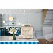
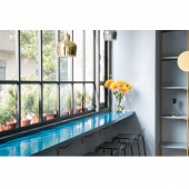
The word Gluck came from German sounds like Good luck. It means lucky and happiness. Designer extends the smiley face U with a big and a small circle, represents circulation and continuous. The linear structure is in loop shape, a bigger square on outside, which is the display stands and bar seating area. Inner square shape is the Nakajima working area, it contains simple kitchen equipment and checkout counter. Lights hide on track of the display stands preserve flexible space for exhibits.
OPERATION / FLOW / INTERACTION:
The compound business area aim for relaxing integrates culture, cafe, souvenir shops and etc. It is in loop shape structure, Nakajima working area was constructed by marble, echoing the quite of nature; the blue facade sheet is to puzzle out wave of the river, creating unique expression of space. The cement structure staircase had been replaces by steel, and embedded it into the wall. To balance the whole visual, designer extends a row of golden round rod to second floor.
PROJECT DURATION AND LOCATION:
The project finished in December, 2017 in Taoyuan City, Taiwan.
FITS BEST INTO CATEGORY:
Interior Space and Exhibition Design
|
PRODUCTION / REALIZATION TECHNOLOGY:
Designer breaks the sense of distance of aesthetic space, creating a space that closes to people. The facade uses a large number of glass, make the natural views as a part of design. Interior uses natural materials such as marble, cement, wood, and steel. The material uses on floor is different, the front side uses cement powder to present the sense of nature, at the same time echoing the land of farmers; Wooden floor is used on the back side, emphasizing interaction between human and nature.
SPECIFICATIONS / TECHNICAL PROPERTIES:
The whole space uses grey blue color, which is the natural color of river and sky, giving us the warmth feelings. Golden sunlight irradiated on the river, echoing the interior steel display stands. Ceiling uses white, and a big chandelier is on the middle. This chandelier, birdie was designed by LUDOVICA+ROBERTO PALOMBA, using the imagery of branches and birds, which fits the main core that designer wants to convey, coexist with nature.
TAGS:
Local, Natural, River view, Furniture, Artistic, Utensils, Gallery, Iron piece, Marble
RESEARCH ABSTRACT:
This case is on the riverside in a lively city. Designer hopes that this space can be given meaningful through integrating healthy ingredients of local farmers, communication between human and artistic. The space should be regarded as the organism of life, inspire more creations through design, at the same time transmit positive values.
CHALLENGE:
Lots of problems could be found in a 30 year old home such as leaking water, exposed pipeline and etc., designer has to put in efforts to solve and reinforce it. There is a small washroom and abnormal corner near the staircase, designer moves sink of the washroom to the corner to maximize space, the sink was decorated with metal frame mirror for visual unity. Other than that, designer plants new plants, place artworks, so that the sunlight which directly enters the space could be reduce.
ADDED DATE:
2019-06-30 03:04:49
TEAM MEMBERS (2) :
Komet Design team and Hsin Chen
IMAGE CREDITS:
Photographer Beck Chen, 2018
|


