DESIGN NAME:
ERC Cafe
PRIMARY FUNCTION:
Commercial Space
INSPIRATION:
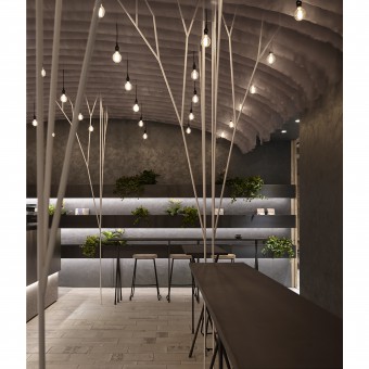
As this Cafe must echo the creative aspiration of Infusion of red brick wall and plant, as well as new visuals, as requested by the client, along with its corner location and curtain wall glass windows, the design of the overall space was anchored on a greenhouse filled with trees, wind, light, i.e. a domain of enriched dynamic visual experiences.
UNIQUE PROPERTIES / PROJECT DESCRIPTION:
In this Loft styled cafe, it was filled with classic elements such as red bricks, metal work, cement finished surfaces, etc., along with an outstanding design feature of fabric. As the design team believed that this cafe has a wide range of consumer segments which warranted a free flowing and soft texture fabric to soften up such rustic and hard spatiality with a feminine touch.
OPERATION / FLOW / INTERACTION:
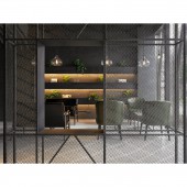
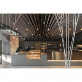
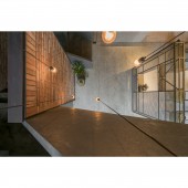
In terms of spatial layout, it was about expanding the double ceiling height area at the building entrance, which increased the vertical spatial connection with transparent spatial quality, and the kitchen was moved to the same side as the counter so as to create a more functional and flowing working circulation, as the original kitchen was designated as a shared seating area with unobstructed window view out.
PROJECT DURATION AND LOCATION:
The project was finished in February, 2019 in New Taipei City, Taiwan.
FITS BEST INTO CATEGORY:
Interior Space and Exhibition Design
|
PRODUCTION / REALIZATION TECHNOLOGY:
Fabric, Metal Work, Vintage Red Tiles, Grinding Stone, Glass, Timber, Mineral Paint
SPECIFICATIONS / TECHNICAL PROPERTIES:
The design area of the two levels is of 218 square meters in total, mainly comprised of front entrance, counter, kitchen, and seating areas such as sofa area, bar stool area, community table, and normal coffee table area, etc.
TAGS:
Fabric, Light and Shadow, Screen, Flowing, Greenhouse, Cafe Design
RESEARCH ABSTRACT:
In echoing with the unique styling of the architectural form of the building, as well as the tree plantation on the street, the spatial planning anchored on theme of infusion into the building while accentuating the serenity of cafe. In material selection, the solid and robust metal work was complemented by soft and translucent fabric material, as well as by the authentic red brick wall, for a balanced spatial quality.
In referencing the formal vocabulary of greenhouse arch, fabric was cut into segments and hung from the ceiling as light and air diffuser, as well as serving as spatial demarcation in an ever changing forest environment.
CHALLENGE:
As much fabric was used in the space, on one hand, the replacement of fabric in maintenance shall be considered, and on the other hand, the fabric shall be hung in seemingly effortless fashion so as to articulate the envisaged arch shape, which also led to its installation technique that was also challenging.
ADDED DATE:
2019-06-29 17:21:17
TEAM MEMBERS (2) :
Ya Wun Yang and Yun Fang Huang
IMAGE CREDITS:
Sam Siew Shien, 2019
|
