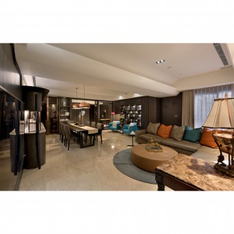
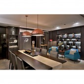
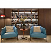
Breaking Dawn Residence by Jumu Chiang |
Home > Winners > #88819 |
| CLIENT/STUDIO/BRAND DETAILS | |
 |
NAME: Dan Xiang Co., Ltd. PROFILE: With deep appreciation for the dream of dwelling, there has always been the enthusiasm, professionalism and ample practical experiences in providing humanistic services as client needs are listened to, and client rituals are understood so as to satisfy the usage needs of the inhabitants in making a comfortable home for clients. The design team offers a series of customizable service procedures based on needs of different client segments of different conceptions of Home which the design team intends to listen to, as it sought to realize all dreams of dwelling. The design team insists on an approach of hands-on start-to-finish by team members so as to ensure the effort of the team realized in every junction, with caution towards every detail, and patience in dealing with complexity, in delivery project on time. For spaces that are large to small, from orientation to functionalities, every planning format would be thoroughly presented in the plans and elevations, even sketched perspectives, so that clients would readily appreciate the imaginations for their future dwellings. The character, Dan, of the first character in the name of the design studio, represents the color of red, which symbolizes the passion of this design studio in serving its clients.The character, Hsiang, of the second character in the name of the design studio, represents the seasons of Spring, Summer, Autumn and Winter, the orientations of East, North, West and South, as well as the four quadrants of Sun, Moon, Star, and Constellation, along with Yin, Yang, Stern, and finesse, as it represents the perennial motion of the design practice much like that of the seasons. |
| AWARD DETAILS | |
 |
Breaking Dawn Residence by Jumu Chiang is Winner in Interior Space and Exhibition Design Category, 2019 - 2020.· Read the interview with designer Jumu Chiang for design Breaking Dawn here.· Press Members: Login or Register to request an exclusive interview with Jumu Chiang. · Click here to register inorder to view the profile and other works by Jumu Chiang. |
| SOCIAL |
| + Add to Likes / Favorites | Send to My Email | Comment | Testimonials | View Press-Release | Press Kit |
Did you like Jumu Chiang's Interior Design?
You will most likely enjoy other award winning interior design as well.
Click here to view more Award Winning Interior Design.


