Open Packaging Sleeves by Koen van Rijen |
Home > Winners > #88515 |
 |
|
||||
| DESIGN DETAILS | |||||
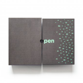
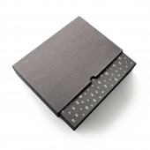
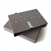
| DESIGN NAME: Open PRIMARY FUNCTION: Packaging Sleeves INSPIRATION: The packaging sleeves hold six photography magazines. The photos in these magazines show raw and real human emotion. This rawness inspired Koen van Rijen to use a natural cardboard with visible fibres. The scenes in the photos appear intense by the use of creative light and heavy contrast. Settings are often gloomy and minimalistic. Koen van Rijen wanted to create a similar contrast and minimalism in the packaging by using an anthracite colour for the sleeves and a neon pastel ink for the numbers. UNIQUE PROPERTIES / PROJECT DESCRIPTION: This project is called open and includes six different photography magazines which are bundled in these custom-made sleeves. The sleeves are made of a thick, heavy, anthracite cardboard with an embossing and screen printed numbers 1-80, the number of subscribers. The client personally stamped each box during the presentation which makes every box a unique one. The title on the boxes is quite literally open, because the cut-away in both boxes show the letter O when placed next to each other. OPERATION / FLOW / INTERACTION: The sleeves are slid into each other. There is a gap in the outer sleeves through which you can grab hold of the inner sleeve. When sliding the inner sleeve out to the right, the word open appears when both sleeves are next to each other. PROJECT DURATION AND LOCATION: The project lasted a year and started in april 2006 FITS BEST INTO CATEGORY: Packaging Design |
PRODUCTION / REALIZATION TECHNOLOGY: Each set of sleeves is handmade and the numbers are screen printed. SPECIFICATIONS / TECHNICAL PROPERTIES: Width 220mm Depth 55mm Height 310mm TAGS: sleeve, cardboard, packaging, screenprint, fibre, neon, pastel, diecut, emboss RESEARCH ABSTRACT: Koen van Rijen researched various types of cardboard material in order to get the perfect combination of visual appeal and sturdyness that matches the style of photography in the magazines. Also, a number of sample screen prints were made to determine the best suitable ink. CHALLENGE: The creative challenge was to find a combination of natural materials and to create a design that would look ánd feel rich in contrast. Also, the materials had to be sturdy and solid enough to be able to safekeep all six magazines. ADDED DATE: 2019-06-27 18:29:13 TEAM MEMBERS (1) : Koen van Rijen IMAGE CREDITS: Image #1 : Art Director Koen van Rijen, open, 2019 Image #2 : Art Director Koen van Rijen, open, 2019 Image #3 : Art Director Koen van Rijen, open, 2019 Image #4 : Art Director Koen van Rijen, open, 2019 Image #5 : Art Director Koen van Rijen, open, 2019 PATENTS/COPYRIGHTS: Copyrights belong to Koen van Rijen, 2019 |
||||
| Visit the following page to learn more: http://bit.ly/2oluHp7 | |||||
| AWARD DETAILS | |
 |
Open Packaging Sleeves by Koen Van Rijen is Winner in Packaging Design Category, 2019 - 2020.· Read the interview with designer Koen van Rijen for design Open here.· Press Members: Login or Register to request an exclusive interview with Koen van Rijen. · Click here to register inorder to view the profile and other works by Koen van Rijen. |
| SOCIAL |
| + Add to Likes / Favorites | Send to My Email | Comment | Testimonials | View Press-Release | Press Kit |
Did you like Koen Van Rijen's Packaging Design?
You will most likely enjoy other award winning packaging design as well.
Click here to view more Award Winning Packaging Design.


