Light - Discovering Umbria Typographic Book by Paul Robb |
Home > Winners > #88176 |
 |
|
||||
| DESIGN DETAILS | |||||
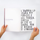
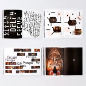
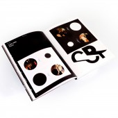
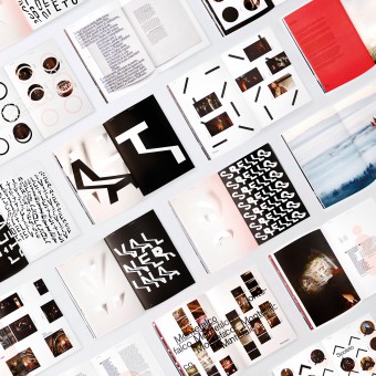
| DESIGN NAME: Light - Discovering Umbria PRIMARY FUNCTION: Typographic Book INSPIRATION: The catalogs explore the links between photography light and shadow within the confines for the rich local cultural heritage, a photographic journey of the territory and juxtaposes custom typefaces and contemporary layout. UNIQUE PROPERTIES / PROJECT DESCRIPTION: Dynamically anchoring the catalogs are two bespoke typefaces. The first font is three different combinations. Inspired from concealing and reflect the words with controlled randomness emulating the lighting situations in continual flux. The same word yields different combinations each time creating a rhythmic pattern. The second font was inspired by shadows within the photographs and the idea of expanding light. Each letter is extended characterizing the long-drawn shadows. OPERATION / FLOW / INTERACTION: The book was developed as a marketing and branding territorial advertising piece. We were approached to identify and refocus and create a marketing tool to requalify and reinforced an optimistic public perception of the region. Only 7% of the territory was damaged by the earthquake but reported in the press as being 100% damaged, the concept was to reinforce the brand reputation and demonstrate to the territory. The project has been shortlisted to the Italian ADI Design Index - Compasso d’oro 2020 and won Gold at the Novum Awards 2019 and Sustainable design of the year at the Novum Awards 2019. PROJECT DURATION AND LOCATION: Design and Art direction from November 2018 to January 2019, Umbria, Perugia |
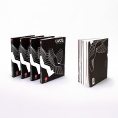
PRODUCTION / REALIZATION TECHNOLOGY: Volume: 256 pages Cover: Silkscreen printing Internal pages: 4 color offset SPECIFICATIONS / TECHNICAL PROPERTIES: Cover: Fedrigoni sirio black black gr. 290 Internal pages: Fedrigoni arco design da gr. 140 TAGS: Type/Font Design, Identity design, Catalog, Photography, Typography RESEARCH ABSTRACT: All areas of the Umbrian territory were visited and researched by the journalist, Cristiana Mapelli. Developing the story from the local population we were able to discover places only they knew, exposing cultural elements not on the normal visitors itineraries. CHALLENGE: Having been affected by the earthquake of 2016, these catalogs explore and celebrate the cultural unseen beauty of the region of Umbria. The catalog accompanies the traveling exhibition, used to demonstrate how little of the cultural heritage was affected by the earthquake and to dispel misrepresented ideas in the press. ADDED DATE: 2019-06-25 09:23:38 TEAM MEMBERS (7) : Designer & Art Direction: Paul Henry Robb, Type design: Paul Henry Robb, Designer: Moira Bartoloni, Animator: Tommaso Calderini, Audio: Paul Henry Robb, Photography: Marco Giugliarelli and Copy: Cristiana Mapelli IMAGE CREDITS: Photography copyright, Paul Robb & Marco Giugliarelli |
||||
| Visit the following page to learn more: https://www.salt-pepper.it | |||||
| AWARD DETAILS | |
 |
Light-Discovering Umbria Typographic Book by Paul Robb is Winner in Print and Published Media Design Category, 2019 - 2020.· Read the interview with designer Paul Robb for design Light - Discovering Umbria here.· Press Members: Login or Register to request an exclusive interview with Paul Robb. · Click here to register inorder to view the profile and other works by Paul Robb. |
| SOCIAL |
| + Add to Likes / Favorites | Send to My Email | Comment | Testimonials | View Press-Release | Press Kit | Translations |
| COMMENTS | ||||||||||||||||||||
|
||||||||||||||||||||
Did you like Paul Robb's Print Design?
You will most likely enjoy other award winning print design as well.
Click here to view more Award Winning Print Design.


