Care for Mom to Be Social Campaign by Seyon Kim |
Home > Winners > #87971 |
 |
|
||||
| DESIGN DETAILS | |||||
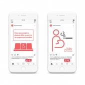
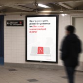
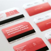
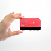
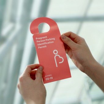
| DESIGN NAME: Care for Mom to Be PRIMARY FUNCTION: Social Campaign INSPIRATION: Pregnant women are often overlooked, especially in transit. This campaign endeavors to promote awareness of the needs of pregnant women, and encourages others to create a more welcoming environment for them. UNIQUE PROPERTIES / PROJECT DESCRIPTION: Care for Mom To Be is a campaign that promotes awareness of the needs of traveling pregnant women. It encourages other to offer a seat on a train or a place to park their car. The campaign grows from a logo that combines the figure of a pregnant person and the shape of a heart. This was designed to appeal to both men and women, and to encourage both sexes to respond positively. OPERATION / FLOW / INTERACTION: This campaign is intended to be viewed in public especially for people in a commuting location like a subway station and parking lot. By looking at the promotional materials, and actually being able to physically interact with the subway ticket with the campaign logo, the viewers can raise their awareness about care for pregnant women. PROJECT DURATION AND LOCATION: 3 weeks in New York City. |
PRODUCTION / REALIZATION TECHNOLOGY: The human figure and heart embedded in the logo are meant to represent a “pregnancy” and “care,” with or without the supporting text. In its full form, it uses a simple twist of a familiar isotype figure, balanced with supporting text. SPECIFICATIONS / TECHNICAL PROPERTIES: Poster: 27"x40" Subway ticket: 1.5"2.5" TAGS: care, pregnant, awareness, campaign RESEARCH ABSTRACT: There was a huge issue in South Korea about the suffering of pregnant women who commute in the subway. I also realized that in the United States, there isn't any designated seats or parking spaces for pregnant women. I read an article from the New York Times and also a few blog posts discussing the low awareness of pregnant people in the U.S. When I interview pregnant women, the answer for this issue wasn't complicated to be solved. More care in the public such as offering a seat to them or a bit more generosity was what they really needed. CHALLENGE: The design challenge was to create that is easy to understand and something memorable. I also wanted to choose the brand color that is more neutral so the pregnancy or women related color doesn't always have to be a pink color. The warm pastel color of mixed red and orange was chosen to represent the underlying significance: Hope, Love, Care, and Belongingness. The word-mark and overall typeface are Neutral that is a friendly sans serif text font with unmistakable character yet universal appeal. ADDED DATE: 2019-06-23 22:51:51 TEAM MEMBERS (1) : Seyon Kim IMAGE CREDITS: Photographed by Seyon Kim |
||||
| Visit the following page to learn more: https://www.behance.net/gallery/64963737 |
|||||
| AWARD DETAILS | |
 |
Care For Mom to Be Social Campaign by Seyon Kim is Winner in Social Design Category, 2019 - 2020.· Read the interview with designer Seyon Kim for design Care for Mom to Be here.· Press Members: Login or Register to request an exclusive interview with Seyon Kim. · Click here to register inorder to view the profile and other works by Seyon Kim. |
| SOCIAL |
| + Add to Likes / Favorites | Send to My Email | Comment | Testimonials | View Press-Release | Press Kit |
Did you like Seyon Kim's Social Design?
You will most likely enjoy other award winning social design as well.
Click here to view more Award Winning Social Design.


