Alphathreat Book by Rasesh Patkar |
Home > Winners > #87916 |
 |
|
||||
| DESIGN DETAILS | |||||
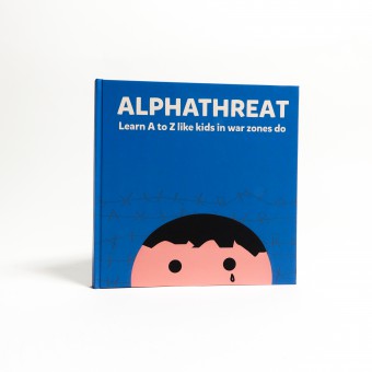
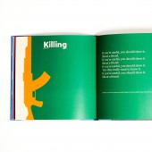
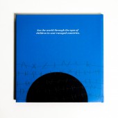
| DESIGN NAME: Alphathreat PRIMARY FUNCTION: Book INSPIRATION: Everyone knows about the conflicts that are occurring across the globe. However, not many are aware about the plight of the children caught in these conflicts. Alphathreat was created to shed light on the things that little kids witness every day, and make parents in peaceful countries feel for them. UNIQUE PROPERTIES / PROJECT DESCRIPTION: Made to look like a regular children’s book, Alphathreat is actually directed at parents in peaceful countries. It looks at the English alphabet from the perspective of children suffering in war-ravaged countries. It disguises the grave truths of our world behind illustrations as innocent as the little kids stuck in war zones. OPERATION / FLOW / INTERACTION: After reading the initial context-setting pages, a reader journeys through the English alphabet, reimagined from the perspective of children in war zones. Every letter comes with a dedicated nursery rhyme, a fact supported by UNICEF or Save The Children, and an illustration that resembles the corresponding letter. The journey for the reader ends on a call to action that encourages the reader to donate to UNICEF or Save The Children. PROJECT DURATION AND LOCATION: The project started in May 2019 in Hamburg and was completed in June 2019, and was exhibited at the Miami Ad School Europe student exhibition. FITS BEST INTO CATEGORY: Graphics, Illustration and Visual Communication Design |
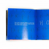
PRODUCTION / REALIZATION TECHNOLOGY: The designs were created on Adobe Illustrator. The book was setup on Adobe InDesign. The paper weight is 200 GSM. Even though being directed at a different target group, Alphathreat is a book of alphabets. The objective of every illustration was to tell a story while depicting a letter of the alphabet. Popular nursery rhymes were tweaked to complement these illustrations. Letters of the alphabet are depicted as parts of a barbed wire as well. SPECIFICATIONS / TECHNICAL PROPERTIES: Alphathreat follows a traditional children’s book format. It has been created in the 1:1 ratio. It measures 210mm x 210mm to be precise. It consists of 84 pages including the front and the back cover. TAGS: child soldiers, war, human shields, child deaths, save the children, unicef, alphabet, illustrations RESEARCH ABSTRACT: The most glaring finding during the research, that further fortified the need for this book, was that people imagine adult men when the word 'war' is uttered. Nobody thinks about the children that might be caught in the crossfire. Getting the facts right was important. Unfortunately, UNICEF and Save The Children have hundreds of facts detailing the plight of these kids. These facts were used to determine the words that were assigned to every letter. CHALLENGE: War sparks visions of debris, pain and bloodshed. The main challenge was to maintain the innocence that a children's book possesses while shedding light on grave topics like abduction, suicide bombing, rape and more. A simple design technique was used to overcome these challenges. The designs were kept minimal with focus on expressive eyes and innocent faces. Negative space or perspective were use to disguise the gory elements. ADDED DATE: 2019-06-23 16:29:31 TEAM MEMBERS (1) : Rasesh Patkar IMAGE CREDITS: #1 Illustrator/Copywriter Rasesh Patkar, Alphathreat, 2019 PATENTS/COPYRIGHTS: Copyrights belong to Rasesh Patkar, 2019 |
||||
| Visit the following page to learn more: http://online.fliphtml5.com/mxlrf/bgvo/ | |||||
| AWARD DETAILS | |
 |
Alphathreat Book by Rasesh Patkar is Winner in Social Design Category, 2019 - 2020.· Read the interview with designer Rasesh Patkar for design Alphathreat here.· Press Members: Login or Register to request an exclusive interview with Rasesh Patkar. · Click here to register inorder to view the profile and other works by Rasesh Patkar. |
| SOCIAL |
| + Add to Likes / Favorites | Send to My Email | Comment | Testimonials | View Press-Release | Press Kit |
Did you like Rasesh Patkar's Social Design?
You will most likely enjoy other award winning social design as well.
Click here to view more Award Winning Social Design.


