DESIGN NAME:
Eatime Space
PRIMARY FUNCTION:
Dining and Working
INSPIRATION:
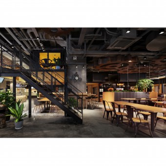
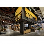
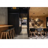
The word Eatime sounds like time in Chinese pronunciation. Normally, a workshop represents old stuff which has witnessed changes as time goes by. On this level, the concept of time can interact with workshop closely. Thus, the design is inspired by the workshop, where industry structure and environment are basic elements to construct space. The entire decor has thus been designed to look and feel like a workshop. Rubik's cube liked units' combination forms a free, open, three-dimensional space for eating and working with enjoyment. People could climb up and down as per their preference,and they can feel time in this special space.
UNIQUE PROPERTIES / PROJECT DESCRIPTION:
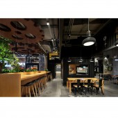
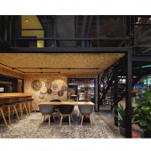
Based on the style of workshop, the decor ties together a vivid industrial feel from the ceiling to the cement & ceramic tile layout on the floor. The industrial pipes, that form the main element of design on the ceiling are meticulously arranged and integrate at the Rubik's cube liked units.Eatime offers venues to encourage people to recall and work in peace. Eatime pays homage to the purest form of design by subtly blending the elements lending themselves to both raw and finished decor. Decorations which indicate time exist everywhere. On the ceiling, giant inner watch structures are hanged. On the wall, diverse horologes layout in a certain rhythm.
OPERATION / FLOW / INTERACTION:
This is an underground project in Nanjing, China. Rubik's cube liked units are important design elements in this design. With diverse combination in different levels, these units create a three-dimensional space with efficiency and fun.
PROJECT DURATION AND LOCATION:
The project started in June 2017 in Nanjing, Jiangsu, China and finished in November 2018 in Nanjing, Jiangsu, China.
FITS BEST INTO CATEGORY:
Interior Space and Exhibition Design
|
PRODUCTION / REALIZATION TECHNOLOGY:
Eatime(Eat & Time) is realized through a wide variety of materials. Main material: Wall with latex paint, cement art paint, metallic paint, Floor with reinforced wood flooring, ceramic tile, cement tile, Furniture, Lamp, Hardware. The theme of the project of making the most healthy foods, and offering venues to encourage people to recall and work in peace, which led to the project being called Eatime. A huge variety of materials have been used from tiles to wooden flooring and wood being the primary materials. Recycled containers with metallic paint layer have a different feeling compared with the warm wooden material surface.
SPECIFICATIONS / TECHNICAL PROPERTIES:
The site has a total area of 1024 Sq.mt.
TAGS:
Eat, Working, Time, Industry, Creativity
RESEARCH ABSTRACT:
In early 2017, EATIME invited us to set up a design research group to specialize in the design of eating, working and time combined environment. In 2017, EATIME hopes to establish an experimental space in Nanjing, Jiangsu. Our team has officially started the project.
CHALLENGE:
Considering the existing pipes on site, it's not easy to rearrange them to match with the whole design. How the pipes are laid out? How can we achieve best design at the least cost? Finally, the pipes are laid out in a very simplistic fashion in lines, which makes the exposed ceiling seems clean.
ADDED DATE:
2019-06-22 10:36:14
TEAM MEMBERS (2) :
Liang DING and Yuefeng ZHOU
IMAGE CREDITS:
Liang Ding and Yuefeng Zhou, 2019.
|


