DESIGN NAME:
GID Office
PRIMARY FUNCTION:
Office
INSPIRATION:
This is an old four-storeyed building in times of Republic of china. Originally the designer was invited to do renovation for this building and later he is invited to move into the 1 and 2 floors to work.
UNIQUE PROPERTIES / PROJECT DESCRIPTION:
Since it is a historical building and the original structure is not allowed to be changed greatly, the design work is rather difficult. Based on its original structure, the designer creates new blocks and functions for it and rebuilds the spatial order and aesthetics. Different from office in other modern buildings, this case locates in residential area in downtown Shanghai.
OPERATION / FLOW / INTERACTION:
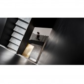
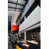
The 1st floor breaks the design of traditional office space and is positioned as a small-scale art museum and collection. The void space above the entrance is the highlight of this case. Demolish the floor slab between 1st and 2nd floor to form a landscape point and improve the lighting of the 1st floor, which is transparent and with improved interactive. Since position of this atrium landscape stairs is at the lift hall of the original house, the designer moves the lift the back of the house and release this area, thus the stairs become a landscape.
PROJECT DURATION AND LOCATION:
Design time:March, 2018;Completion time: December, 2018 .Project location: Shanghai,China
FITS BEST INTO CATEGORY:
Interior Space and Exhibition Design
|
PRODUCTION / REALIZATION TECHNOLOGY:
The designer painted the iron finish on the facade from grey to white, installed black frame, raised the roof 30cm higher and made roof overhang, making it a peaceful and modern space in traditional downtown area.
SPECIFICATIONS / TECHNICAL PROPERTIES:
The office covers an area of 680 sqm.
TAGS:
art, space, stair, bathroom, enjoyment
RESEARCH ABSTRACT:
1st floor is designed into a small art museum instead of traditional office and applied with some original products of the designer. There are ultimate possibilities in the later stage based on different demands. 2nd floor is employee office area.
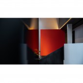
Key tone of the area is black, white and grey. A red box is applied between 2nd and 3rd floor as the ending of the stairs. This makes the whole space more interesting.
Generally, most people have a sense of exclusion on the bathroom. So, the designer hopes the bathroom to be pleasant and uses bright colors in it to make it a show of beauty.
CHALLENGE:
Since it is a historical building and the original structure is not allowed to be changed greatly, the design work is rather difficult. Based on its original structure, the designer creates new blocks and functions for it and rebuilds the spatial order and aesthetics.
Limited by the area of office space, the designer combines many functions together, such as the reader and the meeting area. In this way, the headache point of the office space becomes the luminous point.
ADDED DATE:
2019-04-16 03:23:29
TEAM MEMBERS (1) :
Gary Zeng
IMAGE CREDITS:
Image #1,2,3,4,5:Photographer Wangting , 2019
|


