Cerese F Residential Interior Design by Sadie Wong and Stanley Chun |
Home > Winners > #84999 |
 |
|
||||
| DESIGN DETAILS | |||||
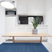
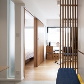
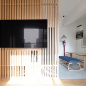
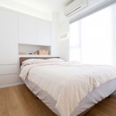
| DESIGN NAME: Cerese F PRIMARY FUNCTION: Residential Interior Design INSPIRATION: The original layout contained a narrow bathroom which was not convenient for taking care of a baby. Therefore, according to the existing conditions, relocated the bathroom and made it to be large enough to use. However, it created a baby room which has windowless. To solve this problem, a movable partition was designed for this place. Two partitions are constructed by wood stripes and doing the shading job, it invites sunlight and fresh air with privacy. It looks harmony and also functionally. UNIQUE PROPERTIES / PROJECT DESCRIPTION: A small unit with 32 square meter is a couple and a new born baby's home. The limited space is required 2-bedroom area and also isolate different function areas, like kitchen, bathroom and living room which seemed impossible. After redesigned the layout, everything was perfect except the baby room which was windowless. To increase fresh air and natural lights going into the room, a functional partition was the solution. Using front and back partitions to adjust the lights go through either on the top and bottom or in the middle. It practically becomes a feature wall in the space. The shoe cabinet was a divider of baby room and foyer, and it contained a TV hub and the home console receivers were on the wood partition where was facing to the sofa. OPERATION / FLOW / INTERACTION: The space is well planed and divides different areas. Every area has enough natural light during to a specific planing. The tricky partition did its role to allow sunshine and air going into the baby room, it also keep the privacy for the people who is in the room. The atmosphere is bright and warm, white and wood texture create a homey ambient. PROJECT DURATION AND LOCATION: The project started in June 2018 and finished in October 2018 in Macau. FITS BEST INTO CATEGORY: Interior Space and Exhibition Design |
PRODUCTION / REALIZATION TECHNOLOGY: Using wood and glass to invite as much as sunlight to the space and visually enlarge the space. Technically using partition to divide foyer and living room and also create a bigger TV wall. The partition is the entry of baby room and a shading wall as well. This is a multi-functional divider. The kitchen wall is installed a glass panel which allow sunlight goes into the space, the embossed glass door has the same purpose for bathroom. SPECIFICATIONS / TECHNICAL PROPERTIES: This is a 32 square meter home. It is divided to foyer (3sqm), kitchen and dining (4.5 sqm), living room (8 sqm), master bedroom (6.5 sqm), baby room (4.2 sqm) and bathroom (4.8 sqm). TAGS: Minimal, Small space, Form follows function, Sunshine, Space plaining RESEARCH ABSTRACT: To design a space for a family, knowing their individual characters through observation and communication. Taking note and measurement of the space and study the space, orientation, sunlight, airflow and the existing fixtures. Using computer accurately do the layout and space planing, 3 dimensional visual program helps to experiment the design result, like colour, lighting, spacing and also materials. The design was checked with client and ensure it was suitable for the living style. CHALLENGE: Small space is the most difficult thing while designing the space, every inch of the space is precious. After site visiting and observation, relocated the bathroom and baby room was one of the main issue in this project. After settled the bathroom location, the baby room came up with an area with no windows which was dark and no fresh air. To create a functional wall became another issue. After did some experiments, a movable wall was the solution. It transformed the space to be a private place yet with lights and fresh air. It was also a part of the TV wall. And the result presents the idea very well, it is a case of "form follows function". ADDED DATE: 2019-03-28 06:33:15 TEAM MEMBERS (2) : Sadie Wong and Stanley Chun IMAGE CREDITS: Photographer Nick Tam |
||||
| Visit the following page to learn more: http://nomaddesign.com.co/product/70.htm |
|||||
| AWARD DETAILS | |
 |
Cerese F Residential Interior Design by Sadie Wong and Stanley Chun is Winner in Interior Space and Exhibition Design Category, 2018 - 2019.· Read the interview with designer Sadie Wong and Stanley Chun for design Cerese F here.· Press Members: Login or Register to request an exclusive interview with Sadie Wong and Stanley Chun. · Click here to register inorder to view the profile and other works by Sadie Wong and Stanley Chun. |
| SOCIAL |
| + Add to Likes / Favorites | Send to My Email | Comment | Testimonials | View Press-Release | Press Kit |
Did you like Sadie Wong and Stanley Chun's Interior Design?
You will most likely enjoy other award winning interior design as well.
Click here to view more Award Winning Interior Design.


