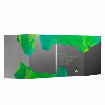
White Paper Abraidi Book by Ruis Vargas |
Home > Winners > #84968 |
 |
|
||||
| DESIGN DETAILS | |||||
| DESIGN NAME: White Paper Abraidi PRIMARY FUNCTION: Book INSPIRATION: Abraidi represents Brazilian companies importing medical products. Thus, the image of crossing oceans appears, integrating distant lands. The visual identity design of the publication is composed of abstract forms, in cubist cuts, which represent the "seeing the planet from above". Compositions are graphic metaphors of ocean-separated continents clippings, which are also applied over photos and spread through the publication composing the visual rhythm of the pages. UNIQUE PROPERTIES / PROJECT DESCRIPTION: The Abraidi white book is permeated by abstract elements that dictate the rhythm of publication and function as clippings of the Earth's cartographic plane. In the set of pages, metaphorically and abstractly, we have the composition of the whole and the junction of all continents surrounded by water. Another relevant detail: the photos are composed by the blend of CMYK and metallic pantone, offering a hybrid look and unusual to the eyes. OPERATION / FLOW / INTERACTION: The Abraidi Yearbook has, above all, the function of marking the entity's fiscal year and setting guidelines for the following year. In addition to the functional aspect of the publication, its aesthetic and graphic aspect is fundamental to mark the date, give permanence to the document and validate its relevance for the sector. PROJECT DURATION AND LOCATION: The project started in February 2018 and finished in March 2018 in Sao Paulo, Brazil. |
PRODUCTION / REALIZATION TECHNOLOGY: The publication was printed in offset, mixing CMYK and Pantone metallic inks. The cover has two symmetrical flaps that provide, in the total aperture, a panoramic and continuous view of the abstract cartographic composition. The core was printed on matte coated paper to soften the reflective aspect of metallic color, mainly to preserve the readability of graphics. SPECIFICATIONS / TECHNICAL PROPERTIES: Sheet size 420 x 297 mm; Print format 210 x 297 mm. Cover in the format 800 x 297 mm in Supremo Duo Design 300 g / m2. Printed in 5 colors (CMYK and metallic pantone). Composed of 92 pages in Fosco couch 150 g / m2. TAGS: Publish, visual identity, editorial design, graphic, book, infographic, documentation RESEARCH ABSTRACT: The Laika method is based on the complete synergy between language skills and pictorial aspects of communication. The project begins with the construction of meaning (semiological aspect) and the need to design small graphic narratives relevant to the brand. These premises permeated the graphic construction and of images that exerted semantic function, besides esthetics in the publication. CHALLENGE: Produce a publication of extensive economic content and technological aspects with graphic organization and ease of access to information. ADDED DATE: 2019-03-28 01:33:24 TEAM MEMBERS (1) : Ruis Vargas, Creative Director and Illustrator, and Thiago Siqueira, Designer IMAGE CREDITS: Arthur Medeiros |
||||
| Visit the following page to learn more: http://www.laika.com.br | |||||
| AWARD DETAILS | |
 |
White Paper Abraidi Book by Ruis Vargas is Winner in Print and Published Media Design Category, 2018 - 2019.· Read the interview with designer Ruis Vargas for design White Paper Abraidi here.· Press Members: Login or Register to request an exclusive interview with Ruis Vargas. · Click here to register inorder to view the profile and other works by Ruis Vargas. |
| SOCIAL |
| + Add to Likes / Favorites | Send to My Email | Comment | Testimonials | View Press-Release | Press Kit |
| COMMENTS | ||||||||||||
|
||||||||||||
Did you like Ruis Vargas' Print Design?
You will most likely enjoy other award winning print design as well.
Click here to view more Award Winning Print Design.


