Gallery Abode Apartment Apartment by Artistroom Pte Ltd |
Home > Winners > #84754 |
 |
|
||||
| DESIGN DETAILS | |||||
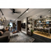
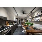
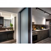
| DESIGN NAME: Gallery Abode Apartment PRIMARY FUNCTION: Apartment INSPIRATION: Our inspiration came from the client's taste. His liking for a particular style for dark and masculine. Likewise his habits and requirements for the space. He wanted a home which can 'inspire him' as well as a spacious study helps keep his things tidy while providing a comfortable place for his media-related work, yet the space linking to the living and kitchen area without much clutter. Working in the media industry, he wanted "a home that would inspire him". UNIQUE PROPERTIES / PROJECT DESCRIPTION: We removed the walls of the second bedroom to make way for an open-concept study. Custom-made wall-to-wall display shelving with slim, linear metal frames in the study. The footprint of the master bedroom was reduce. Its walls were removed, rebuilt to make way for a walk-in wardrobe and additional circulation space around the main living area. Material choices like Black concrete screed flooring, white walls and clean-cut built-in structures were the foundation for this gallery-like home. OPERATION / FLOW / INTERACTION: Like most three-room flats of this era in Singapore, this apartment was constructed with a narrow frontage and deep interior. The layout, too, was very typical: a living-dining area, two bedrooms, a kitchen, bathroom, WC and utility room. We wanted an open layout so that the owner could entertain; a master room with a walk-in wardrobe; and direct access to the bathroom from his master room (as the existing layout had no access). The owner hardly cook as well, so a galley kitchen was sufficient for him to use. The owner wanted a dedicated workspace as he mainly work from home, as well as plenty of shelving space and storage for his books, artefacts and travel memorabilia. As the home owner works as a freelance editor, these objects and pictures hang onto the wall and displays inspires the owner's everyday life and motivation. All non-load-bearing walls were also demolished to create the open plan. One bedroom was converted into his study room/library, with part of its floor space becoming his walk-in wardrobe, itself accessible only from his master room. From his study area, the space flows seamlessly into the living room and into the dining/kitchen. To disguise a structural column, we designed open shelves and storage cabinets around it. These three areas are enclosed by a sliding door that separates the dining/kitchen from the vanity/bathroom, yard and the utility room. PROJECT DURATION AND LOCATION: The project started in Jan 2015 and finished in July 2015. It is a government housing apartment in Singapore which was located at Blk 5, Everton Park. The apartment had 2 bedrooms and 1 living hall; and 1 bathroom. It had a size of 950 sq ft. FITS BEST INTO CATEGORY: Interior Space and Exhibition Design |
PRODUCTION / REALIZATION TECHNOLOGY: We selected a sophisticated palette of materials and tones to achieve the look the owner wanted: custom black concrete screed for the floors; grey oak laminates for the cabinetry; grey marble for the kitchen backsplash; and white paint for most of the walls, to provide a contrast to the darker tones. Black track lights throughout emphasise the linearity of the space, while also adding to the art gallery-like ambience. The furnishings were all new. The owner selected them himself, consulting with us to ensure that their proportions fit the spaces. Aesthetically, his tastes lean towards contemporary Italian design. So we decided to design a place with more clean lines and strong angles. As we felt that this style makes a good backdrop for his eclectic collection of artworks and artefacts. SPECIFICATIONS / TECHNICAL PROPERTIES: The apartment is about 950 sq ft where we re-orientated the activities and functions of the entire space. Each areas has been carefully thought through, to maximise spaciousness, function and reduce the vision of mess given that it is a open layout. Long duration of activities have been placed in areas where natural light and air is most abundant. TAGS: Space Planning, Apartment, Interior Design, A bachelor pad, 3 Room Apartment RESEARCH ABSTRACT: We tried our upmost to create a space devised custom solutions to the owner's specifications. His home was a clean and sleek look inspired by Italian design, with a masculine colour palette of black, grey, white and dark wood tones. However, the walls were kept white, in order to best exhibit the homeowner's many paintings, photos and prints - adding to the gallery-like feel of his stylish, curated home! CHALLENGE: The challenge when we were doing this project were the thin mild steel structure that we had created for the bookshelves that we had to enable the structure to take weight of the owner's ornaments and books. We have to figure ways to embed the structure yet maintaining its' minor texture and colour. The layout was also the initial most challenging part of the design; as we had to find ways to conceive storage yet functionality to the space; where a typical government in Singapore wouldn't allow us to do so easily. ADDED DATE: 2019-03-27 05:22:31 TEAM MEMBERS (2) : Katy Chong and Mark Chen IMAGE CREDITS: Edward Hendricks / CI&A Photography PATENTS/COPYRIGHTS: Project belong to Artistroom Pte Ltd, 2019 |
||||
| Visit the following page to learn more: http://www.artistroom.com.sg | |||||
| AWARD DETAILS | |
 |
Gallery Abode Apartment Apartment by Artistroom Pte Ltd is Winner in Interior Space and Exhibition Design Category, 2018 - 2019.· Read the interview with designer Artistroom Pte Ltd for design Gallery Abode Apartment here.· Press Members: Login or Register to request an exclusive interview with Artistroom Pte Ltd. · Click here to register inorder to view the profile and other works by Artistroom Pte Ltd. |
| SOCIAL |
| + Add to Likes / Favorites | Send to My Email | Comment | Testimonials | View Press-Release | Press Kit |
Did you like Artistroom Pte Ltd's Interior Design?
You will most likely enjoy other award winning interior design as well.
Click here to view more Award Winning Interior Design.


