Reactivate Office Space by Wei Cun Ke |
Home > Winners > #84744 |
 |
|
||||
| DESIGN DETAILS | |||||
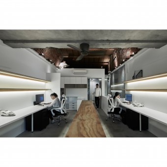
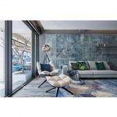
| DESIGN NAME: Reactivate PRIMARY FUNCTION: Office Space INSPIRATION: This is a 40-year-old house, which is intended to transform into a brand-new office.The owner especially want to retain the original essence of the building, thereupon does not do superfluous adornment, merely make use of materials and well spatial configuration, expect to re-molding the features and the durative of the historical house. UNIQUE PROPERTIES / PROJECT DESCRIPTION: In addition of preserving the building original essence wins the customer's favor; adopt the environmental protective non-toxic, easy of maintaining and cleaning materials, also let them feel heart-warming; They become aware of that the office can be not so conventional, further can have its own stylistic quality. From inside to appearance, utterly can't believe it's a 40-year-old out-of-date building. OPERATION / FLOW / INTERACTION: After decided to preserve the original style of the interspace, and then whitewash the exterior appearance and interior area of the building.Beneath the pure white status, endow much more manipulate imagination to the field.Cast aside too many complicated lines and tints, keep hold of the original red bricks, stone walls and wood works, returning to the essence of space and natural appearance. PROJECT DURATION AND LOCATION: The project started in July 2017 and finished in November 2017 in Taiwan. FITS BEST INTO CATEGORY: Interior Space and Exhibition Design |
PRODUCTION / REALIZATION TECHNOLOGY: The whole space takes "environmental protection" and "durability&quo SPECIFICATIONS / TECHNICAL PROPERTIES: How to integrate the old construction with new design is a primary challenge of this project.The compartments in the former space are disorganized. Some metope segment is 2.4 meters, some are 2.5 meters and 2.7 meters, and therefore we have to set up a benchmark. Not only obtain tidy vision, but also be more convenient for the pipeline configuration. TAGS: simplifying complexity, delicate techniques, humanistic aesthetics, the needs of the times, visual aesthetics RESEARCH ABSTRACT: Another major point is how to make the 118.8 square meters space more effective utilized.Thus we dismantled the original compartments of the building, adopt transparent glass and mirror plane, as well as various shades ore corridors, to mark out the environmental properties, while achieving the utility of visual enlargement and spatial extension. CHALLENGE: In order to make the space of 118.8 square meters more effective, demolished the compartment of the building, supplemented with transparent material and plane layout, so as to maximize the field. "Environmental protection" is one of the major appeal, whether floor or the metope, all adopt environmentally friendly and non-toxic safety materials, which echoes the original intention of the design, and at the same time renders the customer a reassured place. ADDED DATE: 2019-03-27 01:56:47 TEAM MEMBERS (2) : Executive Director: Chia Tzu Hsu and Project Manager: Tsai-Chen Huang IMAGE CREDITS: #1:Photographer,FU MING LIN,KAYING PHOTO STUDIO,2018 #2:Photographer,FU MING LIN,KAYING PHOTO STUDIO,2018 #3:Photographer,FU MING LIN,KAYING PHOTO STUDIO,2018 #4:Photographer,FU MING LIN,KAYING PHOTO STUDIO,2018 #5:Photographer,FU MING LIN,KAYING PHOTO STUDIO,2018 PATENTS/COPYRIGHTS: Copyrights belong to KuanJu International co., LTD.,2017. |
||||
| Visit the following page to learn more: https://reurl.cc/LlgWL | |||||
| AWARD DETAILS | |
 |
Reactivate Office Space by Wei Cun Ke is Winner in Interior Space and Exhibition Design Category, 2018 - 2019.· Read the interview with designer Wei Cun Ke for design Reactivate here.· Press Members: Login or Register to request an exclusive interview with Wei Cun Ke . · Click here to register inorder to view the profile and other works by Wei Cun Ke . |
| SOCIAL |
| + Add to Likes / Favorites | Send to My Email | Comment | Testimonials | View Press-Release | Press Kit |
Did you like Wei Cun Ke's Interior Design?
You will most likely enjoy other award winning interior design as well.
Click here to view more Award Winning Interior Design.


