Beauty of Deconstructivism - UA Cinemas Interior Design by Oft Interiors Ltd. |
Home > Winners > #83206 |
 |
|
||||
| DESIGN DETAILS | |||||
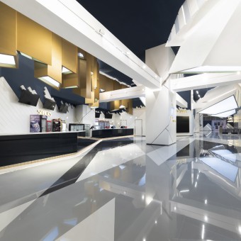
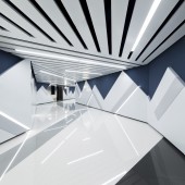
| DESIGN NAME: Beauty of Deconstructivism - UA Cinemas PRIMARY FUNCTION: Interior Design INSPIRATION: This UA cinema in Shanghai celebrates deconstructivism, a postmodern architectural movement that has started since the 1980s. Deconstructivism is about moving away from the shackle of traditions, questioning pre-existing rules, challenging pre-dominating frameworks. It is a movement about freedom and oppression. The deconstructivist philosophy originated from the French philosopher Jacques Derrida, who had influenced some architects during the start of the movement. His approach can be seen in some architectural designs, where there is an absence of harmony, continuity and symmetry in the lines and forms. This design is an attempt to participate in the movement, by creating non-rectilinear shapes that visually appear with unpredictability and controlled chaos. By disassembling space, perhaps a new meaning can be given to the usage of space. UNIQUE PROPERTIES / PROJECT DESCRIPTION: Essence of deconstructivism is seen everywhere throughout the whole cinema, starting from the first part that is seen by the audience. The lobby is a bombshell, which reflects what it is all about: abstraction, virtuality, instability and openness. Audience may be surprised by the tension created just by shapes and forms when they look up while standing in the middle of the lobby, as this ceiling is not a flat surface; a number of irregular columns descend from the top, with lights situated in them. The contrast of champagne gold and greyish blue appear to be more intense in such shapes. It seems to have no harmony here; the ceiling, the walls and the floor finishing all consist their own particular patterns and lines, the only consistency is the colours being used. It is almost like the only connection within disassociation. The white column contains champagne gold highlights while the metallic champagne gold columns contain concealed white lights, as if chaos is the only law that needs to be followed. OPERATION / FLOW / INTERACTION: Creation reflects our inner selves. Some consider it as a mirror; it can get very personal to create and to design. Thus, if we want to create groundbreaking designs, it is us that need to have a breakthrough. If we want to reveal the intrinsic quality of beauty, we need the constructs of beauty. In this process, self-reflection and self-doubt are involved, and deconstruction is inevitable. PROJECT DURATION AND LOCATION: Duration: 10 months Location: Shanghai, China. FITS BEST INTO CATEGORY: Interior Space and Exhibition Design |
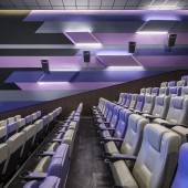
PRODUCTION / REALIZATION TECHNOLOGY: Materials: marble, fabric, custom painted sheets. SPECIFICATIONS / TECHNICAL PROPERTIES: Area: 5,188sqm TAGS: cinema, interior design RESEARCH ABSTRACT: If you feel overwhelmed by the expedition of postmodern architectural movement, it is probably time to settle down at the screening houses. That is why the design here is much subtler, so that the focus of attention can be turned into the movie itself: the purpose of coming to the cinema. In here, purple, grey and black are displayed calmly, with the rectilinear shapes being hanged only on the sides. Perhaps desconstruction is just a part of a cycle: a cycle of defining new constructs, a process that prepares for another movement. CHALLENGE: The ideas of deconstruction and construction are fused together at the VIP lounge and the lavatory sections, with lines and forms being deconstructed and colours act to construct. At the VIP lounge, both the walls and the ceiling are decorated with stripe patterns. The wooden patterned stripes are lined neatly but the directions are unpredictable. Balance is brought by the relatively natural shades of these wooden patterns, some are grey and some are brown. At the lavatory, the stripes are as if distorted horizontally, with rectangular shapes dominating the whole space including the ceiling, the walls, the floor, and the doors of the cubicles. Light grey and dark grey marble patterned tiles are used on both the floor and the walls. The other parts are made up of greyish blue and dark blue lacquered glass with some white ones as partitions. ADDED DATE: 2019-03-07 09:19:12 TEAM MEMBERS (1) : C.M. Jao, Ken Cheung IMAGE CREDITS: All images used in the submission by nk. PATENTS/COPYRIGHTS: Copyrights belong to Oft Interiors, 2018. |
||||
| Visit the following page to learn more: https://www.oftinteriors.com | |||||
| AWARD DETAILS | |
 |
Beauty of Deconstructivism-Ua Cinemas Interior Design by Oft Interiors Ltd is Winner in Interior Space and Exhibition Design Category, 2018 - 2019.· Read the interview with designer Oft Interiors Ltd. for design Beauty of Deconstructivism - UA Cinemas here.· Press Members: Login or Register to request an exclusive interview with Oft Interiors Ltd.. · Click here to register inorder to view the profile and other works by Oft Interiors Ltd.. |
| SOCIAL |
| + Add to Likes / Favorites | Send to My Email | Comment | Testimonials | View Press-Release | Press Kit |
Did you like Oft Interiors Ltd's Interior Design?
You will most likely enjoy other award winning interior design as well.
Click here to view more Award Winning Interior Design.


