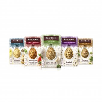
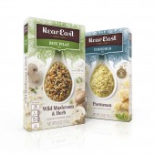
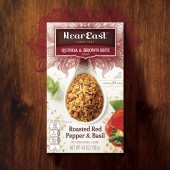
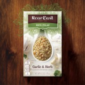
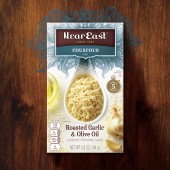
Near East Redesign Food Packaging by PepsiCo Design & Innovation |
Home > Winners > #83126 |
| CLIENT/STUDIO/BRAND DETAILS | |
 |
NAME: PepsiCo PROFILE: At PepsiCo Design, we are crazy enough to think we can inspire the future - of our brands, of our company, of our society. We firmly believe design and design thinking are significant catalysts of innovation and therefore of growth to power our global brands. PepsiCo products are enjoyed by consumers more than one billion times a day in more than 200 countries and territories around the world. PepsiCo generated more than $63 billion in net revenue in 2017, driven by a complementary food and beverage portfolio that includes Frito-Lay, Gatorade, Pepsi-Cola, Quaker and Tropicana. PepsiCo's product portfolio includes a wide range of enjoyable foods and beverages, including 22 brands that generate more than $1 billion each in estimated annual retail sales. |
| AWARD DETAILS | |
 |
Near East Redesign Food Packaging by Pepsico Design & Innovation is Winner in Packaging Design Category, 2018 - 2019.· Read the interview with designer PepsiCo Design & Innovation for design Near East Redesign here.· Press Members: Login or Register to request an exclusive interview with PepsiCo Design & Innovation. · Click here to register inorder to view the profile and other works by PepsiCo Design & Innovation. |
| SOCIAL |
| + Add to Likes / Favorites | Send to My Email | Comment | Testimonials | View Press-Release | Press Kit |
Did you like Pepsico Design & Innovation's Packaging Design?
You will most likely enjoy other award winning packaging design as well.
Click here to view more Award Winning Packaging Design.


