|
|
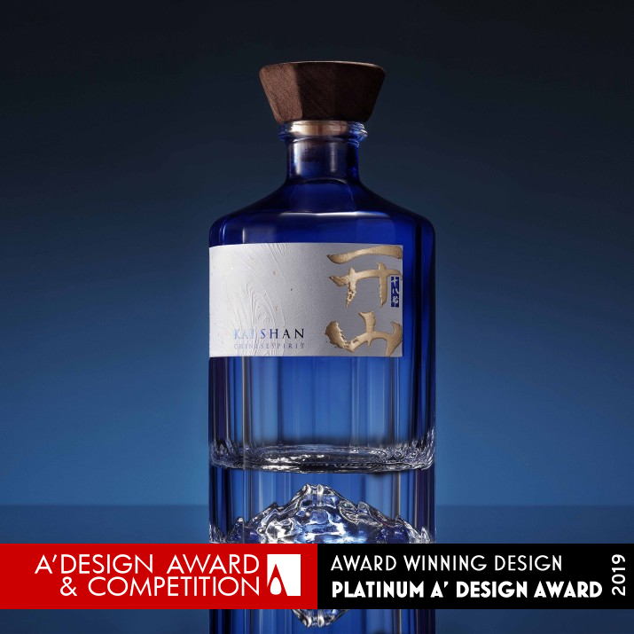
Kaishan Chinese Spirit 18 Neo-Chinese Spirit Package by Jansword Zhu |
|
|

|
|
| DESIGN DETAILS |
DESIGN NAME:
Kaishan Chinese Spirit 18
PRIMARY FUNCTION:
Neo-Chinese Spirit Package
INSPIRATION:
The label inspired from Chinese painting hand-roll and the asymmetry structure of the label is unique.
The 18 cutting surface of the bottle also make the mountain look different in different aspect, which is written in the Chinese old Poem( mountain looks different in different aspect)
The flavor of Kaishan different from the old style, it combines the procedure of Gin, thus the design is also a new fresh for the Chinese traditional spirit market.
UNIQUE PROPERTIES / PROJECT DESCRIPTION:
KAISHAN 18 chinese spirit, allows the customer to drink a dream with the blue and tranquil mountain scene. The blue gradient on the shoulder would reflexing blue aura on the crystal mountain(Dragon mountain of China, Tianshan). Together with the Lucid pattern on the box abstracted from Dunhuang cave painting, the wood Chinese traditional stopper as a contrast, the design shows an heavenly peace of Chinese Aesthetic.
OPERATION / FLOW / INTERACTION:
The product lead to a great success that they make a great sales in only 3 month, also it has approvedthe checking of Many international luxury hotel and Open up the supply channel such as Four Seasons Hotels.
PROJECT DURATION AND LOCATION:
The project started in June 2018 in Shanghai/Beijing and finished in Jan 2019 in Shanghai/Beijing.
FITS BEST INTO CATEGORY:
Packaging Design
|
PRODUCTION / REALIZATION TECHNOLOGY:
Emboss, 3D Emboss,UV, glass sculpting
SPECIFICATIONS / TECHNICAL PROPERTIES:
bottle 90*90*195 mm
box 130*130*300 mm
TAGS:
Modern Oriental, Chinese Spirit, Mountain, Dreaming Blue, Neo-Chinese
RESEARCH ABSTRACT:
Chinese spirit has up to 70% of market share in Chinese alcohol market. But as the traditional Chinese spirit has a strong or even sauce-like smell and the package is old-fashioned, the young consumers is shifting to other choices rather than Chinese spirit.
Kaishan is a revolutionary spirit that combine the brewing method of Gin with traditional spirit. Thus the taste is more clear and sharp.
We use glass to express the clean taste, different from most spirit brand in China which usually use in porcelain. But we used porcelain blue instead of the material. And Quite surprisingly, the mountain is transparent, but reflecting the blue from shoulder, also the makes the shadow with a beam of blue. The shadow part is to be honestly beyond our expectation.
The box is also an high-light of the design as the the bottle will appear as a Blue Chinese lanttern when opened from center.
We do many research to make a abstract pattern deprived from Tonghuang Cave painting from thousand years ago. Also the inverted-trapezoid wood stopper originted from the alcohol vases from Tang dynasty(picture uploaded in additional file)
CHALLENGE:
The hardest part of the Chinese spirit design is that usually a bottle contains 500ml volume(less than whisky or vodka) but the Chinese spirit consumer mania with the big size and expanded visual effect of the package. (A ridiculous rule saying in the spirit sales market is that "the bigger the box, the better it sells") So we thicken the bottom of the bottle, and place the bottle in a big box in a good reason.
Chinese character is also a hard part. Not similar with Japanese character which has katakana, hiragana or directly english alphabet to choose from, We have only uneven characters, and strict law of using the character "rightly". Many Chinese design lost their modernity by bad calligraphy using or over-using of crafts. This time we deal with the four character into two part and left many whitespace to generate mythical atmosphere.
Asymmetry label is also challenge point, we adjust many time about the length and height of label and finally set it in 55% of the perimeter.
ADDED DATE:
2019-02-28 16:49:48
TEAM MEMBERS (6) :
Chief Designer:Jansword Zhu, Illustratior:Jansword Zhu, Assistant Designer:Sola Wang, 3D modeling & render:Ric Ding, Photographer:Zhang Chenglong and Account:Berion Sun
IMAGE CREDITS:
Photographer/Zhang Chenglong, Designer Jansword Zhu,2018
PATENTS/COPYRIGHTS:
Copyrights belong to Jansword Design/KASIHAN
|
|
| CLIENT/STUDIO/BRAND DETAILS |
 |
NAME:
Kaishan spirit
PROFILE:
Kaishan is a revolutionary Chinese spirit brand that intend to revolution the Chinese spirit market with new distillation process, great quality and modern design.
Jansword Design is a design studio focusing on branding, package design and product design in a new style,especially on foods, alcohol and art related cases. As the founder Jansword.Z was graduated from Musashino Art University, it has trilingual communication ability and international understanding to face the internationalized and various needs from clients all over the world, such as GQ, Starbucks, Yokagames, Mobike etc.
|
|
|
| COMMENTS |
| Giulia Esposito |
Comment #9502 on December 26, 2022, 4:22 pm |
|
I am absolutely in awe of Jansword Zhu's award-winning "Kaishan Chinese Spirit 18" package design. The Neo-Chinese spirit theme is so skillfully executed that it communicates a strong sense of cultural heritage. Every detail on the package stands out in a unique and eye-catching way while remaining consistent with the overall design aesthetic. It is a truly inspiring work of packaging design that shows the designer's creative finesse. Kudos to Jansword Zhu for such an incredible achievement!
|
| Stefano Moretti |
Comment #23337 on January 3, 2023, 7:20 am |
|
This award-winning work is a stunning example of modern packaging design which successfully combines traditional Chinese aesthetics with modern materials and technology. The intricate details of the design, such as the blue gradient on the shoulder, the lucid pattern on the box, and the wood Chinese traditional stopper, provide a truly unique and memorable experience. It is a perfect blend of beauty, craftsmanship, and functionality.
|
| Thomas Anderson |
Comment #33749 on January 3, 2023, 10:48 am |
|
I am absolutely in awe of this award-winning work by Jansword Zhu! The combination of Chinese traditional aesthetics with modern elements is truly captivating. The blue gradient on the shoulder of the package is so stunning and the Lucid pattern on the box abstracted from Dunhuang cave painting is breathtaking. The wood Chinese traditional stopper is a nice contrast to the modern elements of the design, creating a heavenly peace. The label inspired from Chinese painting hand-roll and the 18 cutting surface of the bottle create a unique and dynamic mountain view. This new flavor of Kaishan, combining the procedure of Gin, is a refreshing addition to the Chinese traditional spirit market. An outstanding work of art and design, truly deserving of the A' Design Award. Congratulations Jansword Zhu!
|
| Patricia Miller |
Comment #39234 on January 3, 2023, 12:39 pm |
|
This award-winning work is an outstanding example of modern design, combining traditional Chinese aesthetic with innovative techniques and materials to create a unique and beautiful package.
|
| Paul Williams |
Comment #49864 on January 3, 2023, 5:13 pm |
|
The award-winning design "Kaishan Chinese Spirit 18" is a stunning work of art that perfectly captures the Neo-Chinese spirit. The blue gradient on the shoulder coupled with the lucid pattern on the box abstracted from Dunhuang cave painting and the wood Chinese traditional stopper creates an heavenly peace of Chinese aesthetic. The label is inspired from Chinese painting hand-roll and the asymmetry structure of the label is unique. The 18 cutting surface of the bottle also make the mountain look different in different aspect, which is a great achievement. The flavor of Kaishan is different from the old style, it combines the procedure of Gin, thus the design is also a new fresh for the Chinese traditional spirit market. The use of glass to express the clean taste, different from most spirit brand in China which usually use in porcelain, is also a great idea. The box is also an high-light of the design as the the bottle appears as a Blue Chinese lanttern when opened from center. The research and thought behind this design is highly creative and impressive. Kaishan Chinese Spirit 18 is a remarkable work of art that rightly deserves to be celebrated.
|
| Paul Phillips |
Comment #57615 on January 3, 2023, 8:56 pm |
|
I am absolutely mesmerized by the beauty of Jansword Zhu's award-winning work, Kaishan Chinese Spirit 18. The combination of the blue gradient on the shoulder, the lucid pattern abstracted from Dunhuang cave painting, and the wood Chinese traditional stopper, all come together to create a stunningly peaceful and heavenly aesthetic. It's a truly remarkable accomplishment to be able to capture the essence of Chinese culture and tradition in a modern package design. I am deeply impressed by the creativity and detail that went into designing this work and I'm incredibly happy for Jansword Zhu for winning the A' Design Award!
|
| Adam Harris |
Comment #63906 on January 3, 2023, 11:52 pm |
|
This is an amazing work that truly stands out from the rest and it is an incredible achievement to be awarded an A' Design Award for it. The unique properties of the work are perfectly showcased and the effort put in to make it a truly special design is evident. The neo-Chinese spirit package is an extraordinary piece of design that captures the essence of Chinese aesthetics with the lucid pattern from Dunhuang Cave painting and the wood Chinese traditional stopper. The blue gradient on the shoulder creates an enchanting aura that is truly breathtaking. The research and effort behind this work is truly remarkable and is a testament to the skill and creativity of the designer. Congratulations on winning this prestigious award, it is well-deserved!
|
| Chloe Turner |
Comment #73076 on January 4, 2023, 4:10 am |
|
I am absolutely mesmerized by the creative genius behind the award-winning Kaishan Chinese Spirit 18 package. The unique asymmetry structure of the label, inspired by Chinese painting hand-roll, is truly captivating and the 18 cutting surface of the bottle creates a beautiful mountain landscape. The modern re-interpretation of the classic Chinese spirit, combining the procedure of Gin, is a welcomed fresh addition to the traditional spirit market. I am so impressed with the skill and finesse that went into creating this piece, and I congratulate the designer behind this beautiful work!
|
| Mark Allen |
Comment #74993 on January 4, 2023, 5:05 am |
|
This award-winning work celebrates the beautiful traditions of Chinese culture by combining modern design elements with classic motifs. The clever use of blue and white glass to represent a tranquil mountain scene, combined with the intricate Lucid pattern derived from Dunhuang cave paintings and the wood Chinese traditional stopper, creates a truly unique and heavenly aesthetic. All of these elements come together to form a package design that captures the essence of Chinese spirit and is sure to stand out on any shelf.
|
| Elisabeth Clark |
Comment #76637 on January 4, 2023, 5:53 am |
|
As a design enthusiast, I am in awe of Jansword Zhu's work for the A' Design Award. Kaishan Chinese Spirit 18 is a beautiful piece of art that perfectly captures the spirit of Chinese culture. The blue gradient on the shoulder, Lucid pattern on the box abstracted from Dunhuang cave painting, and the wood Chinese traditional stopper make this Neo-Chinese Spirit Package truly unique. It is amazing how they combined the brewing method of Gin with traditional spirit to create a flavor that is clean and sharp. The inverted-trapezoid wood stopper is a brilliant touch that showcases their attention to detail. I am so impressed by the work of Jansword Zhu, and it is well-deserved that they won the A' Design Award.
|
|
|
Did you like Jansword Zhu's Packaging Design?
You will most likely enjoy other award winning packaging design as well.
Click here to view more Award Winning Packaging Design.
Did you like Kaishan Chinese Spirit 18 Neo-Chinese Spirit Package? Help us create a global awareness for good packaging design worldwide. Show your support for Jansword Zhu, the creator of great packaging design by gifting them a nomination ticket so that we could promote more of their great packaging design works.
|
|

|
|
|
|


