Awanama Sake - Japanese Rice Wine by Ryuta Ishikawa |
Home > Winners > #81425 |
| CLIENT/STUDIO/BRAND DETAILS | |
 |
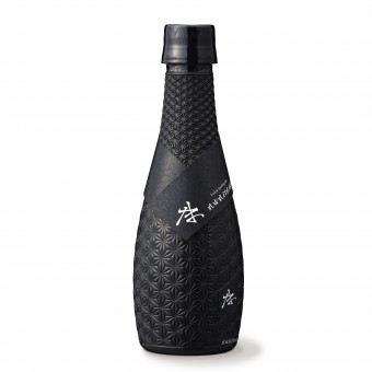
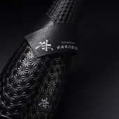
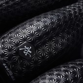
NAME: awanama PROFILE: The namazake brand awanama, which does not heat pasteurize, is an attempt to give the taste of fresh sake overseas. It stops the activity of the bacteria in the bottle by applying high pressure, not heat. As a result, it became possible to distribute namazake, which should normally be refrigerated, at room temperature. In other words, it became possible to work in areas where distribution was difficult, such as overseas. The bottle has the flexibility to absorb high pressure, the light shielding property to maintain quality, and the design to express fine texture. I would like you to rediscover the taste of sake along with its innovative design. |
| AWARD DETAILS | |
 |
Awanama Sake-Japanese Rice Wine by Ryuta Ishikawa is Winner in Packaging Design Category, 2018 - 2019.· Read the interview with designer Ryuta Ishikawa for design Awanama here.· Press Members: Login or Register to request an exclusive interview with Ryuta Ishikawa. · Click here to register inorder to view the profile and other works by Ryuta Ishikawa. |
| SOCIAL |
| + Add to Likes / Favorites | Send to My Email | Comment | Testimonials | View Press-Release | Press Kit |
Did you like Ryuta Ishikawa's Packaging Design?
You will most likely enjoy other award winning packaging design as well.
Click here to view more Award Winning Packaging Design.


