Primator Brewery Label Design by Radoslav Dostal |
Home > Winners > #81293 |
 |
|
||||
| DESIGN DETAILS | |||||
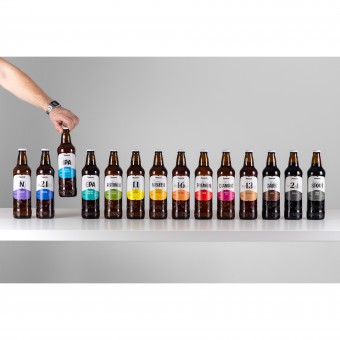
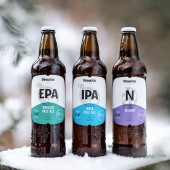
| DESIGN NAME: Primator Brewery PRIMARY FUNCTION: Label Design INSPIRATION: Contrary to common practices, the agency gave more prominence to the beer type rather than the brewery's logo. This further added to the product's recognisability. The simply designed motifs on the labels and the characteristic drawings separated beers into three groups, making it even more simple to find one's preferred beer (or taste other beers from the same category - traditional, speciality and top). A special, heavier-weight stock redolent of handmade paper was used in print. UNIQUE PROPERTIES / PROJECT DESCRIPTION: The agency decided to abandon the cliches - Art Nouveau ribbons, heraldry, gold, crimson and green colours, Schwabacher font etc. They are overused and not communicating the needed craft. The agency put emphasis on simplifying the logo and marrying the analogue world, represented by a series of fine pencil-drawn motifs and lettering, and digital world, represented by simple shapes and clean spaces filled with an unorthodox colour-coded palette distinguishing the 15 beers. OPERATION / FLOW / INTERACTION: The revamped product comprising a new label and also a new bottle with rich embossing is now available in stores in 31 countries around the world. Although the new design is completely different to its predecessor, shortly after its launch in 2018 it was widely accepted by the audiences. Consumers appreciated the design was not your everyday beer design and also the higher visibility and recognisability on store shelves (previously the design blended in too much with other products). PROJECT DURATION AND LOCATION: Czech Republic Commercial release - 2018 Target audience - Global FITS BEST INTO CATEGORY: Packaging Design |
PRODUCTION / REALIZATION TECHNOLOGY: The labels are printed on textured paper, and glued to the bottle. SPECIFICATIONS / TECHNICAL PROPERTIES: The bottle is a 500 ml dark-glass beer bottle with a cap closure. The label consists of two parts: the main label (82 x 87 mm), and the back label (60 x 89 mm). TAGS: Primator, brewery, label, packaging design, Czech RESEARCH ABSTRACT: With 28 awards in 2017 for quality and taste, Primator is one of the most decorated breweries in the Czech Republic, the Land of Beer. Their annual beer production is 120 thousand hectolitres. The client also has an unusually broad product range, with 15 established beer brands and 3 to 4 limited editions per year. Maintaining visual clarity and consistency across 15 different beers, while adding a new look centred on craft to a rather outdated design, was the biggest challenge. The result was a brand new approach to a tired-looking label and bottle, launched across 31 markets worldwide. CHALLENGE: - ADDED DATE: 2019-02-28 11:26:16 TEAM MEMBERS (1) : Radoslav Dostal, Tomas Nedved, Jan Blazek IMAGE CREDITS: Julius Filip |
||||
| Visit the following page to learn more: http://primator.cz | |||||
| AWARD DETAILS | |
 |
Primator Brewery Label Design by Radoslav Dostal is Winner in Packaging Design Category, 2018 - 2019.· Read the interview with designer Radoslav Dostal for design Primator Brewery here.· Press Members: Login or Register to request an exclusive interview with Radoslav Dostal. · Click here to register inorder to view the profile and other works by Radoslav Dostal. |
| SOCIAL |
| + Add to Likes / Favorites | Send to My Email | Comment | Testimonials | View Press-Release | Press Kit |
Did you like Radoslav Dostal's Packaging Design?
You will most likely enjoy other award winning packaging design as well.
Click here to view more Award Winning Packaging Design.


