Semnox Experience Mobile by NetBramha Studios |
Home > Winners > #81146 |
 |
|
||||
| DESIGN DETAILS | |||||
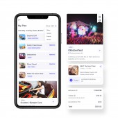
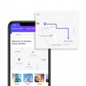
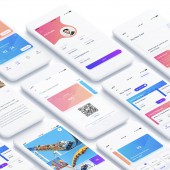
| DESIGN NAME: Semnox Experience PRIMARY FUNCTION: Mobile INSPIRATION: Searching multiple websites to know what rides, events or games are available at an amusement park and waiting in queues just to buy a ticket or to book a show could be pretty frustrating. We looked at different forms of interactions and researched right from shadowing to body storming. The insights from the research along with stakeholder interviews strengthened the solution and we were able to derive at an application that could make the Amusement Park Experience more delightful than ever. UNIQUE PROPERTIES / PROJECT DESCRIPTION: Semnox, a white labelled app is the first of its kind digital interface that makes amusement and entertainment park visits a seamless and fun experience. The app was required to work across all arcades/amusement parks with customizable branding colours and offerings, so we modularised and designed components that can be easily plugged in as per the need. The app enables users to browse through amusement park offerings like rides, events and games and book/buy tickets directly from the app. OPERATION / FLOW / INTERACTION: The app has been designed with easy navigation for any age group to use. The user can plan for activity, buy tickets, recharge cards and use QR codes to activate tickets, book events and shows and navigate using maps at the park. Semnox app is a self-service app for all requests at amusement parks freeing up time to have more fun. It efficiently maximises ROI for customers, engages and creates deeper personalised experiences for all users. PROJECT DURATION AND LOCATION: Project kickstart - April 2018, Project End - May 2018, India & USA |
PRODUCTION / REALIZATION TECHNOLOGY: The wireframes and user interface were primarily designed on Sketch App and prototypes were created on InvisionApp. Illustrations and icons were designed on Adobe Illustrator and Photoshop. User interface and brand guidelines for the app were delivered to the app development team via Zeplin. SPECIFICATIONS / TECHNICAL PROPERTIES: This application has been designed for Android and iOS phones 4.5 Inch and 6.5 Inch Screens. The visuals and interactions have specially been designed to cater to age groups between 14 and 60 years. TAGS: Mobile Application, User Experience, User Research, User Interface, Prototyping, Design Thinking RESEARCH ABSTRACT: We did extensive research with users and visitors at amusement parks to get a detailed understanding of the space. Some key insights of the research were how users found it easy using top-up cards at the parks and how in-app purchase of tickets would ease the pain of standing in long queues. We introduced these features, prototyped and interviewed users and stakeholders for faster feedback on ideas and validated immediately with user testing and A/B analysis. CHALLENGE: Considering the diverse set of audience and needs it was challenging to formulate the requirements in the beginning. Once the requirements for the solution were finalised, the next challenge we faced was finding the right set of users for the user research. The requirement being a white labelled app and for different amusement parks which would need customizable cards and layout, we had to iterate along with prototypes to arrive at a solution that would work across all brands. With iterative and sprint approach we could overcome all these challenges. ADDED DATE: 2019-02-28 07:58:26 TEAM MEMBERS (7) : Aashish Solanki, Saranya V, Shailee S, Aniket K, Sarath PS, Prashanth R and Pragati Singh IMAGE CREDITS: NetBramha Studios LLP PATENTS/COPYRIGHTS: Copyrights belong to NetBramha Studios & Semnox, 2018 |
||||
| Visit the following page to learn more: http://www.semnox.com | |||||
| AWARD DETAILS | |
 |
Semnox Experience Mobile by Netbramha Studios is Winner in Mobile Technologies, Applications and Software Design Category, 2018 - 2019.· Read the interview with designer NetBramha Studios for design Semnox Experience here.· Press Members: Login or Register to request an exclusive interview with NetBramha Studios. · Click here to register inorder to view the profile and other works by NetBramha Studios. |
| SOCIAL |
| + Add to Likes / Favorites | Send to My Email | Comment | Testimonials | View Press-Release | Press Kit |
Did you like Netbramha Studios' Mobile Design?
You will most likely enjoy other award winning mobile design as well.
Click here to view more Award Winning Mobile Design.


